


 Earlier in CSS Bakery, we had designed a summary table that showed all the links to a series of posts to give the user a quick way to access the different posts in the series. The "related" class used one background image to set itself apart from other text around it.
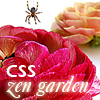
I want to expand on this class by making it wider - old background image was 410 pixels, the new bg will be 550 pixels - and introducing a small, 100 by 100 pixel thumbnail image to the design as seen above. Since we are in the middle of a series of posts on styling for the Zen Garden, I will use that series as an example in our design. You can visit Dave Shea's site here. Here's a working version of our old "related" class and its table of links:
We are going to keep many of the rules written for the related class with few exceptions. I will:
- Reduce text size (SELECTOR: .related_w_image ul a)
- Introduce a new .icons class to replace the default bullet style with a bitmap of our own (SELECTORS: .related_w_image ul.icons AND .related_w_image ul.icons li)
- Style and position the thumbnail img element with a 4 pixel light blue border and float it to the left (SELECTOR: div.post-body .related_w_image img)
.related_thumbnail {
width: 630px;
padding: 22px 0 0 22px;
background: url(http://pics.cssrule.com/pics/bluegradientlong.gif) no-repeat scroll 0 0;
}

div.post-body .related_thumbnail img {
float: left;
margin: 0;   padding: 0;
border: 4px solid #a9d7e4;
}

.related_thumbnail h4 {
color:#305CB6;
font-weight:normal;
font: 1.2em/1em Georgia,Times,Times New Roman,serif;

letter-spacing:0.1em;
text-transform:uppercase;
margin:-2px 0 7px 107px;
padding: 0px 0 0 22px;
}

.related_thumbnail  ul a {
color:#305CB6;
font-size: 0.96em;
}

.related_thumbnail  ul {
list-style-type: disc;
margin:0 0 0 110px;
padding: 0;
color: #a9d7e4;
list-style-position: inside;
}

.related_thumbnail  ul.icons {
 list-style-position: outside;
 list-style-type: none;
 margin:0 0 0 130px;
}

.related_thumbnail  ul.icons li {
background: url(http://pics.cssrule.com/pics/littlediamond.gif)  no-repeat scroll 0 5px ;
}
STYLING THE BULLET ICONS
We want to replace the default list bullets with our own icon. We will do this by turning off the default list bullets (i.e. list-style-type: none), and putting in a background image on each list item. Thanks to the CSS Cascade the list elements will still have all the rules that were previously written in the .related_thumbnail ul rule, but the styling will be modified by the new .related_thumbnail ul.icons rule. With cascading, any properties that conflict will be taken from the new more specific selector (more on this below). By doing it this way, with two separate rules, the old style related posts lists (from my previous post) won't be affected, since it's ul list does not specify class='icons'. The new style list will be coded as follows:
<div class="related_thumbnail">
<ul class="icons">
.......
</ul>

</div>
The two rules that we are going to write are going to modify the properties that were established in the more generic .related_thumbnail ul rule: one rules is for the ul list as a whole, and the other is for the list items. In the first rule, since we are going to use our own bitmap, we get rid of the bullet shaped list markers. The left margin also changes to make room for the new bitmaps. You can find a discussion on list-style-position property here.
.related_thumbnail  ul.icons {
list-style-position: outside;
list-style-type: none;
margin:0 0 0 130px;
}
Note that the list-style-type and the margin values conflict with the values specified in the .related_thumbnail ul li rule. But since .related_thumbnail ul.icons li is a more specific rule, it's values will override the previous rule.
The second rule will add in the background image on each list item (the .related_thumbnail ul li rule did not specify any background):
.related_thumbnail  ul.icons li {
background: url(http://pics.cssrule.com/pics/littlediamond.gif)  no-repeat scroll 0 5px ;
}
Here's the 10 by 10 pixel littlediamond.gif that we will be using as our bitmap:

You can substitute your own bitmap to build a custom design table of links.
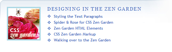
Finally, here's the markup for the list. The significant differences from the previous post are highlighted in blue. We changed the class name from related to related_thumbnail, we added the thumbnail image tag, and added class icons to the ul. The end result is shown below.
<div class="related_thumbnail">
<img src="http://pics.cssrule.com/pics/q6g.jpg" alt="" title="" />
<h4>Designing in the Zen Garden</h4>
<ul class="icons">
<li><a href="http://...html">Styling the Text Paragraphs</a></li>
<li><a href="http://....html">Spider & Rose for CSS Zen Garden</a></li>
<li><a href="http://....html">Zen Garden HTML Elements</a></li>
<li><a href="http://....html">CSS Zen Garden Markup</a></li>
<li><a href="http://....html">Walking over to the Zen Garden</a></li>
</ul>
</div>
Designing in the Zen Garden
- Styling the Text Paragraphs
- Spider & Rose for CSS Zen Garden
- Zen Garden HTML Elements
- CSS Zen Garden Markup
- Walking over to the Zen Garden
The markup for a bullet style summary table is even simpler. Our ul element will no longer have a class. We will use a descendant selector to style it. Note that it's a descendant of related_thumbnail class.
<div class="related_thumbnail">
<img src="http://pics.cssrule.com/pics/q6g.jpg" alt="" title="" />
<h4>Designing in the Zen Garden</h4>
<ul>
<li><a href="http://....html">Styling the Text Paragraphs</a></li>
<li><a href="http://....html">Spider & Rose for CSS Zen Garden</a></li>
<li><a href="http://....html">Zen Garden HTML Elements</a></li>
<li><a href="http://....html">CSS Zen Garden Markup</a></li>
<li><a href="http://....html">Walking over to the Zen Garden</a></li>
</ul>
</div>


 Posts
Posts


Post a Comment
Note: Only a member of this blog may post a comment.