


Each section is made up of: h3, p, and ul. In order to float these, I wrapped them in a div and gave each of div an id. So now we will have "brownie", "cookie", "macaron" and "scone" divs that we can float:
#brownie, #macaron, #cookie, #scone { float: left; }
The float pulls the four div's one by one all to one level. First up is the "#brownie" div and it is placed as far left as possible which is the edge of the page. Then the "#cookie" div is placed next to it because that's as far left as we can go with "brownie" taking up the first available slot. "#macaron" and "#scone" come next but as you resize your browser, we get column drops and "breakfast" div which comes after "#treats" move up.
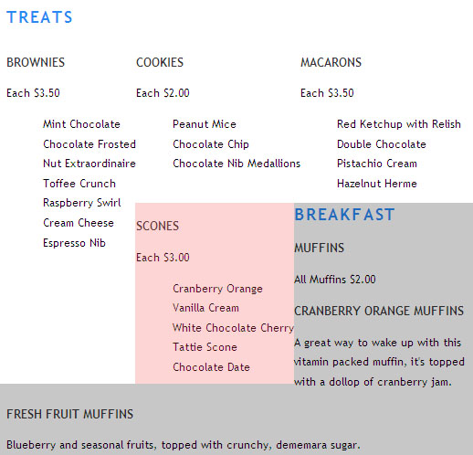
The image is a freeze frame of one of the resizes. The pink rectangle is a column drop and grey area shows how "#breakfast" div moves up when space opens up and forms a hole big enough for "#breakfast" div to squeeze itself in. We have to fix two problems here and we start with keeping "#breakfast" div under our four oclumn layout.
There's a property called "clear" that will prevent an element from appearing next to a float. The clear property is always applied to a non-floated element that you are wishing to start after the float. If you want to clear left floated elements, "clear: left;" , or when you have to clear right floated elements, then "clear: right;" will take care of that situation. In our case we have both of these cases. The four divs contained within "#treats" div are all floated to the left so in order to avoid them, clear: left and we know that the "#specials" div is floated right which would require "clear: right;" to make sure you give your non-floated elements a fresh start. Fortunately there is also a value that covers both of these cases which is "clear: both;" that you can use instead of having to include both left and right.
#breakfast { clear: both; }
If you bring up our page in a browser window "#breakfast" no longer moves up when the window is resized.
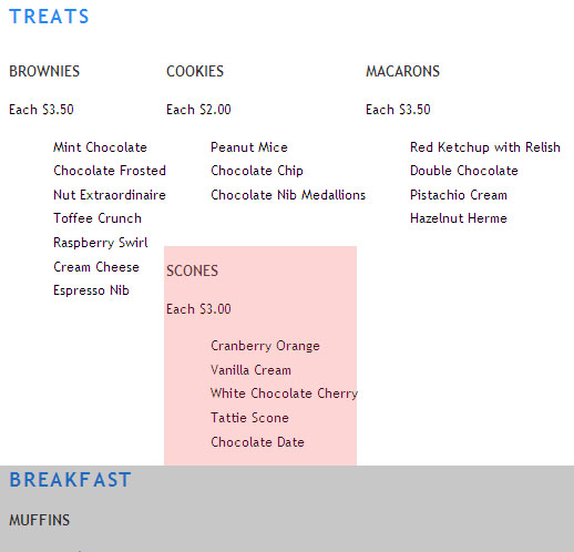
We now have the "#breakfast" div down where it should be, no matter what you do with the browser window, it stays down. The only problem now is the column drop which is shown by the pink colored rectangle. We also need to do some styling of the text. After the price for each general item, there's a listing of different kinds for that particular class which are all indented. I am going to zero out the padding to avoid that.
#treats ul { padding: 0; margin: 0;}
The new page here and also a snapshot:
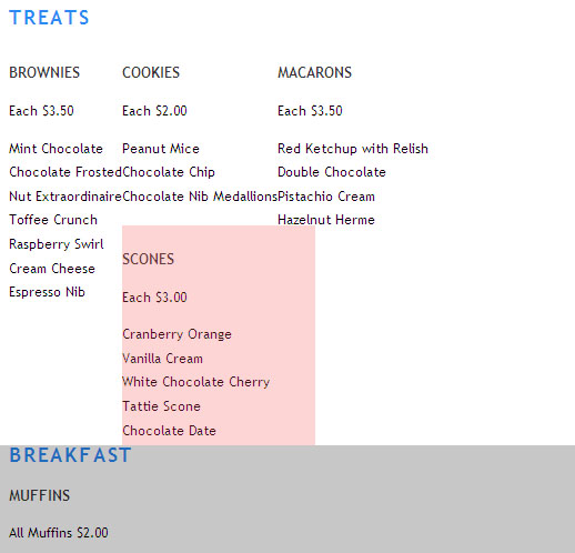
In order to stop the column drop, I gave the div that wraps around the four columns a width and a height. The width is non-negotiable but you can skip the height and get away with it.
#treats {
height: 300px;
width: 642px;
}
Giving the div a width stopped the column drop. With the layout problems behind us, we can focus on styling.
The columns need some spacing, we can drop in a background for the heading, and style the subheadings. For example, Italicizing the item price would be good.
My image for the background is treatsblue3.png. It's about a hundred pixels larger than my blog main area so you won't see the full length because the right side will get cropped but here it is for you to look at:

Since we have an image we can hide the title "treats" either by deleting it or by using image replacement technique:
#treats h2 {
background: url(treatsblue3.png) no-repeat;
height: 93px;
}
#treats h2 span { visibility: hidden; }
Without the height statement your background image will get cropped so you need that 93 pixels rule. Here's the total number of changes we've made so far:
#brownie, #macaron, #cookie, #scone {
float: left;
margin: 0 5px 10px 25px;
text-align: center;
}
#breakfast { clear: both; }
#treats ul { padding: 0; margin: 0;}
#treats {
height: 300px;
width: 642px;
}
#treats h2 {
margin:0; padding:0;
background: url(treatsblue3.png) no-repeat;
height: 93px;
}
#treats h2 span { visibility: hidden; }
#treats h3 {
margin: 0 0 7px 0;
font-size: 15px;
letter-spacing: 0.2em;
}
#treats p {
font-style: italic;
margin: 0 0 3px 0;
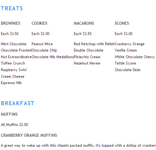
} We got two remaining issues to deal with. The subheadings including brownies, cookies, macarons and scones have to be pulled up into the blue strip area. In the interim, we developed a new float problem. If you decrease browser window width, the "#specials" div trespasses the blue background strip for a little while and then recovers. But the fact that it's happening at all is not acceptable so we need to fix it.
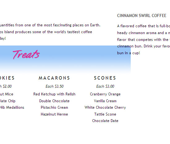
Here's a snapshot that shows the remaining issues:
I wrapped the entire page in a div called "#homepage" with a 990 pixel width. That took care of the float collision problem. While I was there, I added auto left and right margins to center our page in the browser window. "margin: 0 auto;" is shorthand for "margin: 0 auto 0 auto;" which mean the same thing.
The h3 headings in the "#treats" section were moved up by giving the h2 heading above them a negative bottom margin of -50 pixels. Negative margins are valid in CSS and can be very useful in some circumstances such as in this one where they can simplify code needed to nudge an element. New selectors:
#treats h2 {
margin:0 0 -50px 0; padding:0;
}
#homepage {
width: 990px;
margin: 0 auto;
}
The entire CSS rule sheet that made it happen:
<style type="text/css">
#homepage {
  font-family:"Trebuchet MS",Verdana,Arial,Helvetica,sans-serif;
  font-size: 12px;
  line-height: 1.8em;
  width: 980px;
  margin: 0 auto;
}

h1 { font-size: 32px; margin-right: 60px; }
h1, h2 { color: #2989f4; text-transform: uppercase; letter-spacing: 0.1em; }
h3 { font-size: 13px;
     font-weight: 800;
     color: #373737;
     text-transform: uppercase;
}
h1 {
  width: 253px; height: 160px;
  background: url("images/logosquare3.jpg") 0 0 no-repeat;
}

#specials {
     margin: 0 10px 10px 10px;
     width: 270px;
     float: right;
}

#specials h2 {
   text-align: center; color: #6f6b6c;
   margin:0; padding:0;
   height: 60px;
   background: url(images/es3.jpg) 0 0 no-repeat;
}
h1 span, h2 span { visibility: hidden; }
ul { list-style-type: none;  }
#intro, #coffee, blockquote { margin-right: 330px; }
#brownie, #macaron, #cookie, #scone {
       float: left;
       margin: 0 5px 10px 25px;
       text-align: center;
}
#breakfast { clear: both; }
#treats ul { padding: 0; margin: 0;}
#treats {
   height: 300px;
   width: 642px;
}
#treats h2 {
   margin:0 0 -50px 0; padding:0;
   background: url(treatsblue3.png) no-repeat;
   height: 93px;
}
#treats h2 span { visibility: hidden; }
#treats h3 {
   margin: 0 0 7px 0;
   font-size: 15px;
   letter-spacing: 0.2em;
}
#treats p  {
    font-style: italic;
    margin: 0 0 3px 0;
}
</style>


 Posts
Posts


Post a Comment
Note: Only a member of this blog may post a comment.