


When we worked on a CSS image grid last summer, I thought later I'd complete a second version using sprites to show you how that approach can improve performance. I should make notes to myself about loose ends like that because somewhere along the way, I forgot about it. Last week, an email about the original grid reminded me.
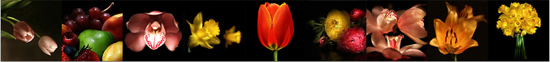
The grid post is popular, the sprite change is easy enough, so let's implement it. By the way, the grid above is a real-time working example generated through HTML included within this post and styles that come from a style sheet. Each thumbnail is clickable but needs a URL assigned to its a element before it'll take you somewhere.
The thumbnail images are still life on black, which is a hobby of mine. I had to crop some of them quite a bit in order to fit them here. Images were saved in low resolution to speed up things for the web.
I made a new copy of the old CSS styles just to keep things from tangling with each other. Most of the code is recycled so for detailed explanations, see this previous post. I posted several times on sprites before if you need help to figure out what those are about.
Keep in mind that my space on the blog is limited to 550 pixels, you can adjust the width to fit your requirements and increase the number of columns of your grid as you wish. You'll find the markup at the end of the CSS.
ul.imggrid {
  padding: 0;
  list-style: none;
  margin: 0 auto;
  width: 495px;
  }

.imggrid li {
    float: left;
    padding: 1px;
    border: 1px solid #cbcad0;
    margin: 0 5px 10px 5px;
    }

.imggrid_display {
   padding: 20px;
   margin: 0 auto;
   width: 513px;
   /*these two properties will be inherited by .portfolio h2 and .portfolio p */
   font-family: 'GraublauWeb', arial, serif;
   text-align: center;
  }

  /* .post-body is only for those who are on Blogger, or all others please skip
     it and write your selector as "div.imggrid_display h2" without the quotes
  */
  .post-body div.imggrid_display h2 {
     padding: 0; margin: 0;
     clear: both;
     font-size: 35px;
     font-weight: normal;
     color: #58595b;
     background: none;
     font-family: 'GraublauWeb', arial, serif;
     /* reset for cascade effects that are trickling down to me
       from other h2's
    */
     text-transform: none;
     letter-spacing: normal;
     }

  .imggrid_display p {
      margin:0; padding: 0;
      font-size: 15px;
      color: #58595b;
      }

/* sprites for imggrid */
.imggrid a {
    background: url('images/spritebitmaps.jpg') no-repeat;
    height: 150px;
    width: 150px;
    display: block;
    }

/*sprites*/
.imggrid a#col1 {background-position: 0 0;}
.imggrid a#col2 {background-position:  -150px 0;}
.imggrid a#col3 {background-position: -300px 0;}
.imggrid a#col4 {background-position:  -450px 0;}
.imggrid a#col5 {background-position:  -600px 0;}
.imggrid a#col6 {background-position:  -750px 0;}
.imggrid a#col7 {background-position:  -900px 0;}
.imggrid a#col8 {background-position:  -1050px 0;}
.imggrid a#col9 {background-position:  -1200px 0;}
/* end sprites for imggrid */
/* end imggrid block */
Important note for the CSS: .post-body is only for those who are on Blogger, All others please skip it and write your selector as div.imggrid_display h2
Fill in your own URLs for the a href's. The markup:
<div class="imggrid_display">
<ul class="imggrid">
<li><a id="col1" href="#"></a></li>
<li><a id="col2" href="#"></a></li>
<li><a id="col3" href="#"></a></li>
<li><a id="col4" href="#"></a></li>
<li><a id="col5" href="#"></a></li>
<li><a id="col6" href="#"></a></li>
<li><a id="col7" href="#"></a></li>
<li><a id="col8" href="#"></a></li>
<li><a id="col9" href="#"></a></li>
</ul>
<h2>Still Life</h2>
<p>© Copyright 2011 | www.cssrule.com | All Rights Reserved</p>
</div>
THE "SPRITE" FILE
All the images used in forming the grid reside in the same file avoiding multiple GETs which saves time and loads the page smoother. I did not leave any space between my images but for clarity and ease of edit, you might want to include at least a single line as a separator between yours.
Since my images are each 150 pixels wide and stacked next to each other with no separator space, I shift the sprite file by a factor of 150 times the order of each image in the file to get to that image.
To give you an example, the red tulip is fifth in line so I multiply 150 by (5-1). I subtracted 1 since we start counting from zero. In other words, I have to shift the background image by 600 pixels to get to the tulip.
The background position x value is negative at -600 pixels because we want to pull the image to the left. If it helps any, think of the negative x axis from school. You are pulling the parts of the image that you don't want into that quadrant and showing only a portion of the remaining in the positive quadrant.
NTH CHILD OF CSS3
We can improve the CSS by including the nth-child construct from CSS3. It will simplify both the CSS and the markup. Off the top of my head, I couldn't tell you how widespread it's implemented in browsers, except that Firefox 3.5 and greater supports it and IE8 and below doesn't. The fact that IE8 does not support it is a dealbreaker and the reason why we cannot use in official code yet. There are still a lot of users running Windows XP, which does not support IE9. Anyway, I will show you how the nth child works in a separate post.

CSS Image Grids
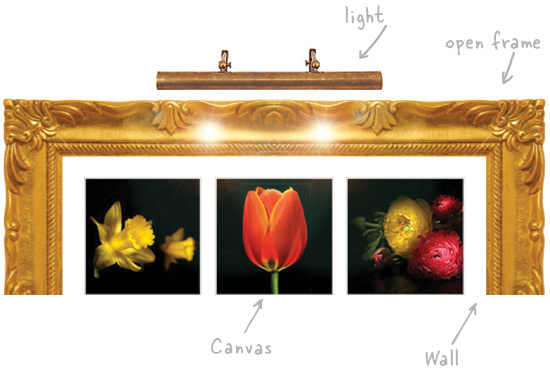
AN IMAGE GRID FOR YOUR WALL
This has nothing to do with software but the idea is very similar to the grid that we just talked about with the only difference being where the images go - on a computer screen or a wall. If you have a collection of pictures - with the proliferation of digital cameras who doesn't these days - you can print them on canvas with a wide format printer. Once the prints are made and mounted, arrange them in a grid on a bare wall and surround the arrangement with a hollow but complete frame. No need for glass, matting, or mounting. Finish it off with a picture light.
SAME GRID WITH 5 IMAGES
This is in response to a question in the comments section. If you have a row that has fewer images than the other rows and you want to center it, you can change the markup or keep the same markup by doing a little math and resetting a single margin. Figure out how much narrower that row is than the other rows. Then, take half of that amount and add to it the left margin of the first image (li element in our case).
So, my calculations went like this: I have 5px left margin, 154px image, 10px in between that image and the next, etc. The thumbnails themselves are 150 pixel squares but I have 1 pixel border and 1 pixel padding all around so the total width comes out to 154 pixels. Same thing with height but we don't need the height for this exercise. (154+10)/2=82. Add 82 to the existing left margin of 5px for a new left margin of 87px which I put in as an inline style just for testing. You should not leave inline styles in your actual code.
<div class="imggrid_display">
<ul class="imggrid">
<li><a id="col1" href="#"></a></li>
<li><a id="col2" href="#"></a></li>
<li><a id="col3" href="#"></a></li>
<li style="margin-left:87px;"><a id="col4" href="#"></a></li>
<li><a id="col5" href="#"></a></li>
</ul>
<h2>
Still Life</h2>
<p>
© Copyright 2011 | www.cssrule.com | All Rights Reserved</p>
</div>


 Posts
Posts


8 comments:
Good information, thank you :)
Muhammad, Thanks.
Hi, so glad i found your site!
do know how to make 'read more' thumbnails appear in a grid, gallery format like this?
Hi Rachel, Are you trying to display a message that says "Read more" under each thumbnail image in the grid?
Hi, is there a way I can center 5 divs, 3 in the top and two in the bottom? Each div contains an image. There are only 5 images. I wanted to center the bottom two so that it’s balanced. The current styling is float:left.
Thanks,
J.
Hi,
See if the new section that I just added at the end of the post will help.
Awesome explanation of sprites, thanks.
I am also looking to figure out how to display text under each image in the grid. Maybe text that is black with a blue background that is squared up against the bottom of the image. Any help with that?? I'm still a bit baffled by it all, but am trying to learn it! Thanks!!
Cleo Cat,
You can add text under each image by putting a paragraph immediately afte the end of each <a> tag in the list of images:
<li><a href="#" id="col1"></a><p>Tulips</p></li>
<li><a href="#" id="col2"></a><p>Fruit</p></li>
<li><a href="#" id="col3"></a><p>Orchid</p></li>
Then you can change the text and background colors by adding another CSS rule to target those new paragraphs:
.imggrid li p { background-color: skyblue; color:black; }
(I only did the first three, but you would add a paragraph tag for each image label. A total of 6 for this grid.)
Post a Comment
Note: Only a member of this blog may post a comment.