


If you were plotting the gross national products of different nations, the name of each country would go along the x-axis, gross national product per capita dollar values along the y-axis will determine the heights of the rectangular bars. This type of graph will quickly tell us how the economies of different countries compare. Take for example, Bulgaria and Romania. Even though both are in the European Union, purchasing power of an individual in these countries hover around $3,500 Dollars per year. Compare that with the GNP of Luxembourg at $70,000 per person, you get an idea of the prosperity levels across EU.
In this tutorial, I'm going to show you how to construct flexible bar graphs using CSS and HTML. The key concepts that will be covered are: the background property, absolute positioning, CSS selectors, first-child, CSS sprites, containing block, cascade, and styling of unordered lists.
DIGITAL GRAPH PAPER
First using Photoshop, I constructed the "graph paper" image which will be the backdrop of my graph. It has a very subtle grey gradient that goes from darker at the top to lighter at the bottom to give the graph some depth. I only need a wide enough background for a single bar because I want a flexible graph that repeats a cross section of "paper" as needed. The CSS background property is perfect for what I'm planning to do. I start out with a div element "bargraph" which will envelope the entire feature.
.bargraph {
}
For its background, I drop in the graph paper section which I will repeat horizontally along the x-axis using the "repeat-x" attribute of the CSS background property.
.bargraph {
background: url (images/papergrid.jpg) repeat-x;
}
At this point in our CSS, we don't know what our graph background will be like yet. We have a cross-section above but until a width is defined, the graph is not completely formed. So far, we have a bargraph div with a 73 pixel wide and 229 pixel high background image that repeats across the page. The height for the div is set to 229 pixels which is equal to the height of the entire background image - the white squared areas and the dark strip underneath reserved for labeling. You have to specify both the height and width for the div to display the entire background image. The height of the graph is permanent so there's no disadvantage to declaring it in the CSS. But since we want to support graphs with varying numbers of bars, widths will be dynamically allocated from the markup where the bars of the graph are defined.
The "papergrid.jpg" image does not have a left border so a left side border is drawn in grey for the bargraph div. By setting the left and right margins to auto, you'll allow the graph to center itself within the window. The 50 pixel bottom margin is wider than usual in order to allow space for the labeling of the graph.
.bargraph {
height: 229px;
position: relative;
background: url(images/papergrid.jpg) repeat-x;
border-left: 1px solid #d4d4d4;
margin: 15px auto 50px;
}
CONTAINING BLOCK
"position: relative" establishes "bargraph" div as a containing block.
I am going to position the elements of the graph inside the "bargraph" div. To do this, I'll use absolute positioning to place the bars and labels of the graph at exact pixel positions. But when I do something like "left: 21px", to position a bar 21 pixels from the left, what exactly is it 21 pixels from? The answer is, it's 21 pixels from the left edge of what is called the "containing block".
The containing block is nothing more than a rectangle that the browser keeps track of so that it can correctly calculate the top, right, left, and bottom offsets with respect to that rectangle.
For absolutely positioned elements, the containing block rectangle is always determined by this rule: starting with the element you are absolutely positioning, look for the first anscester HTML element that itself has a position property of either 'absolute', 'relative', or 'fixed'. The dimensions of that element's rectangle are the containing block.
If there is no element with a position of absolute, relative, or fixed, then the containing block corresponds to the page's body element, so for example offsets of, right: 0px; top: 0px; would place the element in the upper right portion of the page.
That's all the styles needed for the div which will contain and be a reference point as a containing block for bar graph.
LI ELEMENT FOR BARS
The next building block is an unordered list, ul. The "graph-bars" ul is a descendant of "bargraph" div. I do not want any list markers to show so I set the list-style-type to none.
.bargraph ul.bars {
margin: 0;
padding: 0;
/* getting rid of bullets */
list-style-type: none;
}
Then I style the list item li's which I will position absolutely. Their containing block is the bargraph div. Each li represents a bar for the graph. By setting the position to absolute, each bar will be positioned with respect to its containing parent div "bargraph".
In order to clear the strip used for labeling the horizontal axis information at the bottom of the graph, "bottom" for each bar will be set to 29 pixels above the bottom edge of the div. If you look at our "graph paper" image you will see that there's a dark bottom strip.
While the y value (bottom: 29px) is the same for every bar, the x values will differ based on the order of the bars ie the first bar will have a smaller x value than the next bar. The x values will be set for each specific li separately a little later.
.bargraph ul.bars li {
position: absolute;
background: url(images/bars200.jpg) no-repeat;
/*move it up from bottom label*/
bottom: 29px;
width: 30px;
height: 200px;
padding: 0; margin: 0;
text-align: center;
font-weight: 800;
color: white;
line-height: 2.5em;
font-size: 12px;
z-index: 99;
}
Each bar width is equal to 30 pixels which is the thickness of a colored rectangle in bars.jpg file. For the bars, I put together a collection of rectangles which I colored using the Photoshop gradient tool to give each bar a three dimensional look. The image file which is a collection of 10 bars becomes the background for every list item . I will be using the CSS Sprite technique where you shift the background image around to display only the part of the image that you want. Putting the background for all bars in one image allows the page to load faster.

Although I have the height set to 200 pixels which is the full length of a bar in the bars.jpg file, these heights will be overwritten from the markup. By allowing height information entry from XHTML, we'll have a flexible graph that is not set in stone. If someone forgets to enter a number, the bar will have an initial value of 100 percent.
The text-align, font-weight, color and line-height are all for the styling of text that is going to inside the bars. The text-align property centers the text within the bar, line-height provides space between the text and the top of the bar, and we use bold styled text for legibility.
The height of each bar represents a numeric value in the y-axis. I can display this value either just outside of each bar on top of it or choose a good contrasting color like white and stay inside the bar which is what I chose to do in this case. The font is white and bold with a line-height of 2.5em.
Alternatively to display the vertical numeric value outside of a bar, I set the position to relative and moved the top by -25 pixels using "ul.bars li span" selector. The text color in this case is a dark grey to provide contrast to the graph paper underneath. When there's a relative position, the browser leaves a hole behind where the element was supposed to go and displays it in the new specified position. Printing outside the bar is useful when a bar is too short because of a low y-value, it will not have enough space for the number to go inside it.
.bargraph ul.bars li span { position: relative; top: -25px; color: #7c7c7c; }
MULTI CLASS ELEMENTS, THE CASCADE, SPRITES
Following the styling of the list item li, I declared nine more list items that are more specific. As the browser is rendering each list item will look for matching rules in the CSS and will apply them according to their specifity and the order in which they appear. So for list item, the general li styling will cascade down to the more specific li's such as bar1, bar2, bluebar, redbar and so on. This is called "cascading".
/* positioning each bar on the graph paper - these numbers will change
based upon the background image for graph paper */
.bargraph ul.bars li.bar1 { left: 21px; }
.bargraph ul.bars li.bar2 { left: 94px; }
.bargraph ul.bars li.bar3 { left: 167px; }
......... code snipped .........
.bargraph ul.bars li.bar9 { left: 605px; }
The "left" position along with the "bottom" position that was defined in ".bargraph ul.bars li" selector determines where each list item is displayed on the graph. Bottom position is the same for every li item or bar - 29 pixels as it was declared in ".bars li". The horizontal value changes so each different bar class gets its own left or x-value. List item "bar1" comes before "bar2" so it's left value is at 21 pixels while "bar2" is at 94 pixels.
/* Sprites - bottom means 100% in background-position */
.bargraph ul.bars li.bluebar        { background-position: 0px bottom; }
.bargraph ul.bars li.redbar         { background-position: -30px bottom; }
.bargraph ul.bars li.greenbar      { background-position: -60px bottom; }
...................                code snipped               ...........................
.bargraph ul.bars li.goldbar       {  background-position: -240px bottom; }
.bargraph ul.bars li.tealbar       {  background-position: -270px bottom; }
The second positioning value is for the CSS Sprite. Unless set differently from a more specific li down the line, the background image for all li's is bars.jpg file. Using the background-position property we can shift the image to choose a differently colored bar for each li. The blue colored bar is the first bar in the file so the background-position for "bluebar" is set at zero pixels. This is the beginning of the image file. The width of the li block element is set to 30 pixels which is the same width of a bar in the image file. So we show only the first 30 pixels of bars.jpg file in the background for "bluebar" list item. To get to the red bar, we shift the background by 30 pixels to the left and display the next 30 pixels which happens to be the red bar in the file. These positions will also determine what point of the background corresponds to the point on the element (li in our case). Since we are using "bottom", we will be starting from the bottom of the bars.jpg file.
.bargraph ul.bars li.redbar { background-position: -30px bottom; }
These two rules could have been combined into one rule: .bargraph ul.bars li.bar1 { left: 21px; background-position: -30px bottom; } but this would have also taken away the flexibility and always force the first bar in the graph to be of a certain color, red in this case. By separating the two rules like I have done above, we give the document power to choose which color to use for the bars. You can make all the bars the same color or give each bar a different color, use a different combination of color every time; it's all up to you.
Multiple classes will help put the two classes above to work. Even though the first bar in the image file is blue, we are not bound to use blue as our first bar or as any at all. I chose the green colored bar as my first. Separating the sprite and graph positioning into different classes allows for flexibility and greater power. Here's an example XHTML markup to show how to write a three bar graph:
<li class="bar1 greenbar" style="height: 80px;">40</li>
<li class="bar2 bluebar" style="height: 180px;">90</li>
<li class="bar3 red" style="height: 140px;">70</li>
Or, I might go for a graph with uniformly colored bars, gold in this case. You get to do this from the document without having to touch your style sheets:
<li class="bar1 goldbar" style="height: 120px;">60</li>
<li class="bar2 goldbar" style="height: 170px;">85</li>
<li class="bar3 goldbar" style="height: 36px;">18</li>
To recap multiple classes, an element can have more than one class and to separate the multi class format, use a space in betwen the class names and enclose the entire string in quotes. Although IE 5 and 6 do not support the multi class approach, IE 7 and Firefox do.
LABELING OF THE GRAPH
For the horizontal axis, I created another unordered list called "label" which I position absolutely with its bottom margin edge 3 pixels above the bottom of the box's containing block. The containing block for both labels is the "bargraph" div. List-style-type is set to none again because we do not need the default markers of an unordered list.
I set the font color to white, letter-spacing to 0.1em, font-size to 11px, centered and uppercase transformed text in ".label li". To safeguard against a label that is too long, I set the overflow property to hidden. If you inadvertently type a label that is too long, it will not break the code. Finally I floated all the li's which are block elements to the left. The width is set to 73 pixels which is the actual width of the "graph paper" section that we are repeating for the digital "graph paper".
.label {
list-style-type: none;
position: absolute; bottom: 3px;
margin: 0; padding: 0;
}
.label li {
color: white;
text-transform: uppercase;
letter-spacing: 0.1em;
font-size: 11px;
width: 73px;
text-align: center;
/*safeguard against a label that is too long*/
overflow: hidden;
float: left;
}
The labeling of the vertical or the y-axis is not as straightforward. I start out with an unordered list "y-label", get rid of the markers, and absolutely position it -45 pixels from the left. Left normally specifies how far a box's left margin edge is offset to the right of the left edge of the box's containing block. But since I use a negative value, although we still take the left edge of y-label's containing block as our reference, instead of offsetting to the right, we offset to the left of it. That way we print the y-axis numbers outside the graph but right next to it.
ul.y-axis {
list-style-type: none;
position: absolute;
/*positioning the ul box - the box that goes around the list, 100, 75,... */
left: -45px;
bottom: 0;
width: 40px;
text-align: right;
margin: 0; padding: 0;
}
For ".y-label li" list element, I chose a medium grey color, font-size of 12 pixels. The height for each li block is 51 pixels which is twice the amount of each vertical grid. I am going to mark two vertical blocks at a time. I also set the line-height to 51 pixels to center it vertically within the 51 pixel high box. This is a nice trick to get the positioning right. I aligned the text to the right. You can choose to align to the left or center if you'd like.
ul.y-axis li {
color: #aba8a8;
font-size: 12px;
height: 51px;
line-height: 51px;
text-align: right;
}
The following rule is to push the last label for the y-axis down into the graph area. If I hadn't written this rule, I doubt anybody would take notice but since it's a good example to feature the "first-child"concept in CSS, I included it. This rule will execute without us having to write any markup from the document because CSS can figure out who the element and who's its first child is. We reduce the height and force the text to center within the reduced space via line-height that is the same.
ul.y-axis li:first-child {
height: 40px;
line-height: 40px;
}
Optional styling for vertical axis units:
ul.y-axis li.units {
position: absolute;
bottom: 110px;
right: 20px;
line-height: 1.2em;
height: auto;
}
GRAPH TITLE
To give the graph a title, I added a paragraph element which I position absolutely from the top by 236 pixels down. Initially I had used "bottom" to position it but this approach does not work well. Instead of "top: 236px", assume we had "bottom: -30px". What this says is to place the paragraph absolutely negative 30 pixels down from the bottom of bargraph div which is the containing block. The negative value establishes the direction. Normally an offset will take you somewhere in the space the element occupies but with a negative offset you go exactly the opposite or outside of the element's boundaries.
So far so good, the title displays fine until you type in a longer label then the text moves into the graph area and writes over the x-axis labeling. You are stumped wondering what's going on since your offset seemed to work the first time around.
If you look at the screen shot, in the second example when the title gets long-winded, we are overwriting because the browser matches the "bottom" corner of the title paragraph - you have to think of all elements as being in boxes in CSS - with the bottom left position that we specify. The "X" position is where the two bottoms come together so the larger paragraph being taller spills out of the white area. We could make our "bottom" value larger but shorter paragraphs will display far away from the graph making the results look odd.
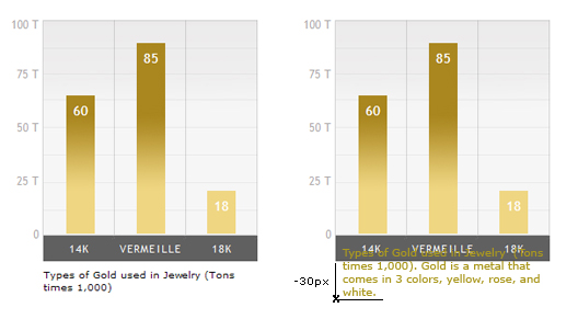
Specifying a "top" value is the best approach. With "top: 236px;", your title text always starts 236 down from the top of the bargraph and you can choose a title of any length with no worries. For most titles, I aligned text to left but also provide an option for centering text.
There's one more important change that I made in order for the title to work correctly and that is adding a bottom margin for "bargraph" div. The extra fifty pixels allows enough space for the absolutely positioned title fit without it running into other elements that come after it. Absolutely positioned elements are taken out of the flow so the browser does not watch over the positioning of ".bargraph p". The p element is no longer its responsibility so we need to make sure it's taken care of. If you absolutely position an element you have to either open up space for it on the page or place it where there's enough space.
/*labeling of the graph*/
.bargraph p {
position: absolute;
left: 0;
top: 236px;
width: 100%;
padding: 0; margin:0;
text-align: left;
font-family: Verdana, sans-serif;
font-size: 10px;
color: black;
line-height: 1.3em;
}
.bargraph p.centered { text-align: center; }
WATERMARKS AND COLOR FILTERS
You have an option to place a watermark on the graph by using multiple classes as shown in the markup:
<div class="bargraph" style= "width: 365px;">
<ul class="bars olympic-watermark">
<li class="bar1 goldbar" style="height: 170px;">85</li>
<li class="bar2 goldbar" style="height: 70px;">35</li>
. . . . . .
</ul>
. . . .
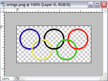
The olympic watermark is a transparent png file that goes in between the digital graph paper and the bars of the graph. You can see the graph paper underneath showing through because of its transparency. The height for the image is required for IE.
.bargraph ul.olympic-watermark {
background: url(images/orings.png) no-repeat;
background-position: 50% 50%;
height: 122px; /* IE fix */
}
We can also place an optional transparent layer over the graph to change its color. The CSS opacity property has to be kept in a separate element in order to not effect the opacity of other elements. I created an empty div with the same width as bargraph div. The width is important because you want to tell the browser how much of your graph you want layered with the new "colorfilter".
<div class="bargraph" style= "width: 365px;">
<ul class="bars olympic-watermark">
<div class="colorfilter" style="width: 365px;"></div>
<li class="bar1 goldbar" style="height: 170px;">85</li>
<li class="bar2 goldbar" style="height: 70px;">35</li>
.............................
</ul>
</div>
The containing block already set, you can position the colorfilter div absolutely, matching it up exactly with bargraph div edge to edge. The color choice is yours, width is set from the markup to allow for flexibility, height is fixed at 201 pixels. Note that the z-index for colorfilter class is lower than the li element because you want the graph bars to go on top of the colored layer.
div.bargraph div.colorfilter {
position: absolute;
top: 0; left: 0;
height: 201px;
background-color: black;
opacity:0.2; filter:alpha(opacity=20);
z-index: 97;
}
ICONS SITTING ON TOP OF EACH BAR
You can place small icons that are representative on top of each bar. The markup is an img tag enclosed within an li element.
<div class="bargraph" style= "width: 146px;">
<ul class="bars">
<li class="bar1 crimsonbar" style="height: 150px;">75<span><img src="images/gift2.png">
</span></li>
<li class="bar2 greenbar" style="height: 100px;">50<span><img src="images/tree2.png">
</span></li>
...........................
</ul>
</div>
I moved them into position using relative positioning. The containing block is the li element which is absolutely positioned.
.bargraph ul.bars li img {
margin: 0; padding: 0;
position: relative;
top: -71px;
left: 0;
}
- 75

- 50

- 25

- Gifts
- Trees
- Trim
- $100K
- $75K
- $50K
- $25K
- $0
Holiday Expenditure in US in 1920
LABELING BARS IN A DIFFERENT COLOR
Each individual bar has a color gradient so depending on how tall a bar gets the white font color can look pale if there is not enough contrast with its background. To remedy situations like this, you can create a darker colored font using the span element. Since we already are using the span for also writing outside a bar, I will declare a span of "darkpen" class. The most significant declaration in this rule is the position property being set to static. This is because span element has a relative position that has been declared previously and unless we reset it, it will be acquired by the ".darkpen" through the cascade.
.bargraph ul.bars li span.darkpen {
color: #515151;
position: static;
}
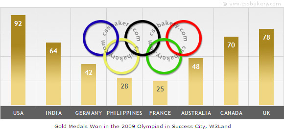
The differences in li elements in the markup. Note that numbers for Philippines and France are being written with span.darkpen:
<div class="bargraph" style= "width: 584px;">
<ul class="bars olympic-watermark">
<li class="bar1 goldbar" style="height: 184px;">92</li>
<li class="bar2 goldbar" style="height: 128px;">64</li>
<li class="bar3 goldbar" style="height: 84px;">42</li>
<li class="bar4 goldbar" style="height: 56px;"><span class="darkpen">28</span></li>
<li class="bar5 goldbar" style="height: 50px;"><span class="darkpen">25</span></li>
<li class="bar6 goldbar" style="height: 96px;">48</li>
<li class="bar7 goldbar" style="height: 140px;">70</li>
<li class="bar8 goldbar" style="height: 156px;">78</li>
</ul>
For the next bar graph, I used the statistics from the site counter. These are the countries where most of the traffic on cssbakery.com come from.
HOW TO USE THESE STYLES? THE XHTML
The width of the graph is specified in the markup. The width of the background image for the "graph paper" is 73 pixels so to calculate the total width for your graph, multiply the number of bars times 73 pixels. A five bar graph comes out to 365 pixels.
For the five bars that we have, we can choose any color that we wish. I matched the colors of the fruit to the bars so apples got the red bar, grapes the purple and so on. The height values determine how high up each bar goes. In order to make the calculation easy, I purposefully made the bars image file and the white graph paper equal to 200 pixels. To calculate the bar heights for a vertical axis that goes from 0 to 100, multiply your values by 2. For 80 Tons of oranges, the height equals to 160 pixels. The kiwi consumption is low at 7 Tons per year so I use span's to print outside the bar. I styled "bargraph ul.bars li span" selector for this purpose.
<div class="bargraph" style= "width: 365px;">
<ul class="bars">
<li class="bar1 purplebar" style="height: 100px;">50</li>
<li class="bar2 redbar" style="height: 170px;">90</li>
<li class="bar3 bluebar" style="height: 70px;">35</li>
<li class="bar4 greenbar" style="height: 14px;"><span>7</span></li>
<li class="bar5 orangebar" style="height: 160px;">80</li>
</ul>
<ul class="label"><li>grape</li><li>apple</li><li>blueberry</li><li>kiwi</li><li>orange</li></ul>
<ul class="y-axis"><li>100</li><li>75</li><li>50</li><li>25</li><li>0</li></ul>
<p class="centered">Yearly US Fruit Consumption in Tons</p>
</div>
The nice thing about "bargraph" class is its flexibility. You can label the x-axis and y-axis any way you want. The scale of y-axis does not always have to start from zero, as long as you scale your values in XHTML based on 200 pixels, the bars will be accurate. You can have any number of bars in any color that you want, the graph will expand or contract based on the width that you specify in your markup. You can bring your own creative watermarks to personalize your graph. You can drop in a color filter of your choice simply by changing a color code or if not, try the black color in differing shades. You can even place small icons on top of each bar to make the graph look even more interactive.
If you use the class, I'd love to see your results and a link back to cssbakery.com. Have fun! :)
WANT TO DO A TEST RUN ON YOUR MACHINE?
Here's the CSS file for the bar graph styles. I'm using these styles in the markup below that generates the fruit consumption graph. The two images are papergrid.jpg and bars200.jpg. I uploaded the HTML file also so you can see the final result. Do "View>Source" in your browser to see the code or see below.
<html>
<head>
<link href='http://pics.cssrule.com/pics/css/verticalbargraph.css' rel='stylesheet'
type='text/css'/>
</head>

<body>

<div class="bargraph" style= "width: 365px;">
    <ul class="bars">
        <li class="bar1 purplebar" style="height: 100px;">50</li>
        <li class="bar2 redbar" style="height: 170px;">90</li>
        <li class="bar3 bluebar" style="height: 70px;">35</li>
        <li class="bar4 greenbar" style="height: 14px;"><span>7</span></li>
        <li class="bar5 orangebar" style="height: 160px;">80</li>
    </ul>
<ul class="label"><li>grape</li><li>apple</li><li>blueberry</li><li>kiwi</li><li>orange</li></ul>
<ul class="y-axis"><li>100</li><li>75</li><li>50</li><li>25</li><li>0</li></ul>
<p class="centered">Yearly US Fruit Consumption in Tons</p>
</div>

</body>
</html> © All text and images are the property of CSSBAKERY.COM Copyright 2009 All Rights Reserved


 Posts
Posts


12 comments:
Fantastic piece of tutorial! I am going to add it to my CSS aggregator website.Hope you dont mind!
Love it - will use these techniques!!
I would love to see a working example!
I'm still working through this tutorial but your explanation of CSS techniques and why is fantastic. Good job!
Very good, worked with minimum adjustments for my site. Label width needed to be reduced to allow for existing l/r margin set ups. Easy to add more results - I needed 10 for my graph.
I like the way that you can easily use existing dynamic data (Dreamweaver MySQL recordsets) in the code to reflect changes.
Thank you very much.
The information is very useful, I'll put a link to your blog, on my blog, thank you
This tutorial is really very nice, and I love it
This is the best tutorial i have ever seen
Thank you very much
Very well done tutorial, I really like the way you deliver in-depth information about each step, that's just the right way to deliver knowledge! Regarding this specific tutorial: ever thought of creating a JQuery plugin capable of delivering bar diagrams using dynamic data? Would be nice!
Sascha, Thanks for your comment. The jQuery plugin is a good idea. Back when I wrote this I was trying to show how you can create bar graphs with CSS alone for people who don't know jQuery. A plugin could simplify some things such as calculating offsets. Also, now that HTML5/CSS3 and SVG are more widely available in browsers some additional visual effedts could be added to these bar graphs.
Fantastic. Going to use this in WP e-Customers plugin for Wordpress. I'll get a link back to you setup under the charts. Already made progress on a Jan - Dec chart for user registration. Time saved.
I linked to this post from my own post which shows a PHP function for building the y-axis. Feed the highest bar number to the function and it establishes suitable labels i.e. 4550 results in 5000, 3750, 2500, 1250 as the four labels.
http://www.webtechglobal.co.uk/wtg-blog/php-bar-chart-dynamic-y-axis-function/
Post a Comment
Note: Only a member of this blog may post a comment.