


For an update on image grids, see this new post from May 2011.
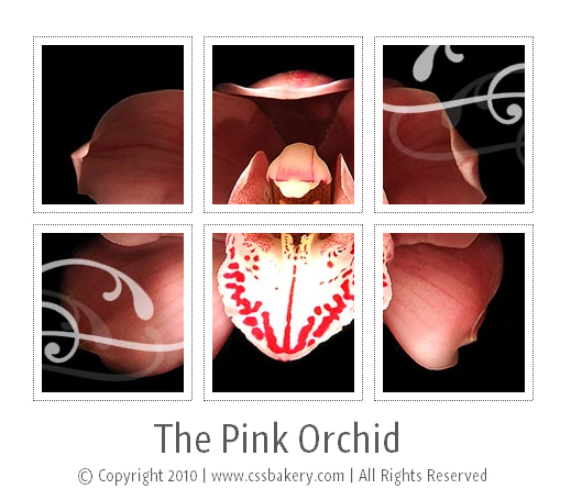
So far in this series, we have floated div's for page layout, floated images for styling a page, and floated li elements to construct a navigation menu. This time around, we are going to float small pictures to form an image grid. You are seeing a snapshot image of such a grid above. Its fully functional, interactive version lights up as you move your mouse over the images making up the grid.
STYLING THE GRID
Click here to view the HTML markup for this exercise.
We start with an unordered list named grid where we list the images that we are going to float. Each img tag will be wrapped in an "a" element which in turn will nest inside an li element. We will zero out the list-style option for ul#grid to avoid the default bullets that come with an unordered list, and give it a width of 465 pixels which is 387 pixels for three images side by side (each 129px times 3), 6 pixels for border (each 1px times 6), 42 pixels for padding (each 7px times 6), 30 pixels for margins (each 5px times 6).
ul#grid {
  padding: 0;
  list-style: none;
  margin: 20px auto 0;
  width: 465px;
  }

#grid li {
  float: left;
  padding: 0;
  margin: 0 5px 10px 5px;
  }
I have six images which I named using matrix notation. First image which is at row 1 and column 1 is named a11.jpg. It'll be the first image to float. There is no padding or top margin set by the .grid li style. Each image gets a little room on its left and right by 5 pixels and 10 pixels in its bottom.

<a> is an inline element. With .grid li a selector, I set its display property to block for a reason. At first it was still defaulting to inline, and although I did not run into any problems in Firefox and IE, one of the older browsers was not displaying everything right because of <a> being inline. Whenever you want to control the vertical padding, margin and the height of an element then you want to make it a block element since the browser ignores those properties for inline elements. If you really do need to control the height of an inline element, you can use line-height property but in general, it's better to just make it a block element.
#grid li a {
  display: block;
  }
In .grid li img selector, I draw a thin border, 7 pixel offset from each image. I made the background of the images white but you can keep it as transparent. Then, I set the grid_display div's background to a color other than white for a contrasting look. See background-color: #ffd7ce; in .grid_display class and view this working version to see how two different background colors can change the look of the grid.
#grid li img {
  background-color: white;
  padding: 7px; margin: 0;
  border: 1px dotted #58595b;
  width: 129px;
  height: 145px;
  }
It makes the page appear more interactive when there's a visual response to a hover. So when the mouse moves over a thumbnail image (small images in our case but you can choose any size image), with .grid li a:hover img selector, we will lower the opacity of the image providing a contrast to the rest of the grid and standing out. The reason for two opacity styles is because of differences in browsers. First rule is for IE, the second for Firefox.
#grid li a:hover img {
opacity:0.3; filter:alpha(opacity=30);
}
.grid_display is the div that envelopes the grid. If you don't have any title/text to add then you can choose to skip it. There are two noteworthy lines to mention in these styles. In div.grid_display h2, I have a "clear: both;" to avoid the heading climbing up next to the floated images. I also had to set text-transform to none and letter-spacing to normal in order to reset the effects of the cascade that were trickling down to us from other h2 styles. If you are trying this example in the comfort of a solitary style sheet, then you don't have to worry about the cascade. In Blogger, there are too many styles ahead of anything new that you add which will force you to both watch out for specificity of your selectors and the cascade effect.
.grid_display {
  padding: 20px;
  margin-left: auto; margin-right: auto;  margin-top:50px; margin-bottom:0;
  /*background-color: #ffd7ce;*/
  width: 513px;

  /*these two properties will be inherited by .grid_display h2 and .grid_display p */
  font-family: 'GraublauWeb', arial, serif;
  text-align: center;
  }

div.grid_display h2 {
  padding: 0; margin: 0;
  clear: both;
  font-size: 35px;
  font-weight: normal;
  color: #58595b;
  background: none;
  font-family: 'GraublauWeb', arial, serif;

  /* reset for cascade effects that are trickling down from other h2's */
  text-transform: none;
  letter-spacing: normal;
  }

.grid_display p {
  margin:0; padding: 0;
  font-size: 15px;
  color: #58595b;
  }
If you noticed, the font for the grid title and paragraph looks different than the ubiquitous Sans-Serif fonts. We include GraublauWeb web font via the @font-face directive. This doesn't work in many older browsers, but works fine in recent browsers. The .eot version is for IE, .otf for all others (i.e. Firefox, Opera, Safari, & Chrome).
@font-face {
    font-family:'GraublauWeb';
    src: url(fonts/GraublauWeb.eot);
    src: url(fonts/GraublauWeb.otf) format("opentype");
}
A VERTICAL GRID AS NAVIGATION
The same floating technique can also be used for a single column navigation menu. The only thing we need to do is set the width of a parent element to be narrow enough so that the images can no longer float side by side. As an example see this page with left hand navigation images.
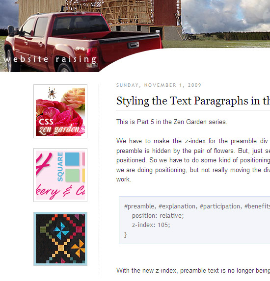
And here's the code for that page, where you can see the left-sidebar-wrapper width is set to 196px, which is too narrow to accommodate two of the 100px wide images side by side, forcing them to line up in a single column:
#left-sidebar-wrapper {
   float: left;
   width: 196px;
   padding-right: 5px;
   margin-top: 22px;
   border-right: 1px dotted #CCCCCC;
}

/* thumbnail images in sidebar */
.webnail {
  float: right;
}

.webnail a {
  height: 100px;
  width: 100px;
  margin: 0 3px 20px 10px;
  padding: 4px;
  border: 1px solid #CBCBCB;
  display: block;
}
One difference from the grid example above, is that here the hover action does not set opacity. Instead it changes the background color of the <a> link, so that a light blue border appears around the image (rather than the "lighting" effect we did earlier using opacity).
div.sectiondiv div.webnail a:hover {
  background: #a9d7e4;
}

#left-sidebar-wrapper .sectiondiv .webnail img {
  margin: 0;  padding: 0;
}
.....
Your markup will look like:
<div id='left-sidebar-wrapper'>
<div class='sectiondiv'>

<div class='webnail'><a href='elastic-design-for-css-zen-garden.html' title=''>
<img alt='CSS Zen Garden' src='images/q6g.jpg' title='CSS Zen Garden'/></a>
</div>

<div class='webnail'><a href='css-caf-tutorial.html' title=''>
<img alt='CSS Tutorials' src='images/t1.jpg' title='CSS Cafe Tutorials'/></a>
</div>

.....
MARKUP FOR THE IMAGE GRID
<div class="portfolio">
<ul id="grid">
   <li><a href="#"><img src="imagegrid_files/a11.jpg"></a></li>
   <li><a href="#"><img src="imagegrid_files/a12.jpg"></a></li>
   <li><a href="#"><img src="imagegrid_files/a13.jpg"></a></li>

   <li><a href="#"><img src="imagegrid_files/a21.jpg"></a></li>
   <li><a href="#"><img src="imagegrid_files/a22.jpg"></a></li>
   <li><a href="#"><img src="imagegrid_files/a23.jpg"></a></li>
</ul>
<h2>The Pink Orchid</h2>
<p>© Copyright 2010 | www.cssrule.com | All Rights Reserved</p>
</div>
My img tag pathnames are all relative. If you are trying to make this example work locally on your machine change the pathnames to
http://pics.cssrule.com/pics/pinkpoison/imagegrid_files/a11.jpg (and so on)
The pound signs should also be changed into valid URL's of your choice.
Click here to see the CSS for this exercise.


 Posts
Posts


10 comments:
Beautiful effect, and a great tutorial. A download of the demo would be cool too.
Works like a charm, but can you also do this with div elements instead of a list?
If you have existing markup that you do not want to change, you could do it with a series of div's. Div's and li's are both block level elements, so change the selectors to target the div's instead of the li's and it should work.
Thanks for a good tutorial. I would like to make an image grid like this, with 4 images per row (200px images inside 800px container), but the first image of the series being twice the size of the rest (400px), then have the following images populate the empty space next to the image.
I guess this practically means two different li IDs inside the ul. I'm just not sure how to do it. Any tips on how to do this?
Here's a new post that shows how to construct an image grid by floating different sized elements. Good luck :)
this one is pretty cool: http://codecanyon.net/item/auto-grid-responsive-gallery/3864088 I strongly recommend it!
Great Tutorial. Would have made more sense with the HTML at the beginning though.
Any hint for how to add another image to each of the rows in the grid? i'm new and i want 4 across but can't seem to make it work. I've been working on it ALL day and yours is the first image grid I can make work properly, but it just needs one more on each row.
Thanks!
Re: HTML at the beginning
Thank you for your comment and suggestion. I updated the post with an advance link to the markup.
Hi Ash, It's very easy. Everything's based on the total width. In this example the width is 465 pixels. If I wanted another column, I'd increase the width by 155 making it 620 pixels which would add enough space for one image width (129), left plus right padding (14), left plus right margin (10) and two pixels for the border. That's the CSS change.
For each new image, you are going to add a new li element to the markup meaning your HTML. These li's are part of your ul#grid element.
Try it first on the interactive version of the example. Bring up Firebug and increase ul width to 620 just to see what it'll do. You'll see that the first image in the second row will float up to the first row giving you a fourth column.
Post a Comment
Note: Only a member of this blog may post a comment.