


I had to create a set of round images recently. The images were permanent and not going to change anytime soon so I easily could have used Photoshop to make the rounds and be done with them. But what this project made me think of is a more flexible way of producing the round images via the use of pre-made masks and CSS without ever having to go into image editing when you are given new images to "round". The using of masks also ensures precise cutouts - any of you who have spent time squinting and trying to match things up just right in Photoshop know what I'm talking about.
Unlike my project, some sites are actually having to make new "rounds" as their content changes and they get new images. The technique that I am going to describe will benefit you enormously if your site relies on changing content that requires you to shape-process images before you can post them on your site.
This tutorial is great for going over the CSS background property, relative and absolute positioning techniques. First thing we do is to create the mask that you are going to use on your images. For this tutorial I want a mask with round holes but you could draw anything that you want, including even stars. I used a white layer since my blog's background is white which is probably going to be the case for many of you. The mask color has to match your site background color to appear seamless.
In Photoshop, Switch from the rectangular marquee tool to elliptical marque tool (Marquee tool is the first tool in the toolbox in upper left corner). Photoshop elliptical marquee tool turns into a perfect circle if you press the SHIFT key while drawing your shape. Once you get the right amount of radius that you are after, press the delete key to make your circular cutout. Then I repeated the same step two more times to make a mask with three holes in it.
Constructing templates in Photoshop:
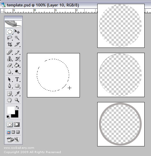
If you wish, you can add a drop shadow using Layer Style/Drop Shadow option (2nd example above). Alternatively to make a colored ring around your cutout, draw out your circle, fill in with the rim color that you'd like (Paint Bucket tool), choose Select > Modify > Contract and enter a value like 3 or 4 pixels, your selection will shrink and fall inside the color filled circle, Press the DEL key to get the "core" out of there and you will have a cutout with a rim color around it (3rd example above). I made three different versions for my masks and named the first one that I'm going to use in the tutorial "mask.png".
Now you can write the CSS and HTML needed to make this all work. I will first step through an easier way to do this exercise and then do the same thing using a more sophisticated approach with CSS positioning.
I'm to produce a three color round sampler bank using the colors pink, green and blue. I have a div named "swatch" which is given the same dimensions of my image files, 150 pixel high and 500 pixel wide. I set a 30 pixel all-around margin for the div element and made the three color sample image the background of my "swatch" div. As you can see in the HTML, I specify the kind of mask that I'm going to use from the markup. Personally I would have preferred that the masks were in the style sheet and the files to be processed came from the markup but that is not possible given the syntax of CSS and the approach I'm using. My background property has a "no-repeat" value because I already have a three hole mask that I'm going to use only once.
So the mechanics of this method is simple, You have a div with known dimensions and with a tri-color swatch as its background image on to which you overlay a white cutout mask of your choice. Here is the code and results:
The background image for the "swatch" div:

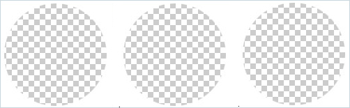
The three hole template "mask.png" does not have a border in the image; I framed it with a light blue border for the tutorial to show where the image begins and ends:
<div class="swatch">
<img src="../images/mask.png" alt=" " title="mask" />
</div>
.swatch {
height: 150px;
width: 500px;
background: url(http://pics.cssrule.com/pics/color-swatch-3.gif) no-repeat 0 0;
margin:30px;
}
div.swatch img { margin:0; padding: 0; }
The output:

Same exercise using a mask with built-in drop shadows:
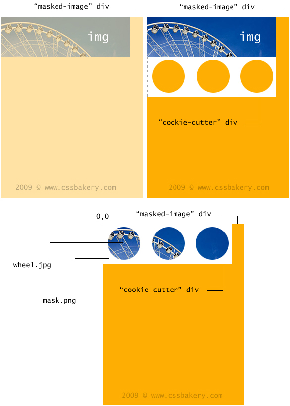
In this section, I'm going to describe another method to produce the same results. There are some important differences like how the masking file is now permanently in my style sheet and the image that's going to be "cutout" is specified in the markup which is the exact opposite of what we did in the previous example.
My masking image "mask.png" is the background image of "cookie-cutter" div. Since this div has nothing in it in the markup, it is imperative that we give it height and width in the CSS which I have done.

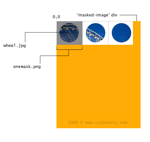
<div class="masked-image">
<img src="../images/wheel.jpg" alt=" " title=" " />
<div class="cookie-cutter">
</div>
</div>

.masked-image {
position: relative;
width: 500px;
}

.cookie-cutter {
position: absolute;
left:0; top:0;
width: 500px; height: 150px;
background: url(../images/mask.png) no-repeat;
}
The img element is contained within "masked-image" div and positioned at the top left corner and even though it's an inline element there's not enough room for the next div to fit next to it so the "cookie-cutter" div is placed underneath the first div. What we are seeing in the third drawing is the effect of absolute positioning the "cookie-cutter" div with respect to "masked-image" div. The offsets are (0,0) which means that the second div "cookie-cutter" is placed on top of the first div "masked-image" producing the round cutouts.
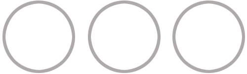
The output:
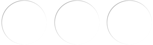
This is a variation of the last example. Notice we used a mask that has three holes punched out of it. We can make the programming more flexible by using a single hole mask and repeating it along the horizontal (x-axis) taking advantage of the CSS background-repeat property. Only one line of code changes which is the background rule in the CSS. We also use a new masking file named "onemask.png" which comes with a light grey rimmed round window for a different look.
background: url(../images/onemask.png) repeat-x;
The output:


 Posts
Posts


6 comments:
CSS is always providing a nice result and one of example we see in this tutorial as well.The new masking file which you used in this that an additional information for me which i haven't know about this. Thanks for sharing.
The technique of css masking is useful, especially for me converting complex graphic designs to web while allowing for greater flexibility for future image changing.
Thanks for the article.
nice result, good technique of css masking.
thanks
This doesn't work. Using Mozilla FF 9.0.1 and does not show mask at all.
Hi, I will test it on FF9 when I get a chance but it's very possible that it's not working due to something that you are doing wrong. I wrote a newer how-to post where I explain how to use the class that may be helpful. Thanks for the feedback :-)
Hi again, I tested the code that you are having trouble with on Firefox@10.0.1 and everything runs as it should. If all's fine on v10, it'll definitely be Ok under v9 since my original version was written on a much older version than either 9 or 10.
The example test is actually built into the post; you just click a link called resulting image which will reveal the masked image. To look at the html/css behind the technique, right click on your browser window and choose "View Page Source". You can view the masking here and the masked image here. Good luck! :)
Post a Comment
Note: Only a member of this blog may post a comment.