.filler {
    padding-left:20px;
    height:448px;
    width:500px;
    float:left;
}

.filler-mask {
    background: url('images/filler-mask.png') repeat;
    position: absolute;
    left:0; top:0;
    height: 448px;
    width: 500px;
}

.filler-picture {
    z-index: 0;
    background: url('http://pics.cssrule.com/pics/cubic2.jpg') no-repeat;
    position: relative;
    height: 448px;
    width: 500px;
    display: block;
}
...
<div class="filler">
    <div class="filler-picture">
        <img src="http://pics.cssrule.com/pics/cubic2.jpg" alt="test" />
        <div class="filler-mask"> </div>
    </div>
</div>
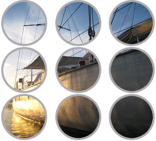
I used a circular "cookie cutter" mask over an image of a boat:

Next I decided to re-write the example a bit and see if I could streamline the code some:
* { margin:0; padding:0; }

.framed, .framed img {
  width:500px;
  height:448px;
  }

.picture {
  position: relative;
  }

.mask {
  background: url('images/filler-mask.png') repeat;
  position: absolute;
  left:0; top:0;
  }
...
<div class="framed">
    <div class="framed picture">
        <img src="http://pics.cssrule.com/pics/cubic2.jpg" alt="test" />
        <div class="framed mask"> </div>
    </div>
</div>
Only the class names have been changed in the markup, and now the CSS is considerably shorter. The resulting image is the same.
What this technique really boils down to is using the png mask image as a background on a div, and then displaying that div directly over the top of the photo we want to make the cuts from. We do that using absolute positioning, making sure that we have a parent div that provides a positioning context.


11 comments:
Hi, thanks for the tutorial. So what Im trying to do is somewhat similar. I have some background image set using the img tag as above. As for the masking div element, I have an ul element consisting of multiple li elements. So the goal here is to get the background image/bounding boxes of the li elements to be parts of the image from the img tag. Any thoughts?
Kid, I'm a little confused by your last sentence. Do you want parts of the image to only show up in the backgrounds of the li elements or do the li elements obscure/hide parts of the image?
Thanks for the reply, I would like the first option - parts of the image to only show up in the backgrounds of the li elements
See if these examples help. To see the code behind the page, click the right mouse button and choose "view page source" from the menu. The red numbers and the grid borders are there to show you how the code works. I used a smaller cutout with a built-in shadow. Good luck :)
Thanks a lot of the examples, they're great. So this method would work perfect for li elements that are lined up "nicely." I am now wondering how to deal with crazier arrangements of the li elements if we want to play with the design a little: say a diagonal arrangement where only the li bounding boxes have the background.
I have a diagonal menu post. If that's the kind of look you are after, you could adapt it to include the cutouts.
Hi
Not true masking this - more of a frame than a mask and I think you should note this in the article. This method is dependent on the png mask opaque colour matching the bg colour. E.g. this wont work if you're masking against a patterned bg - your png mask opaque area would have to include the pattern and then when placing on page you would have to try to align perfectly to background pattern to remove seam. Total PITA and maintenance nightmare.
Not sure what you mean by "true" masking. Mask is defined as covering or partially covering to conceal what's behind, which is what we are doing here in the context of CSS - hiding parts of the boat. The code will work for every case. So long as the surrounding area is a solid color, it's just a matter of simple Photoshop steps to produce a mask that matches that color.
My goal was to demonstrate a CSS technique and I assume that you have enough image editing skills to apply it to your situation (color and the shape of the mask). I used white because that's the most common background color on the web. I wouldn't recommend this technique for a background such as this. Use tools that best fit your situation.
For creating hollow Photoshop shapes with your background color, see the video at the end of this post
unfortunately, it is just an image of a boat underneath a transparent image. you cant actually click the image of the boat because the transparent image is in the way. cool trick but this wont work for what im trying to do. i need the element to be clickable.
ah ha! i found a work-around... i needed the layer underneath (in this case, the "boat" image) to be draggable. so i added a transparent layer ontop of everything and linked the movements of that layer with the boat layer (using jquery ui draggable). so when the user drags the transparent layer, it drags the boat layer too. the user gets the feeling that they are actually dragging the boat layer. it works perfectly! i really wish IE would support -webkit-mask-image but oh well.
Elacdude, Thanks for sharing, That's an interesting approach.
Post a Comment
Note: Only a member of this blog may post a comment.