


Iwas reading an article in a magazine the other day where they had a large, bold, Arial type plain Sans Serif capital letter replace the first letter of the paragraph. This simple change added style and focus to the document. I had seen dropcaps before of course, including those intricate looking ones drawn in gold and ready to make a grand entrance, but this was the first time that a dropcap had grabbed my attention and piqued my interest. Ever since then, I've been working in Photoshop to come up with some unique dropcaps like the one that I used in this paragraph.
As I show you how I built the drop cap classes, you will become more familiar with CSS Sprites, attribute selectors, text indentation, floats, CSS background property and how backgrounds interact with padding. You will see that floats in CSS serve more than one purpose and are not just for building multi-column layouts.
NO EFFORT DROPCAPS
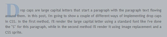
Drop caps are large letters with a bit of dramatic flair that start a paragraph with the paragraph text flowing around them. They are enlarged enough to drop two or more lines, where the top of the letter lines up or comes pretty close to lining up with the top of the paragraph. In this post, I'm going to show a couple of different ways of implementing drop caps in CSS. In the first method, I'll let the browser render the large capital letter using a standard font like I've done the "D" for this paragraph, while in the second method I'll render it using image replacement and CSS sprites.So, first let's look at the method where we have the browser render the first letter using a standard font. Here's the markup for the first sentence of the paragraph above:
<p><span class="dropcap">D</span>rop caps are large letters...</p>
And here's the CSS to style it:
.dropcap {
font-size: 600%;
float: left;
line-height: 0.8em;
padding: 0 2px 0 0;
color: #c7dffb;
font-family: Serif;
font-weight: bold;
position: relative;
left: -3px;
}
The key ideas here are: Make it big, Float it left, Adjust the whitespace, and Adjust the font.
In this case I set the font size to 600%. You may want to adjust that depending on your font size and line height. Next I float it to the left so that the other text will flow around it. If you just do those two steps, you'll find that the whitespace around the character doesn't look right. The Dropcap sticks halfway out, there's no vertical white space below it, and not enough horizontal space between it and the other text.
To remedy the vertical problem, I set the line-height to 0.8em. To solve the horizontal space problem, I add 2px of right padding.
The Dropcap can also be nudged to the left some to line it up with the paragraph body. To do that, I gave it a -3 pixel relative positioning which will move the dropcap three pixels to the left from where the browser will have normally placed it. At this point, it's looking pretty good. What's remaining is to set a color, and choose a font. I chose bold Serif in light blue to match the blog's color palette. The advantages of this method are its simplicity and the ability to enlarge the dropcap along with changing text size...i.e. when user chooses larger text by pressing CTRL key and moving the mouse wheel forward simultaneously.
USING IMAGE REPLACEMENT AND CSS SPRITES
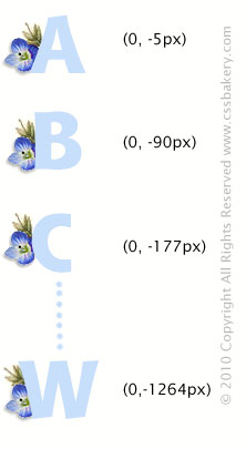
Now lets turn our attention to a second method. The main advantage of image replacement is that we get complete control over the font for the drop cap, and don't depend on what fonts are installed on the user's computer. It's a bit more work, but if you want to use some really fancy or rare font, it's a reasonable way to go. Other methods would be to use Flash (Sifr) or Javascript (Cufon) to render the font.So, the basic idea is to do an image replacement of the first letter of the paragraph, using a CSS Sprite, and float it to the left, so that the remaining paragraph text flows around it. The main thing we need for this is an image that contains all the letters of the alphabet. We'll use the CSS Sprite technique to use just the portion of that image that contains the character we need. The markup will be slightly different:
<p><span class="dropcap_t">T</span>his is an example of using a drop cap.</p>
Note that the only difference is that the class is now dropcap_s instead of dropcap. That's because with this technique we need a unique class for every character. That class name will allow us to pick the correct offset into the sprite image. Here's the CSS (for a subset of the characters):
.dropcap_c, .dropcap_s, .dropcap_t, .dropcap_w {
font-size: 1px;
text-indent: -9999px !important;
color: #FFFFFF;

background: transparent url(images/capital_arial2.png) no-repeat scroll 0 0;
width:  36px;
height: 40px;
float:  left;
}

.dropcap_c { background-position:0 -112px; }
.dropcap_s { background-position:0 -1034px; }
.dropcap_t { background-position:0 -1092px; }
.dropcap_w { background-position:0 -1264px; width: 50px; }The main ideas here are: Hide the original character, Show the part of the image that corresponds to that character, and Float it left. To hide the character, we set the font size to 1px and shift it way off to the left using text-indent. We also make the font color white for good measure. We then set the background to point to the image file. We set the height and width of a single character image, and finally, float it left.
The last thing we need to do is set the correct background-position offset so that the correct character gets rendered. For this, we have a rule per character, to provide that offset value. In some cases where the character is wider or taller than usual, we also use this rule to override the default width and/or height(see the .dropcap_w rule above).
I didn't show offsets for all characters here, but you get the idea. Here's a look at another file I worked on with some of the offsets marked.
LETTER ON A SQUARE PLATE
Ct first, you think, once you figure out the approximate distance between two consecutive characters, the rest of the offsets can be calculated easily and quickly. I'm sorry to say that assumption does not hold. I had to labor to get each letter plucked out of the sprite file. This was the case both with plain fonts like Arial and with what I call "temperamental" fonts, those fonts with extra hooks, flourishes, "trains" and what have you. By the time I had my epiphany, I had already gone through a few sets of different fonts burning the midnight oil.
Then with relief came this letter on a square plate style font that you see at the beginning of the paragraph above where each letter occupies exactly the same width and height in the image file. Every character is 100 by 100 pixels and if you add 150 pixels (the height of one letter plus any space between two letters, 50 pixels in my case) to your offset, you arrive at the next character without a hitch. Whoever invented this style of font, I couldn't thank you enough.
The CSS is nearly identical with the exception of a few numbers and of course offsets. The extra nine pixels for the width (width is set to 109) are there to give the dropcap some breathing room from the text that wraps around it. The background offsets are all 150 pixels apart and there was no need to overwrite the widths or heights set in the initial selector since every letter is exactly the same size.
Ihave a top margin of 4 pixels in order to push the square plate down and make it even with the top of the paragraph. However, once that's done, the vertical space in the bottom gets tighter. You can open up some space by also introducing a bottom margin. Based on your line-height and text font size, this may cause your paragraph text to skip a line which is what happened in my case. So I let go of the bottom margin idea because overall, I am pleased with the way the dropcap looks.
.dropcap_ag, .dropcap_bg, .dropcap_cg, .dropcap_dg, .dropcap_eg, .... {
background:  transparent url(images/gothic.jpg) no-repeat scroll 0 0;
color:#FFFFFF;
float:left;
font-size:1px;
margin-top: 4px;
text-indent:-9999px !important;
width: 109px;
height:100px;
}

.dropcap_ag { background-position:0 0 }
.dropcap_bg { background-position:0 -150px; }
.dropcap_cg { background-position:0 -300px; }
.dropcap_dg { background-position:0 -450px; }
......Xerox, a trademark for photocopying process or machine using this process, Xenon, a colorless, odorless inert gas found in minute quantities in the atmosphere, X-axis, the horizontal axis of a two-dimensional Cartesian coordinate system are some of the very few x letter words that we have in the English language. This X dropcap is a variation of the font with the roses. It uses the same background and lettering but is painted with a different motif, making it look more masculine for those who are not crazy about flowers. There's really many other unique design ideas that you can come up with for dropcaps - including one drawn by hand, scanned and used as a background under a favorite font.
FLOAT-FREE AND SPRITE-FREE STYLIZING
Don't like floats that much? There's another way to stylize first letter of a paragraph without using floats or even a sprite file. Of course, when we forgo a sprite file, we are committing to make an individual bitmap for every letter in the alphabet. Christopher Schmitt in CSS Cookbook uses a similar technique for his paragraph "initials" (See Section 3.15). Initials, as he calls them are different from dropcaps in that they do not "drop". Instead they extend above the top of the paragraph.
The markup is going to have a p element with multiple classes. One of the classes will be called stylized_olho followed by a dash and the letter of the alphabet that you want enlarged. We'll discuss the details of the second class hidefirst a little later. For the letter w, you would write:
<p class= "stylized_olho-w  hidefirst" >Welcome to the conversion tool. This utility will allow
you to include your HTML code without the angle brackets causing problems. Your HTML
code will appear as HTML statements instead of being intepreted by the browser. ..</p>
As you'll recall, you can assign more than one class to an element by placing spaces between the class names. Let's take a look at the CSS for the first class, stylized_olho- followed by any one letter.
Keeping in mind that we are writing these rules for an 82 pixel high, 125 pixel wide bitmap, we are going to push the text to the right and down some in order to make space for the enlarged initial. Since only a few of the letters like W or N actually span the entire 125 pixel width, I chose 86 pixels for text-indent which will be sufficient for most of the letters. Some of the letters are even narrower so they need less space which we will adjust individually later. The text-indent will push the paragraph 86 pixels to the right. That will clear the horizontal space needed to place our large letter.
For the vertical space, we are going to take advantage of top padding. Since each letter bitmap is 82 pixels, you may be inclined to assign that number to the top padding but since we just pushed text to the right, we actually need borrow less space from top padding. 60 pixels seem to do the trick there.
/*attribute selector
|= means that it'll match first part of an attribute value
that equals the word following |= up until the first dash

this selector will match any p element that has a class attribute
that starts with "stylized_olho" followed by a dash.

we are taking this shortcut in order to avoid  .stylized_olho-a,
.stylized_olho-b, .stylized_olho-c type repeat selectors

not supported in IE6.
*/

p[class|=stylized_olho] {
text-indent: 86px;
padding-top: 60px;
}
p.stylized_olho-a { background: url(images/ao.png) no-repeat;
text-indent: 88px;}

p.stylized_olho-c { background: url(images/co.png) no-repeat;
text-indent: 80px;}

p.stylized_olho-d { background: url(images/do.png) no-repeat; }

p.stylized_olho-i { background: url(images/io.png) no-repeat;
text-indent: 70px;}

p.stylized_olho-l { background: url(images/lo.png) no-repeat; }

p.stylized_olho-m { background: url(images/mo.png) no-repeat;
text-indent: 90px;}
I know I had promised you a world of no floats at the beginning of this section. But this is a minor and pretty easy use of the float property and one that cannot be avoided if we want to keep our markup uncluttered. Notice that in our XHTML, we do not have spans, all we have is a p element which encloses the paragraph so the job to both print the stylized large initial and also to remove the unstyled first letter of the paragraph is left upto the p element. Our markup once again:
<p class= "stylized_olho-w hidefirst" >Welcome to the conversion tool. This utility ...</p>
p.hidefirst:first-letter { float:left; }
The "B" is floated however it's still showing up so let's try giving it a small negative margin and see what happens.
p.hidefirst:first-letter { float:left; margin-left: -4px; }
Increase the negative margin to hide the first letter and also print it in white just in case. You will never see "B" again. I've sprinkled a few of Olho handwritten ink font throughout this section to show what we've done.
p.hidefirst:first-letter { float:left; margin-left: -999px; color: white;}Finally, here's a short comparison of how the markup changes for the two different classes we've talked about in this post. Happy Dropcapping ! (if that's a word):
<p><span class="dropcap_t">T</span>his is an example of using a drop cap.</p>

vs.

<p class= "stylized_olho-t  hidefirst" > ..</p>This is an example of using a drop cap.
PS. A new post on dropcaps using CSS circles. No bitmaps necessary!
PS2. A basic dropcap


 Posts
Posts


5 comments:
That really is amazing how you have worked out the details and techniques to create a nice looking drop cap text.
You certainly make it easy or at least sound easy for something which few folks would ever take the time for figure out to any great degree.
Thanks again.
This is one of the most awesome clever tricks I've yet seen. I love the long series of letters used by offsets. Plus the letters themselves are very cool.
Thank you!
TheAngel . com
Thank you so much! This helped me out so much!
Amber, Thanks :)
Sorry Lassar, I accidentally deleted your comment. You are welcome to send it in again if you'd like.
Post a Comment
Note: Only a member of this blog may post a comment.