Sed tempus adipiscing eleifend. Aenean aliquam nibh quis enim varius cursus. Cras ut neque eget eros mattis volutpat. Nulla et pretium massa. Suspendisse potenti. Nam id quam mauris. Lorem ipsum dolor sit amet, consectetur adipiscing elit. Sed sodales, leo dictum tempor auctor, nulla urna commodo lacus, eget vehicula nulla neque mollis velit. Quisque lobortis feugiat pharetra. Vivamus id nibh facilisis, dictum dolor quis, mattis tellus.
We have styled drop caps before. Another short post here. This is an easier and faster way of styling them using CSS3 and Typekit fonts.
The CSS:
.circle_dropcap {
    color: white;
    background-color: #338FD1;
    font-family: "p22-fllw-eaglefeather";
    font-weight: bold;
    font-size: 340%;
    display: block;
    float: left;
    border-radius: 50%;
    height: 1.4em;
    width: 1.4em;
    text-align: center;
    line-height: 1.5em; /* was 1.4em */
    margin-right: 7px;
    margin-top: 4px;
    box-shadow: 1px 1px 2px 0 #828282;
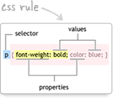
The first 5 lines are just setting the colors and font we want to use:
color: white;
    background-color: #338FD1;
    font-family: "p22-fllw-eaglefeather";
    font-weight: bold;
    font-size: 340%;
We then turn the span into a block element so that we can size it using width and height, and use margins and padding as we please. When an element is inline width and height are ignored as well as vertical margins and padding. Next we float the new block element left so that the remaining text will flow around it.
Since we want to show a circle, we set border radius to 50%. That means each corner of the block element will make an arc that is one half the width and height of the block element. The result is a circle.
We next set the width and height using em's so that the circle will scale according to the font size used. Make the font larger, and the circle will grow with it.
Now we want to make sure the letter is centered both horizontally and vertically within the circle. We can take care of the horizontal centering with text-align: center. For the vertical centering we just set the line height equal to the height of our circle. (We could also tweak this a bit by setting vertical-align).
To put some space between the circle and the text to the right of it, we set a right margin.
To move the circle down a bit, we set a top margin.
And finally, we want a little drop shadow from the circle, so we set the box-shadow property.
Here's the CSS for the square drop cap:
.square2_dropcap {
    border-radius:4px;
    color: white;
    font-family: "museo";
    font-weight: bold;
    font-size: 340%;
    display: block;
    float: left;
    box-shadow: 2px 2px 2px 0 #828282;
    height: 1.2em;
    width: 1.2em;
    text-align: center;
    line-height: 1.18em;
    margin-right: 8px;
    margin-top: 8px;
    background-color:#c342da;
    }
























Post a Comment
Note: Only a member of this blog may post a comment.