


CSS Scrolling Tables is a big topic. Lots of people have asked questions about how to keep the headings fixed, but are not always finding good answers. It took me one day (Saturday) to figure out the problem and part of today (Sunday) to write this post. I'm working on a project where I needed a scrolling table with fixed headings. That's where the table headings stay fixed in place, and you can scroll the data portion of the table. I tried a couple of things that didn't work, then resorted to a quick Google search that landed me at Stu Nicholls' CSSPlay site where he has a post on CSS Scrolling Tables.
Stu's solution is very clean compared to some others I found, however it didn't handle the very complex table I was dealing with. It does work fine when the data in each column of the table are close to the same width, but my table has one column where there is text that varies from a few words to a lengthy paragraph. To make things even worse, there are occasional cases in my data where a column will have a LongUnbrokenStringThatJustKeepsGoing. Those long strings create havoc in tables (and in my blog's text) as the browser tries to adjust column widths to accommodate the longest string it sees.
That combination of long paragraph data, and long unbroken strings broke Stu's solution.
The problem is that with variable length data in the cells, the browser ends up adjusting the width of the data cells based on content, but does not adjust the width of the fixed heading cells. So you end up with the column heading cells having different widths than the data cells, and they do not align. The frustrating thing is that if you allow the headings to scroll along with the data, then the browser will adjust the heading widths and all is well. But as soon as you start keeping the headings fixed, they no longer align.
I tried a few things to fix it.
First I set table-layout to fixed, thinking that would cause the Browser to use fixed cell width, which would be the same for headings and data cells. Didn't work.
Next, I allowed the Browser to load the whole page with the headings allowed to scroll (not fixed), then using Javascript I set the headings to be fixed. I was thinking, 'Well, I'll let the Browser figure out all the right widths for the headings, then sneak in with Javascript and tell it to not scroll them'. No luck! As soon as the Javascript ran, the headings no longer aligned with the data cells.
Then, I decided to give every column a class name, on both the heading and data cells, and use CSS to set the width explicitly on each column, like .col1 { width: 6em; }. Same result! The headings still didn't align with the data.
A little research revealed that when it comes to Tables, Browsers take your width statements as "suggestions" rather than as "commands". They'll try to accommodate you, but if there's some long string in a table cell, they can decide on a different width.
At this point I was about ready to ditch the table markup completely and just render it all with div's. I even coded it up, and quickly discovered that I could make fixed headings and data rows align correctly, but there was one thing that wasn't working. HTML tables do have the benefit that they render all the cells in a row with the same height. That wasn't true in my div-based markup. I had rows with cells of varying height, and that made it difficult to use borders to render a nice grid for the table.
For a second I thought about a way to make my div-based tables work using Javascript, but then another idea struck me: Go back to using table markup, but in each heading and data cell, put in an extra div to wrap the content, and give those divs explicit widths via CSS. Amazingly, this worked. I just wished I had thought of it sooner.
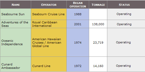
AN EXAMPLE: CRUISE SHIPS
I have linked to a series of self contained example files that illustrate various problems, and the ultimate solution. (note: the table data is a subset of the table in this Wikipedia article):
tableTest0 - This file contains just the initial table markup, and some minimal styling. This is what the table would look like with no scrolling.
tableTest1 - In this file we start having the table scroll. But notice that the headings scroll as well. What we're going for is to have the headings stay fixed, and only have the data portion of the table scroll.
tableTest2 - Here, we've got the headings fixed in place, but they are the wrong widths. The Browser is treating them like a separate table with respect to calculating their widths.
tableTest3 - In this file we change the markup to add a class on every table cell (both heading and data cells). We then apply widths to each cell class. At first this seems to work, but it's actually got a problem. As soon as you introduce one of those LongStringsWithNoSpaces, then this solution breaks. This is shown in tableTest4.
In tableTest5 we solve the problem by changing the markup to put div's in all the table cells, and those div's are all given widths. Below we'll take a closer look at the details of this solution.
tableTest6 is the final result after I applied some additional tweaks to improve the appearance of the table. These tweaks are described later in the post.
THE SOLUTION MARKUP & CSS
Here is the markup for the tableTest5 solution (this is prior to the tweaks applied in the next section of this post):
<div class="scrollableContainer">
  <div class="scrollingArea">
   <table class="cruises scrollable">
     <thead>
     <tr>
         <th><div class="name">Name</div></th>
         <th><div class="operator">Operator</div></th>
         <th><div class="began">Began operation</div></th>
         <th><div class="tonnage">Tonnage</div></th>
         <th><div class="status">Status</div></th>
     </tr>
    </thead>
    <tbody>
      <tr>
          <td><div class="name">Name of ship</div></td>
          <td><div class="operator">Who operates</div></td>
          <td><div class="began">Began service when</div></td>
          <td><div class="tonnage">How big</div></td>
          <td><div class="status">Current status</div></td>
        </tr>
       ... more rows ...
      </tbody>
   </table>
 </div>
</div>
One thing you'll notice is I've wrapped the table in two DIVs. The outer div holds the whole thing and has some padding at the top that will be used for rendering the fixed headings (we'll absolutely position the headings over the top padding). The inner div defines the area that will scroll. The key to producing the scrolling area is giving this div a height and setting the overflow property to 'auto'.
The other change in the markup is that I've wrapped the contents of each cell (both th's and td's) with divs, and given those divs class names that correspond to the name of the column. I hesitated in putting in this extra markup, tried several ways to avoid it, but in the end I found it absolutely necessary in order to take control of the column widths. Without it you end up with cases like my 4th example file: tableTest4. In fact the only difference between this example and the final solution (tableTest5) was the addition of the divs wrapping the cell contents.
Here's the CSS of the solution presented in the tableTest5 example. This is prior to the various tweaks we apply in the next section to improve the appearance of the table (to see the final code do a "view source" on tableTest6, or follow the individual changes described in the next section.):
* { padding: 0; margin: 0; }
  table.cruises {
    font-family: verdana, arial, helvetica, sans-serif;
    font-size: 11px;
    cellspacing: 0;
    border-collapse: collapse;
    width: 535px;
    }
  table.cruises th, table.cruises td {
    border-right: 1px solid #999;
    border-bottom: 1px solid #999;
    }
  table.cruises th { background: #aab; }
  table.cruises td { background: #eee; }

  div.scrollableContainer {
    position: relative;
    width: 552px;
    padding-top: 1.7em;
    margin: 40px;
    border: 1px solid #999;
    background: #aab;
    }
  div.scrollingArea {
    height: 240px;
    overflow: auto;
    }

  table.scrollable thead tr {
    left: 0; top: 0;
    position: absolute;
    }

  table.cruises .name     { width: 108px; }
  table.cruises .operator { width: 126px; }
  table.cruises .began    { width: 76px; text-align:center; }
  table.cruises .tonnage  { width: 60px; text-align:center; }
  table.cruises .status   { width: 160px; }
Let's break down the CSS one part at a time. This first part is really just styling the table, and is not directly involved in the scrolling aspects of the design:
table.cruises {
    font-family: verdana, arial, helvetica, sans-serif;
    font-size: 11px;
    cellspacing: 0;
    border-collapse: collapse;
    width: 535px;
    }
  table.cruises th, table.cruises td {
    border-right: 1px solid #999;
    border-bottom: 1px solid #999;
    }
  table.cruises th { background: #aab; }
  table.cruises td { background: #eee; }
In the next part we style the two wrapper div's that I mentioned earlier. The outer container is set to position: relative so it becomes the positioning context for all elements under it. We also add some padding at the top of this div. That padding area is the place where we will position the column headings (using absolute positioning, explained below). We also set the width to 552px. This has to be wide enough to accommodate both the table and the vertical scroll bar. You'll probably want to tweak your width to get things just right. The only other thing we do with this div is set it's border and background to match the colors we are using with the table.
In the inner div, all we need to do is set the height of the scrolling area and set overflow to auto. This creates the scrolling area of the table.
div.scrollableContainer {
    position: relative;
    width: 552px;
    padding-top: 1.7em;
    margin: 40px;
    border: 1px solid #999;
    background: #aab;
    }
  div.scrollingArea {
    height: 240px;
    overflow: auto;
    }
In the final part of the CSS, we first setup the absolute positioning of the column headings. We just put them as 0,0 of the positioning context, which is the outer div (class='scrollableContainer'). So, what we're doing here is positioning the column headings over the top of the padding we had created in that outer div.
The only other thing we need to do is set the widths of each column. You need to adjust these widths for the final presentation of the table. You want the last column to end just before the vertical scroll bar, but don't make the table too wide or you'll get a horizontal scroll bar. In my case the column widths add up to 530px. The total width of the outer div is 552px. The difference of 22px is taken up by the vertical scroll bar. If you want to center any columns, you can do that here too, as I do with the 'began' and 'tonnage' columns.
table.scrollable thead tr {
    left: 0; top: 0;
    position: absolute;
    }

  table.cruises .name     { width: 108px; }
  table.cruises .operator { width: 126px; }
  table.cruises .began    { width: 76px; text-align:center; }
  table.cruises .tonnage  { width: 60px; text-align:center; }
  table.cruises .status   { width: 160px; }
ADDITIONAL TWEAKS
Hiding Cell Overflow
After a few final tweaks, here is my final example.If you looked at each of the examples I linked to above, one thing you might have noticed in tableTest5 is that the text in the 2nd column of the 9th row overflows into the next cell. Since we are taking full control of the column widths, and no longer allowing the Browser to determine widths based on LongStringsWithNoSpaces, then we also have to be responsible for making sure our column widths are wide enough.
If you have just a few cells that overflow and you don't want to make the whole column wider just for them, you have two choices: (1) Let them overflow into the next cell, or (2) truncate them. You can truncate them by setting overflow: hidden on the table cells. Adding that to the CSS of my example, would look like this:
table.cruises td { background: #eee; overflow: hidden; }
Fixing Scroll Bar Interaction
Another issue I found is that putting the cell borders on the right, as I have done, is causing some strange interaction with the scroll bar in some browsers, leaving artifacts while scrolling. The solution is to move the cell borders to the left and bottom, instead of right and bottom, like this:table.cruises th, table.cruises td {
border-left: 1px solid #999;
border-bottom: 1px solid #999;
}
But then you'll notice that the headings are mis-aligned by one pixel. The reason for this is that we absolutely positioned the headers at 0,0 - which worked fine when there was no left border. But adding the left border shifted the headers over by one pixel. The solution for this is easy: just absolutely position at -1,0 instead:table.scrollable thead tr {
left: -1px; top: 0;
position: absolute;
}
Colored Columns
Next, I wanted to do something different, and give the columns different colors. To do this I decided to change the markup a bit by moving the class names off of the divs in each cell, up to the enclosing td or th. Like this:<tr>
<th class="name"><div>Name</div></th>
<th class="operator"><div>Operator</div></th>
...
<tr>
<td class="name"><div>Queen Elizabeth</div></td>
<td class="operator"><div>Cunard Line</div></td>
...
That markup change requires adjusting the CSS selectors for each column to target the divs, using descendant selectors:table.cruises .name div { width: 108px; }
table.cruises .operator div { width: 126px; }
table.cruises .began div { width: 76px; text-align:center; }
table.cruises .tonnage div { width: 60px; text-align:center; }
table.cruises .status div { width: 160px; }
Now, with that markup change in place, I can now set the colors of the various columns, like this:
table.cruises td.operator { background: #ebcb4d; }
  table.cruises td.tonnage  { background: white; }
  table.cruises td.name     { background: #C7E0C1; }
  table.cruises td.began    { background: #B7C3E8; }
Adding Padding
The next tweak is to add some padding in all the cells:table.cruises th, table.cruises td {
...
padding: 2px 4px;
}
That padding makes the table wider, so we also adjust the width of the outer div up to 592px (this avoids the horizontal scroll bar):div.scrollableContainer {
position: relative;
width: 592px;
...
Styling the Headings
Finally we'll change the headings to different color and background, and set them to render in "small-caps". We also change the color of the scrollableContainer div to match the new color of the heading backgrounds:table.cruises th {
background: #6b6164;
color: white;
font-variant: small-caps;
}
div.scrollableContainer {
...
background: #6b6164;
}
The screenshot of the table does not show the scroll bar on the right. Once again final working version with a scrollbar can be seen here. Do a "view source" to see the final CSS and Markup.
LARGER SCREEN, LARGER TABLE
Say you want the table to default to being fairly short (for people on netbooks or small monitors), but increase the height if the user is on a larger monitor with a large browser window.
That's not hard to do using Javascript. The following code uses the jQuery Javascript library.
First it pulls in jQuery hosted on Google's servers. When the document is loaded, the script sets the height of the scrollingArea div to be 100 px less than the Browser window height. You may need to subtract more than 100 depending on your page layout.
I also added another line of code that will resize the scrolling area as you drag the Browser window to re-size it. This is optional - if you don't want this behavior just remove the line that starts with $(window).resize.
<script type="text/javascript" src="http://ajax.googleapis.com/ajax/libs/jquery/1.4.4/jquery.min.js"></script>
<script type="text/javascript">
$(document).ready(function() {
$(".scrollingArea").height( $(window).height()-100 );
$(window).resize(function() { $(".scrollingArea").height( $(window).height()-100 ); } );
});
</script>
You can see a working example here.
JAVASCRIPT ALTERNATE STRIPING
Someone wrote to say they really liked the way the columns of the table are colored but they are wondering if there is an easy way to make every other row look a little different for easy readability, but still keeping with the overall column-based color scheme. Different shades of same colors on every other row for example.
A couple of lines of Javascript can give you that effect by setting the opacity to slightly different values on even and odd rows. Try this out:
$(".cruises tr:odd").css({'opacity':'.95'});
$(“.cruises tr:even”).css({‘opacity’:’.85’});
I’ve included it in the new example here.
NO JS? NO PROBLEM
What if you want to color every other row using only CSS? There is a pure CSS3 solution for this, but it won't work in IE < 9, or in older versions of other browsers. The following two rules do the equivalent of the Javascript above: .cruises tr:nth-child(odd) { opacity: 0.95; filter:alpha(opacity=95); } .cruises tr:nth-child(even){ opacity: 0.85; filter:alpha(opacity=85); } Example here.
The other way to solve it is to stick with CSS2, but also make some change to the server side code that generates the table so that it puts an "odd" or "even" class name on each row of the table. Then the CSS can use those class names to accomplish the same thing with these rules:
.cruises tr.odd { opacity: 0.95; filter:alpha(opacity=95); }
.cruises tr.even { opacity: 0.85; filter:alpha(opacity=85); }
Example here.
CONCLUDING NOTES
If you are having trouble with headings mis-aligning with the data by a few pixels, try increasing the width of the columns, starting on the left with the first column that is mis-aligned. It's best to do this in Firebug by placing your cursor on the width value and bumping it up (you can use the 'up arrow' key for this, or just edit in a new value). Once you've got the right widths in Firebug, remember to copy the value to your code.
If you are out there struggling with fixed table headings on a complex table (as I was for a full day), I hope this post will help you.
UPDATE
A question in the comments asks about highlighting rows of the table when they are hovered over. This just requires one additional CSS rule, but you have to make it specific enough. The CSS rule I added is:
table.cruises tr:hover td {
    background: rgb(255, 255, 3);
  }
See the resulting table here.Another question in the comments says: "My tbody content is pushed under the thead, so I'm not seeing my first tbody row... I've added an empty row to fix this but I still wonder why."
My answer: The padding-top setting on the scrollableContainer div should open up enough vertical space for the first row to show. You may need to increase the value of padding-top for your particular table. Give that a try and see if it allows you to get rid of the dummy row you inserted at the top of your table.


 Posts
Posts


62 comments:
FANTASTIC!!!!!!
this is an elegant method for accomplishing fixed headings. thanks!!
A little html-error? DIV's are not allowed inside a TD-tag or TH-tag. Use a SPAN-tag and redefine it to a block level element with:
td.span, th.span {display:block;}
And thanks for some really nice code =)
To keep it standard-compliant, I think you should have span-tags instead of div-tags inside the td-tags, and then use css to make them block-level elements.
Hi Espen,
Sorry for the late reply, I haven't been here much. I ran the W3 validator and it doesn't complain about div's inside of td's: W3 Validator
Just for completeness I also ran it against HTML 4.01 Strict, XHTML 1.0 Strict, and HTML 5 validators and none of them complain about the div's being inside of td's, so the HTML standards do allow it.
This is also discussed on StackOverflow: is-div-valid-within-a-td?
Thank you for bringing up this topic. My apologies for being tardy with a response. Take care.
Thanks a lot for the great post!!
Thanks for the tip! Your suggestion to add the divs proved invaluable to me.
Hi there, I have not yet tried this. But will this work if I don't know how wide my table will be? Basically, my table will vary width depending on user selections.
Thanks
Nicely done and explained! Is there a way to make the widths (dynamic just like the heights)?
Jacob, In what way will your width change? Will it be a single column that could need to be wider, or are you thinking of adding additional columns based on user selections?
In general, I think my solution really depends on telling the browser how wide every column (header and data cells included) should be. Assuming you want a column's width to vary based on user selections, I can think of a couple of ways it could work:
1. The server knows the what the width should be and generates the table using CSS classes that are defined for the desired width. (So, class="col2_narrow" vs. class="col2_wide").
2. Use Javascript to decide how wide specific columns should be and set their widths when the pages loads, or when some other event happens on the page. (So, using jQuery, something like: $(".col2").width(120), or $(".col2").width(250); where both the table heading and data cells for column 2 have class="col2").
Bg, See my answer to Jacob. You could either have the server logic decide on the widths when it's generating the table or set the width dynamically with Javascript.
Hi CSSB
Sorry I should have been more specific. Basically my table consists of a minimum set of columns and then a number of user "specified" columns (all the same width, which does not change). The number of columns can change a lot depending on user selection.
Thanks
Jacob
Jacob, I assume that you must have some logic on your server that is generating the table, and based on some user selections it is adding some number of user specified columns. So for example if you were using PHP, you might have some logic like this:
// Determine number of columns the user wants.
// For example:
$numUserColumns = $_GET['userCols'];
// output table tag to start table (not shown)
...
// In a loop: output a row of the table:
echo "<tr>";
// first fixed column:
echo "<td class='col_1'>Col1 Data</td>";
// User specified columns
for ($i=0; $i<$numUserColumns; $i++) {
$data = getDataForUserColumn($i);
echo "<td><div class='userCol'>$data</div></td>";
}
echo "</tr>";
So with this code, each user specified column gets a div with class of 'userCol' and your CSS would specify the width of userCol. (you could add more PHP logic to specify different classes if these user columns need to have different widths.)
You would need similar logic for the table headings, generating th tags that contain div's with the 'userCol' class for each user column.
So it's just a matter of getting the right class names on all the columns and specifying the width of those columns from CSS.
I follow up this excellent article with my changes to create an in-browser data grid. Thank you for the rich information!
Hi,
Thanks for the code and great explanation!But I was wondering if there is way I can make it work with having the width as percentage not px. I can't get the header width working with percentage. any idea or solution?
Many thanks,
Mim
Mim, I'd have to try that. There might be a way to do it. I'll update the post later.
Fantastic post! One challenge with scrolling is that sometimes you want a fixed width and height but you want to allow for horizontal scrolling on the table. How would you handle this with the fixed header? In your example the header doesn't move. Any solution here?
lovely boss.thanks :)
Thank you for this great post. Is there any thought of having fixed footer, so that only TBODY content scrolls.
Mathew
Re: Percentage Widths
Mim, When you specify a width for th and td elements, the Browser just takes it as a "suggestion" and goes ahead and does what it wants to do. So in this case it seems impossible to give the inner divs a percentage width since that would be a percentage of the containing td or th. We can give the divs a width of 100% but then we are back to trying to set the percentages on the th and td.
I think a Javascript solution is possible, where the Javascript computes the percentages and then just fixes the widths of the divs (as in my original solution). The table would probably need to be hidden during the width manipulations to avoid jumping around on the screen.
Re: Horizontal Scrolling
I have a working example for you. To see the code, right click on your Firefox browser window and select "View page source". I marked the new changes with "h scroll".
I have the fixed footer working and will post that later this weekend.
I struggled more than a day about this crazy fixed header question, more than a year until I found your solution!
Up to now, I used solution with two tables, first having just the same header content as second one, plus setting first table over the second one's header! Plus a lot of javascript to equal columns width of each table!
Your idea to position:absolute the header is great. May I suggest some modifications to improve:
- the scrollableContainer Div has a padding-top you set as 1.7em. This is a value you have to fix manually for each table project,
- horizontal scrolling, in your demo, we have no more fixed header?
To fix padding-top problem, we can either use a script to calculate the header height and set padding-top equal to header height or move the header above the container to a distance equal to its height
The script could be this
var tbHdr=MM_findObj('header');
var contDiv=MM_findObj('scrollableContainer');
contDiv.style.paddingTop= tbHdr.offsetHeight+ "px";
Another simple solution could be to add to the table, a first dummy row in tbody, with a content equal to header's content, so same height, same width and the second table row will fit naturally under the header.
I would prefer this second solution because it solves another problem we'll see later.
To fix horizontal scrolling, just to do these modifications:
table.scrollable thead tr {
left: -1px; top: 0;
position: absolute;
overflow:hidden;
}
div.scrollableContainer {
position: relative;
width: 500px;
overflow: hidden; /* change this to overflow:visible for fun and see how it works*/
margin: 20px;
border: 1px solid red; /* set width to 0 after tests*/
}
Then we'll have to scroll the header synchronised to scrollingArea scroll with this
div class="scrollingArea" id="scrollDiv" onscroll="fixHeader();"
....
function fixHeader(){
var scDiv=MM_findObj('scrollDiv');
// adjust theader left position
tbHdr.style.left = "-" + scDiv.scrollLeft + "px";
window.onresize=fixHeader;
}
Then for the purists who would like to have a right scrollbar going up to the top of table header, as done in Excel, we must shorten the header width with this code
tbHdr.style.left = "-" + scDiv.scrollLeft + "px";
tbHdr.style.width =scDiv.clientWidth + scDiv.scrollLeft + "px";
To complete, we also need this dummy row to allow the table to go up to the top.
I tested this with IE8, and Firefox 14.0 , Google Chrome 12.0, Safari 5.1.7
Thanks.
SR
SR, Thank you for a great comment. :) I'm going to try your suggestions.
Great solution, to add a spannar, any one figured out how to lock more than 1 row in the header? I have a 3 Row header, and still strugling.
Great solution, to throw a spannar in, does any one know how to make this work with a multi row header? I have 3 Rows in mine.
Is it possible to make this table to span along browser's window width and scale along with it?
Derei,
I think it could be done using Javascript, but I don't see a way to do it with CSS alone. Percentage widths don't work well with this technique. With Javascript you would watch for an event that indicates the window width has changed, and then you'd update the widths of the various columns.
Cyberience,
I created an example with three header rows.
See here.
Thanks for share it, very useful
In Firefox 15.0.1, the scrollbar on the right side bites into the header, but this doesn't happen for Opera, IE or Safari. Any ideas?
Dave, Thank you for your comment. Here's the new version with the fixes.
I'm curious what I'd need to do to get this going properly in IE 8 Quirks Mode?
In IE7/8/9 Quirks Mode, the scrollbar overlaps on the last row of the header. As such, the header is now part of the scrollable area. Any idea how to fix this?
Thanks.
Re: IE Quirks Mode
Hi, I don't test with IE quirks mode, so never tried this until now. I do see that the headings don't stay fixed. I tried a couple of quick modifications to the CSS, but didn't find a solution. As you know, quirks mode causes the browser to render pages using non-standard, buggy behavior of older IE versions (incorrect box model, etc..) Your easiest path might be to update your page to standards-based rendering.
This is awesome. The only one I was looking for is to see if there is a way we can freeze 1 or 2 columns in the left. Please let me know. Thanks in advance.
Great article (and site in general!) An FYI, your horizontal scrolling example does not appear to work in Firefox 16.0.1 or Safari 6.0.1 (both on a Mac) That is to say, it scrolls horizontally, but the header isn't fixed.
@Nagendra, Do you mean you are using the horizontal scrolling that I mentioned in an earlier comment, and you want to freeze 1 or 2 columns so that they do not scroll *horizontally* along with the other columns? If so, that sounds difficult to implement with CSS alone. You may have to resort to using Javascript, possibly using different tables for the two sets of columns.
@Kilwag, Everything in the original post works on Mac (both Safari and Firefox) but I see you are talking specifically about the horizontal scrolling example I linked to in the comment section (August 9, 2012 9:50PM). I'll take a quick look on my Mac but this isn't very high priority since the horizontal scrolling isn't part of the original post. Thanks for letting me know.
Hi,
Can you please give me an idea how should I treat the case when I need the table 100% horizontally and vertically expandable, with fixed header and footer and the columns width is not fixed. Thank you so much!
Hi, That sounds difficult to achieve using only CSS. I think you may need a Javascript solution.
The key thing that makes my fixed header work is the fixed sized divs inside each th and td. As soon as you try to make those cells expandable it will break.
So, I'm thinking of a Javascript solution where you let the widths of the tds expand, and fix the widths of the th cells dynamically using Javascript. The Javascript would examine the width of the td cells and use those widths to control the widths of the th cells. This would be done when the page first loads, and whenever the page is being resized (using Javascript event handlers). This could probably be done with a few lines of jQuery.
Hi I would like to know of a solution to lock the first column along with the fixed header (which you have it here already) just not the fixed column. Can you help? Basically, there should be a vertical scrollbar and horizontal scrollbar. so when scrolling vertically, the header should be fixed. when scrolling horizontally, the first column should be fixed.
That sounds difficult, especially with just CSS. You might be able to do it with some Javascript. I'm thinking you might actually have two separate tables, one for the first column and one for the remaining columns. The Javascript would need to keep the vertical scrolling in sync between the two. The horizontal scrolling would just work normally (without Javascript). You'd need to style the tables so that they appear to the user as a single table.
Wonderful article, not just for the end result but also for all the explanations along the way. Very helpful.
One more thing that I hope maybe you can help: For big wide tables, I usually would like an entire row to change color when the mouse hovers over it. Unfortunately the usual
tbody tr:hover { background: #EEEEEE; }
no longer works on a table like this. What would work?
Pardon me, I meant
tbody tr:hover {background-color:#EEEEEE;}
Hi,
ive added overflow-y:scroll to the div.scrollingArea.
Now the scrollbar is visible even if I remove some entries with JS.
Looks now like:
div.scrollingArea {
height: 240px;
overflow: auto;
overflow-y:scroll
}
BTW: THX FOR THIS ARTICLE! Greetings Jan
Re: Highlighting Rows When Hovering
I've updated the post to answer the question above about highlighting rows when hovering.
Jan, Thanks for the note, that could come in handy.
Thank you VERY MUCH for the highlinging while hover solution! I didn't know CSS enough to know one can use the selector that way. A useful thing to know for sure!
Thanks again.
Ying-Da
great contribution, you can include table example with horizontal and vertical scroll, but fixes the titles of the columns?. Thank you.
when you define a scrollable table, the tbody and tfoot will not contain the scroll bar.
Pradeep
CSS Training
Hello,
just went through something like this where thead had row and col span.
I cloned thead into tfoot (no matters what height it'll be), gave some classes to th and set tfoot on absolute positionning to top .
Table doesn't scroll, but container does.
see it there and play with it :)
http://dabblet.com/gist/5648624
Regards
Gcyrillus, Looks great! Thank you for sharing :)
Hi CSSBakery,
No question. Just wanted to say how wonderful this article is, along with the explanation along the way. Well written, very handy (for me, who has been struggling with trying to do exactly this). Even your answers to questions and comments are calm, helpful, thoughtful and gracious! I'm looking forward to getting to know you and your blog a little more over time.
Thanks very much!
Hi Chareaves, Thank you for the nice comment :)
OMG. I have been looking for this very solution for part of my intranet. Thank you very much for your excellent explanation!
Glad to hear it was useful for your company. Thanks for your comment :)
Regarding the December 13, 2010 post:
How should this be coded in an external script file?
I am using
<body onresize="resizetable()">
to call the function.
1) Including jquery.min.js causes a DOMException 12 error when loading the page.
2) document.getElementById("landingtexts").height(requiredht); //causes a Object#<HTMLDivElement> has no 'height' method.
3) document.getElementById("landingtexts").clientHeight = requiredht; //does not work.
4) document.getElementById("landingtexts").style.height = requiredht; //does not work. In fact, all styles are empty.
I am trying to develop this script using just one each of HTML, CSS and JS files without a server. The table inside a div is only a small part of the page. It only works on Chrome.
Re: Resizing the table based on browser dimensions - June 19, 2013
You shouldn't be getting a DOMException just from loading jQuery, so the first thing to do is to solve that problem. You can pull in a recent version from Google's servers like this:
<script type="text/javascript" src="http://ajax.googleapis.com/ajax/libs/jquery/1.9.1/jquery.min.js"></script>
Once you have jQuery, you should be able to set the height of your div with id landingtexts like this:
$('#landingtexts').height(requiredht);
Refer back to the December 13 comment to see where you should call this from.
Good luck
Re: Resizing the table based on browser dimensions - June 23, 2013
I'm still seeing a DOMException error so I have to look into that.
I found the jQuery documentation and have been able to manipulate a demonstrations page.
Thanks.
3 years later, thanks...
Have a small problem tho, for whatever the reason is, my tbody content is pushed under the thead, so I'm not seeing my first tbody row... I've added an empty row to fix this but I still wonder why
Hey there.. this is absolutely the standout way to do CSS fixed header scrolling, thank you!!
One of the things that was bothering me though is that I hate setting explicit widths, and now with the div technique I had to do it more than ever! I am actually using several of these tables in a tabular format in my "one page" web application so you see that I was doing "table.fields .field1 div { width: 55px; }" a lot.
I ended up using some JavaScript / JQuery in that resized the table and all containing divs to a % of the parent container, so that everything would format nice and neat. Just set the parent container (be it table / div / whatever) and the fixed header table and all columns will expand to meet it. Here's the code:
//this function expands all table.fields to within a percentage of parent container and applies same percentage to table.fields divs. Purely for design.
//it is really difficult to do this with pure CSS AND keep frozen header scrollability with fixed width.
function formatTabTableWidths() {
//get width / height of containing tab. we only need one.
var tabWidth = $('div #tab1').outerWidth();
var tabHeight = $('div #tab1').outerHeight();
//alert('Parent Width = ' + tabWidth + '; Height = ' + tabHeight);
//now get current width of smaller table.fields
var tableWidth = $('table.fields:first-of-type').outerWidth();
var growthWidthPct = (((tableWidth / tabWidth) - 1) * -1 + 1);
//alert('Table Fields Width: ' + tableWidth + '; Difference = ' + growthWidthPct + '%; New Table Fields Width: ' + Math.round(tableWidth * growthWidthPct));
//all table.fields get their width bumped up by %.
$('table.fields').width(Math.round(tableWidth * growthWidthPct) + 'px');
//same thing with all table.field divs - grow by same %.
var divList = $('table.fields').find('div');
for (var i = 0; i < divList.length; i++) {
var div = $(divList[i]);
//very stupid, but for now adding an arbitrary 2px bump to get total coverage.
//there should be a way to get rid of header gap on right side without this though. Some sort of rounding issue Im sure. JCC
div.width(Math.round(div.innerWidth() * growthWidthPct) + 2 + 'px');
}
//ok, now for height, we're dealing with the div.scrollableAreas. same growth by %, but fortunately we don't have to worry about field divs.
var divHeight = $('div.scrollingArea:first-of-type').outerHeight();
var growthHeightPct = (((divHeight / tabHeight) - 1) * -1 + 1);
//change all div.scrollableAreas to fill out tab.
$('div.scrollingArea').height(Math.round(divHeight * growthHeightPct) + 'px');
}
Hope someone finds this useful.. thanks again!
J'son
Post a Comment
Note: Only a member of this blog may post a comment.