


MySpace CSS Tutorials
- MySpace Tutorial 1 : Introduction and a Harry Potter Theme
- MySpace Tutorial 2 : MySpace Structure
- MySpace Tutorial 3 : Styling MySpace using CSS
- MySpace Tutorial 4 : More Improvements
- MySpace Tutorial 5 : The Complete CSS
- MySpace Tutorial 6 : Gryffindor Layout | Potter's MySpace Page
- MySpace Tutorial 7 : New Layout, Slytherin Theme | Snape's Page
- MySpace CSS Tutorial Update
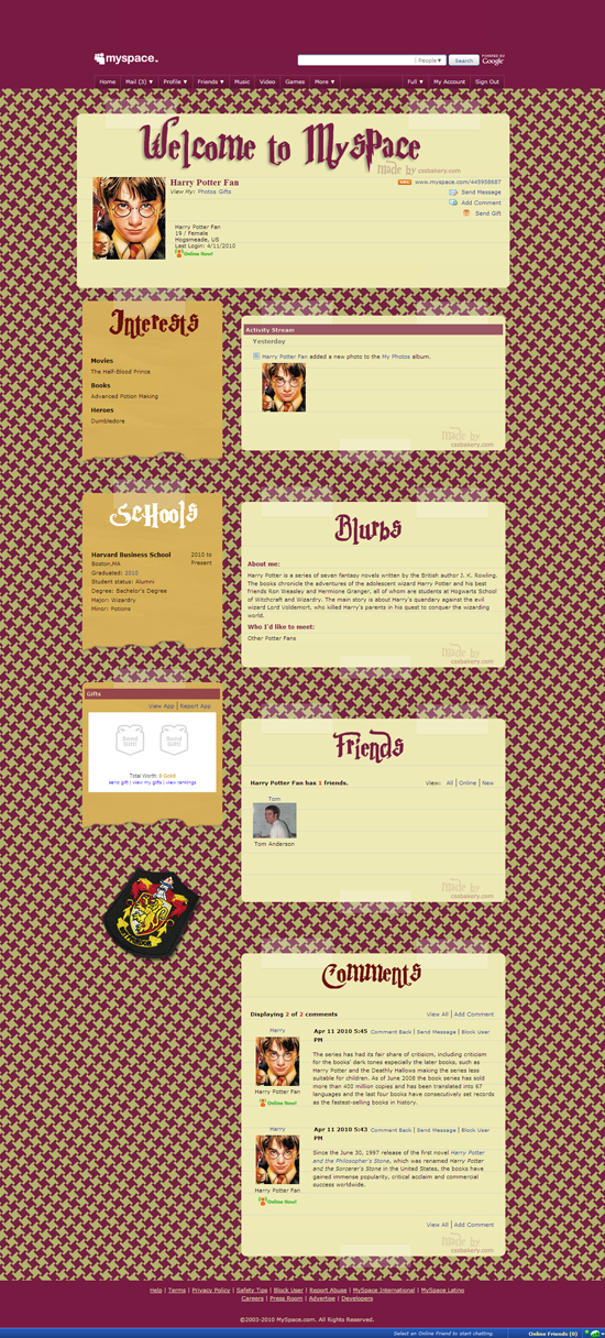
By bringing in other colors and bitmaps while keeping everything else including the main framework the same, we can quickly create another Harry Potter theme for our MySpace profile page with very little effort. We'll feature the color green and the serpent, emblem of Slytherin House in J.K. Rowling's Hogwarts, in the new design.
I made new title bitmaps in green for networking, comments, blurbs, schools, companies, interests, friends, details and the welcome page modules. I changed the eggplant color in the masthead, menu, footer and houndstooth patterned background to green. I changed all the links, section titles and member name to green. I replaced the school crest.
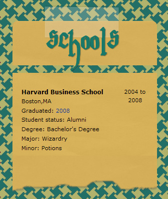
As I was making my changes, I ran into a problem with a few of the new title bitmaps such as "networking", or "schools" which were too wide, causing a gap as shown below:
body div.content div.schoolsModule div.moduleTop div {
    background: url(http://..../myspace/schools_sly.png)
                40%  0 no-repeat;
    height: 95px;
    }

div.schoolsModule h3.moduleHead {
    visibility: hidden;
    }
The reason for the gap is the new height, 95 pixels up from 80 pixels. I tried different methods to fix the problem. In the following method, I moved the two sections together with a negative margin which worked fine except that the top section ended up underneath so I added z-indexes to remedy that. Negative top margin applied to an element will have the effect of moving that element up, without affecting the position of elements above it, and it can be used to make elements overlap. Z-index is used to make one element appear on top of another when there is overlap, but Z-index will only work if the element is positioned (e.g. position set to absolute, relative etc..). In this case I used relative:
body div.content div.schoolsModule div.moduleTop div {
    background: url(http://..../schools_sly.png)
                40%  0 no-repeat;
    height: 95px;
    position: relative;
    z-index: 99;
    }

div.schoolsModule h3.moduleHead {
    visibility: hidden;
    }

body div.content div.schoolsModule div.moduleMid {
    margin-top: -15px;
    position: relative;
    z-index: 2;
}
Unfortunately this fix only partially works because MySpace strips out "z-index" rules. Once the z-index is gone, one of our letters - see the letter h - gets clipped in the bitmap. I have not confirmed this but I suspect the reason behind their aversion to "z-index" probably has something to do with making sure that no one covers up the banner ads intentionally or by mistake:

So I finally chose to extend the notepaper image to accommodate "fatter" title bitmaps instead of fixing it through CSS:

The problem was originally caused by our background image that was only 120px tall. That background is applied to all the "moduleTop" divs in the left column of the layout. The div that we put the module title image into is inside of the moduleTop div (i.e. its a descendant of moduleTop). So when we came up with a new title that was taller, we increased the height of that child div to accommodate it. That in turn, increased the height of the moduleTop div (for the Schools module in this case), and made it too tall for our original background. So the fix was to just give moduleTop a taller background image (height of 173px) that closes the gap.
You can see Schools module is fixed in the final version. To view the Slytherin MySpace page, click here.

MYSPACE COPY/PASTE CODE FOR SLYTHERIN THEME
For instructions on how to customize your MySpace profile using cut/paste code, you can read my prior post.


Post a Comment
Note: Only a member of this blog may post a comment.