


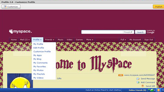
Let’s fix it. This CSS will set the colors of the menu items, and also change the color of the little bar between menu sections:
div#topnav ul li.hover a, li.hover, a:hover,
div#topnav ul li.dropDown:hover a {
background: #781a42;
color: WhiteSmoke;
}

ul#leftNav, ul#rightNav {
border-right: 1px solid #8e4061;
}

ul#leftNav li, ul#rightNav li {
border-left: 1px solid #8e4061 ;
}
Looking much better now:
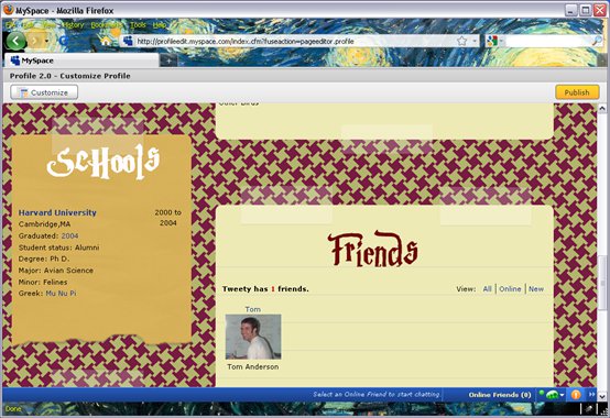
Looking the page over, it’s pretty good, but the Schools module looks a little weak. We can give it a nicer title like this:
body div.content div.schoolsModule div.moduleTop div {
background: url(http://myspace/schools_potter.gif)
40%  0 no-repeat;
height: 80px;
}

div.schoolsModule h3.moduleHead {
visibility: hidden;
}
And here’s the new schools module:
PLACING A GRYYFINDOR CREST ON THE BACKGROUND IMAGE
At the bottom of the first column, let’s put up a badge image:
div#row1 div.firstColumn div.columnEnd {
background: url(http://myspace/gryfindor.png) no-repeat;
width: 226px;
height: 212px;
margin: 50px 0 0 36px;
}
This image is a png with transparent background, so it appears to float over the top of our page background. We position it using the margins listed above:
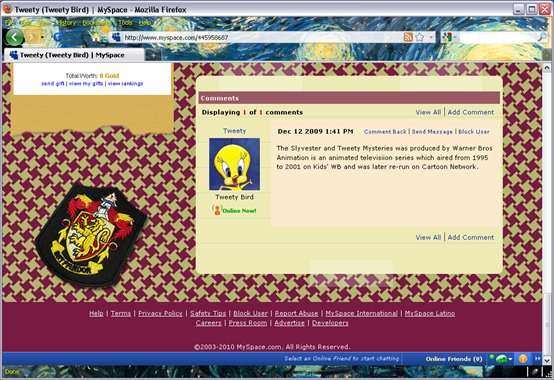
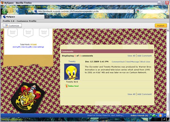
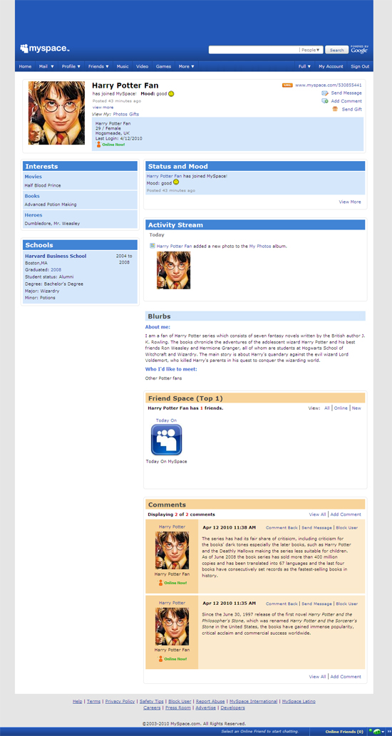
We notice another problem (as you can see in the screenshot above) with the Comments module. The styling of the comment has a different colored background and doesn’t show our ruled line “paper” background. That’s a pretty easy fix:
body div.commentsModule div.userComment { background: transparent; }And here’s our result:
ADJUSTING MORE COLORS IN THE MENU
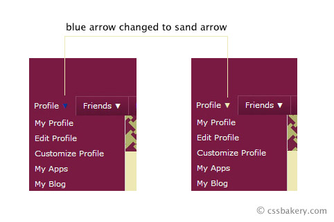
This is a small cosmetic change but makes a difference. If you look closely there's an upside down blue arrow next to Profile submenu. Because of our new dark background, Myspace's blue arrow is no longer visible. We can easily change this to the cream color to make it visible:
body #topnav ul li a:hover small, body #topnav ul li a.hover small {
color: #eeeab6;
}
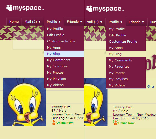
When you pull down on a menu item, each submenu is highlighted using a light blue color. You could leave it the way it is or choose a complimenting color for our new palette. I am going to try #eeeab6 which is the same light beige color of our "notepad" paper and use #781a42, a dark eggplant to write over it.
body #topnav li.dropDown:hover ul.subMenu a:hover,
body #topnav li.hover ul.subMenu a:hover
{
background: #eeeab6;
color: #781a42;
}
When you hover over the dropdown menu, MySpace highlights those without a submenu underneath in bright blue. This looks Ok but in the interest of harmony, I changed the highlight color to match the rest of the menu. Background color is the sandy beige and text appears in the dark eggplant for our descendant selector.
body #topnav ul a:hover {
background-color: #eeeab6;
color: #781a42;
}
DIGITAL PAPER: STYLING HEADINGS
The default Myspace margins did not look comfortable like above so we give the Interests module left and right margins:
.interestsModule .moduleBody { margin-left:8px; margin-right:8px; }
Then when I looked around, I saw other places where the text would come right upto the edge so I essentially wrote over the interestsModule style by rewriting the rule using a more generic selector:
.moduleBody { margin-left:8px; margin-right:8px; }
While in the Interests module, I also changed the blue heading color to black by the following selector for both Interests and SchoolInfo modules:
body div.interestsModule li h4, body .schoolInfo h4 a:link,
body .schoolInfo h4 a:visited
{
color: black;
}
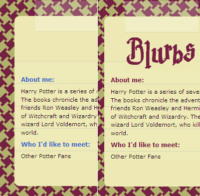
The Blurbs module had the same problem. Over there instead of black, I used eggplant for the headings:
body div.blurbsModule h4 {
color: #781a42;
}
UPDATE FONT IN THE WELCOME WINDOW
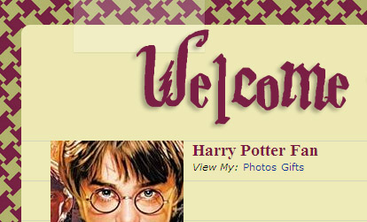
Myspace default font for the user name is a sans-serif font in black. I changed ours to serif font and used eggplant which looks less severe:
body .basicInfoDetails h2 {
font-family: Times, Serif;
color: #781a42;
}
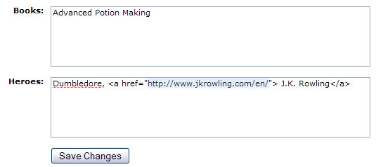
LINKS IN MYSPACE
Did you know you can have clickable links in your MySpace profile? While you are editing your profile, you add your link (J.K. Rowling) wrapped in an "a href" as shown below. The URL is highlighted in light blue color:
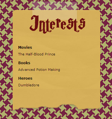
There is now a new link in the Interests module. "J.K. Rowling" shows up as a link instead of plain text:
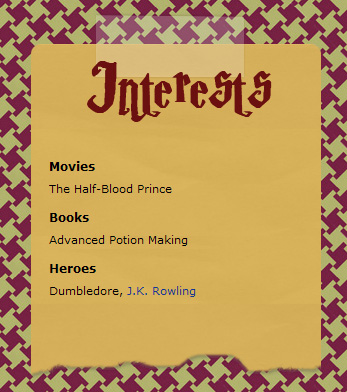
As you can see from the above example, MySpace default color for links is blue. In order to coordinate with our color scheme, we will switch to the eggplant color with the following:
body a:link, a:visited { color: #950553; }
Once again the Interests module but this time with a new link color:
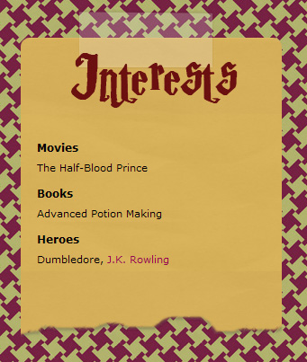
The new rule goes beyond just the Interests module and changes all other link colors in the profile:
FINAL TOUCHES TO THE FOOTER
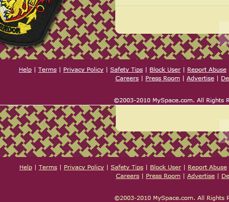
It may be hard to see but if you look closely at the bottom menu, the links appear in white. I'm going to change the link color to light beige color (hex #eeeab6).
#footer, div#footer a {
color: #eeeab6;
}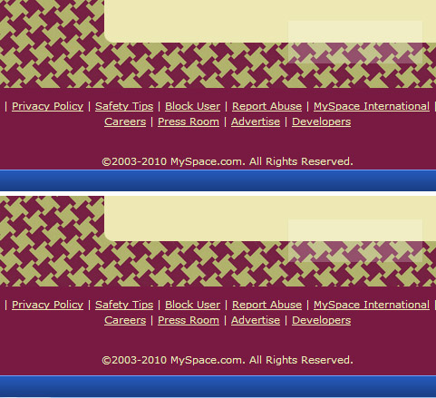
To push the last line of the footer away from the blue bar in the bottom, increased the bottom padding by 8 pixels:
body #footer { padding-bottom: 35px; }
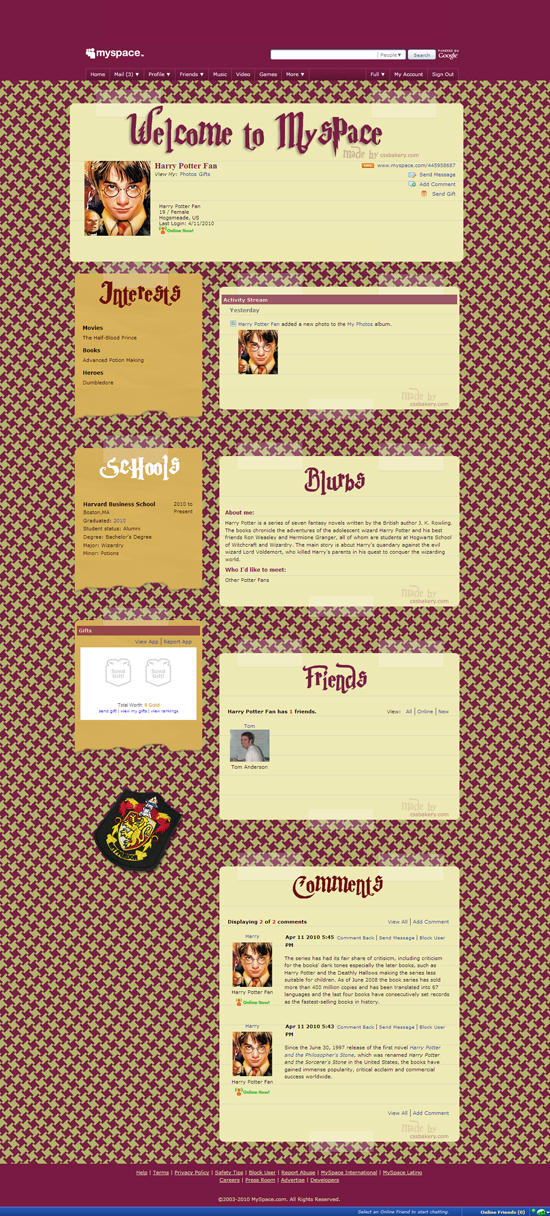
We can tweak more things around but basically what we have is a nicely coordinated template that is ready to use. We came a long way from the basic blue on white default scheme! Click here to see Harry Potter Fan's MySpace page.
A bitmap of the finished product:
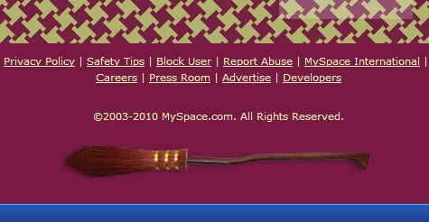
WAIT A MINUTE! NO WANDS OR FLYING BROOMS?
Well, Ok. It wasn't in our original design and I'm afraid I don't have any wands on hand but we can clean up a Nimbus 2000 to place it in our footer. You need to add this style:
#footer {
  background: url(http://pics.cssrule.com/pics/myspace/nimbus.png)
     50% 70% no-repeat;
}
The bitmap will be placed halfway in the horizontal and 70% down vertically. I increased the bottom padding from 35 pixels to 115 pixels to make room for the image.


Post a Comment
Note: Only a member of this blog may post a comment.