


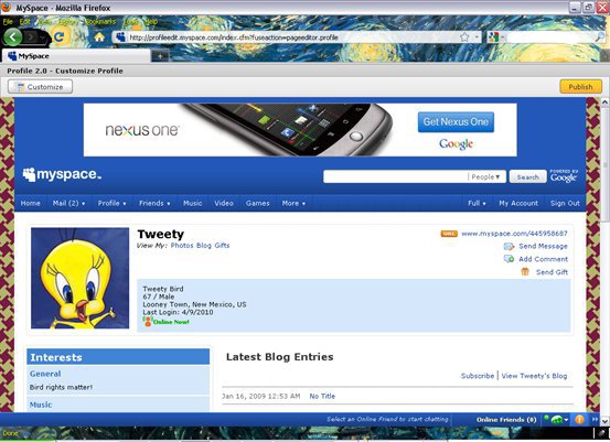
How do we add new CSS styles to MySpace? Their user interface is a little slow and clunky but it works. Go to "Customize Profile" from the Profile pulldown menu on your MySpace page. Click on it which will take you to another screen. From the top left corner under "Select Theme", choose "CSS { }" and copy/paste the CSS example you'd like to test drive. Hit "Preview" button and then if you're happy with what you see, click "Publish" to finish changing your MySpace layout. MySpace asks you one more time if everything is "OK". So one more click later, you'll be done.
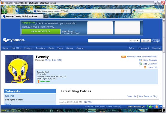
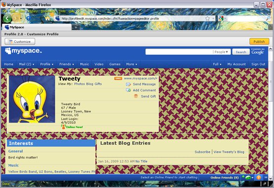
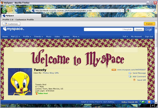
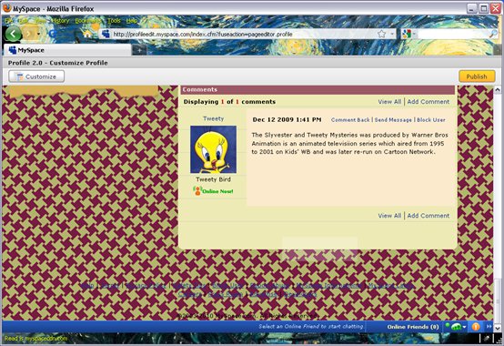
So that's the administrative side of MySpace. The diagrams in MySpace Tutorial 2: MySpace Structure should give you a pretty good feel for the kinds of selectors we can write to hook into the page. Here's what the page looks like by default, using a built in MySpace design. We will eventually change the personal info from Tweety to "Harry Potter Fan". I just happened to take the earlier screenshots using the older profile info:
A NEW BACKGROUND
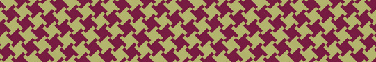
The profile uses the standard MySpace blue on white styling. We are going to change that using colors that match the Gryffindor House colors from the Harry Potter series by J.K. Rowling. The background image is a 90 pixel high houndstooth pattern that I designed by interlocking gold and eggplant colors. The nice thing about the bitmap is that it repeats seamlessly. The user will not be able tell where the repeating images join:
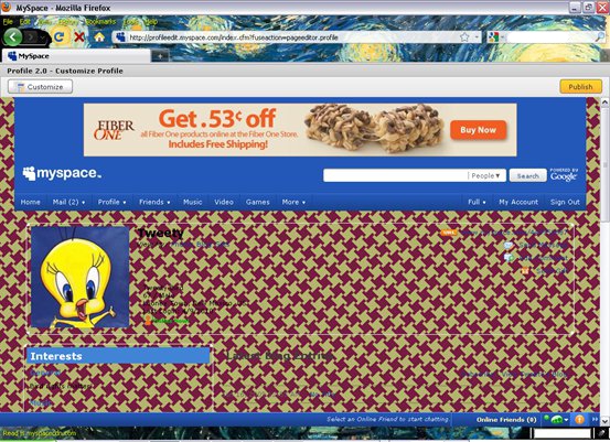
Let's start with just changing the background of the page using this bitmap as our bg:
body {
background: url(http://myspace/houndstoothbright2.jpg) repeat;
}
With just that change, not much of the new background shows up. In fact its only visible on the edges and in the footer area of the page:
The problem is that all the other content areas have their own backgrounds that are showing up instead of our new one. To solve that, we need to change a number of backgrounds to be transparent:
div#leaderboard, div#googlebar {
background: transparent none; }
body div.contentMid {
background: transparent none; }
div.module div.moduleBody li {
background: transparent none; }
body div.moduleBody li.moduleItem {
background: transparent none; }
div.contentMid2 {
background:transparent none; }
div.profileDemographics {
background: transparent none; }
div.statusMoodModule ul.moduleList li,
div.statusMoodModule ul.statusMood li,
div.schoolsModule li.moduleItem, div.detailsModule li  {
background: transparent none;
}
That's going a little overboard, because now our new background is showing up almost everywhere (except for the masthead area). But we'll soon be adding different backgrounds for some of these elements, to make things more readable.
We’re going to be using images for the backgrounds on all the modules, so let’s just start with giving the mid-section of each module a new background:
body div.module div.moduleMid {
background: url(http://myspace/ruled.gif) 0 0 repeat;
width: 546px;
}
The reason the selector is "body div.module div.moduleMid" instead of just div.moduleMid is to give it enough specificity to override default MySpace rules for moduleMid. You'll notice this pattern in a number of other selectors we write as well. Here’s the result from this change:
STYLING THE BASIC INFO MODULE
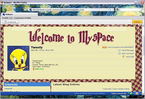
Not too bad, but we can do a lot better. Let’s attack the “Basic Info” Module. That’s the first module with your photo, name and other “basic” information about you. We’ll add images at the module top and bottom, and adjust the spacing in the middle of the module:
body div.basicInfoModule div.moduleTop {
background: url(http://myspace/mheadtop.png)
no-repeat;
height: 163px;
padding: 0px;
}
body div.basicInfoModule div.moduleTop div div {
background: url(http://myspace/welcome_potter.png)
50% 100% no-repeat;
padding-top: 82px;
height: 80px;
}

body div.basicInfoModule div.moduleMid {
margin-left: 0;
width: 895px;
}
body div.basicInfoModule img.photo {
margin-left: 20px;
}

body div.content div.basicInfoModule div.moduleBottom {
background: url(http://myspace/mheadbottom.png)
no-repeat;
height: 53px;
padding: 0px;
}
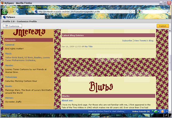
STYLING THE LEFT COLUMN
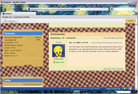
Now, this is more like it, but notice the two columns of modules below the Basic Info are still a bit ugly. Let’s see what we can do with all the modules in the first column (which is called col1_0 in the markup). We’ll give them all new images for module tops, bottoms, and mid sections. We also adjust the padding and width of the right hand column (col1_1).
div.content div#col1_0 div.moduleTop {
background: url(http:///myspace/yellowtop.png) 0 0 no-repeat;
padding-top: 40px;
}

body div.content div#col1_0 div.moduleMid {
width: 290px;
background: url(http://myspace/yellowmid.gif) 0 0;
}

body div.content div#col1_0 div.moduleBottom  {
background: url(http://myspace/yellowbottom.png) 0 0 no-repeat;
height: 83px;
}

#col1_1 {
padding-left: 25px;
width: 60%;
}
Now the left hand column is looking much better:
STYLING THE RIGHT COLUMN
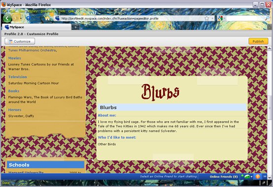
Now let’s start on the right hand column. First we’ll add some custom title images to the Blurbs, Interests, and Friends modules. The font that I'm going to use, complete with a P with the lighting bolt, is from the Harry Potter series:
div.blurbsModule div.moduleTop div {
background: url(http://myspace/blurbs_potter.png)
42% 0 no-repeat;
height: 77px;
}

div.interestsModule div.moduleTop div {
background: url(http://myspace/interests_potter.png)
42% 0 no-repeat;
height: 77px;
}

div.friendSpaceModule div.moduleTop div {
background: url(http://myspace/friend_potter.png)
42% 0 no-repeat;
height: 77px;
}
These images will appear as the titles of the modules, but they won't replace the existing titles. But, you can easily hide those existing titles if you want. Let's do that for the Friends module: div.friendSpaceModule h3.moduleHead { visibility: hidden; }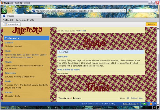
Ooops, one problem with that last set of changes: We need a bit more CSS to fill in a background on the module top and module bottom. For all the modules in the right hand column (which has an id of "col1_1" in the markup) we will add new images for module top and bottom and adjust the margins and padding for them to fit:
body div#col1_1 div.moduleTop {
padding-top: 55px;
margin-top: 30px;
background: url(http://myspace/cardtop.png) no-repeat;
}

body div#col1_1 div.module div.moduleBottom {
bottom-padding: 25px;
height: 75px;
background: url(http://myspace/cardbottom.png) no-repeat;
}
Here’s the result, and our right hand column is looking pretty good now:
We still have some of the original blue color scheme showing through on the modules though. Let’s fix that:
div.module h3.moduleHead  {
background: #781a42;
color:whitesmoke;
font-size: 98%;
opacity: 0.70;
filter: alpha(opacity=70);
}
Note that the opacity settings here are not really needed. Anyway, now the colors are bit more consistent:
One problem you might have noticed is that we have some ghostly looking images showing up on the page. Notice the thin white line and white chicken scratches around the Basic Info Module. These are background images left over from the default MySpace styling. If you look closely you’ll also see some extra borders on some of the modules:
We can get rid of them easily enough:
body div[class~="moduleTop"] div,
body div[class~="moduleBottom"] div {
background-image: none;
border: none;
}

div.module div.moduleMid { border: none;}
body div.moduleMid1 { border: none; }
Note that the selectors are written using the ~= attribute selector. This attribute selector will select div's where one of the class names matches. We actually could have written this using a more traditional class selector as in: "body div.moduleTop div, body div.moduleBottom div". This is an equivalent selector, so this rule can be written using either approach.And here’s the result, looking a bit cleaner:
FIXING THE FOOTER AND THE HEADER
We’re looking pretty good, but the page footer isn’t very readable, and we’ve still got a lot of blue up in the masthead area:
With this CSS we’ll fix the header and the footer all at once. We want to change the background colors, but just to make it look nicer,we'd also like to make them stretch all they way across the browser, which they don't do by default. The key thing we do here is set the wrap, header, and footer divs to have a width of 100%. But if you just do that change the layout will be broken as those elements were holding the whole fixed width layout together. We get around that problem by setting the width of the content, leaderboard, googlebar, and topnav divs, and centering them (with "margin: 0 auto"):
div#footer, div#header {
background: #781a42;
}

#footer, div#footer a {
color: WhiteSmoke;
}
div#leaderboard, div#googlebar, div#topnav {
width: 848px;
margin: 0 auto;
}

div.content {
width: 960px;
margin: 0 auto;
}

div.wrap, div.header, div.footer {
width: 100%;
}


Post a Comment
Note: Only a member of this blog may post a comment.