


A typical web page has a masthead, any number of columns in the body and a footer for miscellaneous information at the bottom. The markup below with its header div, maincontentwrapper div which includes col1, col2 and col3 divs and footer div reflects that type of structure:
<div id="outerwrapper">
<div id="header">
<p>Header text goes here</p>
</div>

<div id="maincontentwrapper">
<div id="col1">
<p>First Column: </p>
</div>
<div id="col2">
<p>Second Column: </p>
</div>
<div id="col3">
<p>Third Column:  </p>
</div>
</div>

<div id="footer">
<p>Footer text goes here</p>
</div>

</div>
Before we render the markup in a browser, let's style it.
STYLING WITH DEBUGGING IN MIND
The "beauty" of the following styles is due to my attempt to mark the elements more clearly. Once we complete the column exercise and fix any problems, we can get rid of the tacky borders and loud colors. But till then, feel free to use up all the colors in your paintbox:
#outerwrapper {
border: 10px dashed black;
background-color: pink;
width: 100%;
}
#header {
border: 10px solid white;
background-color: black;
color: #ffffff;
}
#maincontentwrapper {
border: 10px solid blue;
background: white url(images/snowcrystals.jpg) repeat;
}
#col1 { background-color: #05b3fc; }
#col2 { background-color: #84d9fc; }
#col3 { background-color: #dff3fb; }
#col1, #col2, #col3, #footer { padding: 0 5px; }
#footer { background-color: yellow; }
The borders and the various background colors are all there for debugging and showing what the browser is doing with our elements.
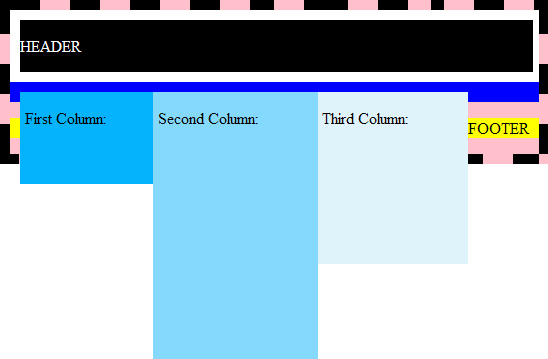
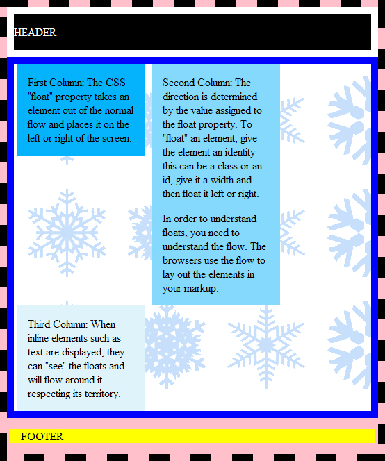
The outerwrapper div has a pink background with a thick black dashed border. You see very clearly how it wraps around our entire content with its bold border. For the most part its background color is being disguised by other content that's layered on top of it. The footer div with its browser margins allows some of the pink to show through.
Inside outerwrapper, we first come across the header div which has a black background, white text color and is bordered by thick solid white. Header is a div with a p element in it and as a block element it goes the entire width of its containing div, outerwrapper.
The mainwrapperdiv contains the three div's which will turned into columns but before discussing those let's make a note of its blue border and background image which we can both see in the output. You can see the snowflake patterned background image showing through the three columns of varying blue colors that are inside the mainwrapperdiv. The col1, col2, col3 div's are all block elements and thus extend to the right edge of their containing div, maincontentwrapper. Even though we want the three div's side by side as columns, right now they are stacked on top of each other.
Last element is the footer div which has a yellow background color.
FLOATING THE DIVS
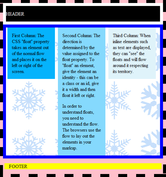
We want col1, col2, and col3 to form three side-by-side columns so I am going to float all three div's to the left. In order to float an element, we'll give it a width. The div's are already marked up as ID elements with names.
You can either give a set width such as 200 pixels or you can make it a percentage value which will make your layout elastic, allowing your columns to expand or retract when the browser window is resized. Once you have an identity and width for an element, you can float it. We are floating all of them to the left side.
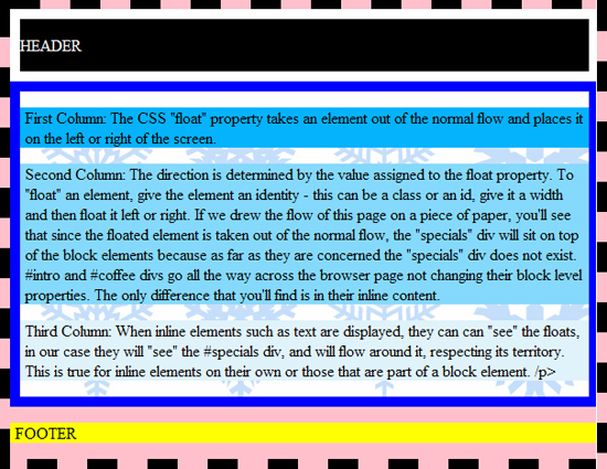
When the browser encounters the float property, it will take that element out of the normal flow and place it all the way to the left. If there's another floated element to the left then it'll float up against it. Since col1 comes first in our markup, it will be placed leftmost in the layout.
#col1, #col2, #col3 {
width: 30%;
float: left;
}
The col1, col2 and col3 divs are no longer stacked on top of each other, and now form three distinct columns although they are too tall, with their "feet" sticking out of maincontentwrapper and its parent, outerwrapper divs. The reason this is happening is because the float property takes the three floated divs out of the flow. So the containing div, maincontentwrapper is not "aware" that it holds any content and so doesn't make room for them. The footer with its text appearing from behind the three columns instead of staying below them on the page is also out of place. Let's solve both problems together in the next section.
CSS CLEAR PROPERTY
How do you stop colliding with floats above you? The clear property works by taking the footer div and positioning it below the three floated columns. You no longer see a yellow div (footer) next to the three columns above. The outerwrapper div is extended down to accommodate footer div so the the three divs no longer are hanging out from the frame.
#footer { clear: both; }
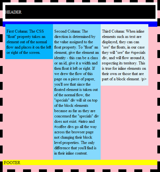
Although we had tiled a snowflake background image, the background is a solid pink color and does not show any snowflakes. If you look closely at the browser output, you'll see that the maincontentwrapper div has collapsed down to its blue borders resting right below where the three columns start. This is why the background snowflake image is not showing up because its div, maincontentwrapper thinks it has no content.

This can be confusing because you might think since the div has a background image, it ought to display at least some of it. The thing is that the divs first have to stretch out to where their content will take them before they can display their backgrounds. In their collapsed state, you will only see their borders. As far as the browser's concerned, if there's no content, there's no need for a background since backgrounds go underneath content.
I can hear you saying "Wait a minute, that div does have content. What about the three divs, col1, col2, col3 that make up the columns which go inside maincontentwrapper div? All of those have text in them!". This is true but when we floated the col1, col2 and col3 divs, we took them out of the flow. The browser no longer uses these divs to determine the size of maincontentwrapper. Once you float an element it becomes something of a ghost to the browser. So this is why the browser thinks maincontentwrapper div has nothing in it and collapses it down to its borders. In fact if we hadn't turned on its borders, we'd see nothing of it.
CSS OVERFLOW PROPERTY
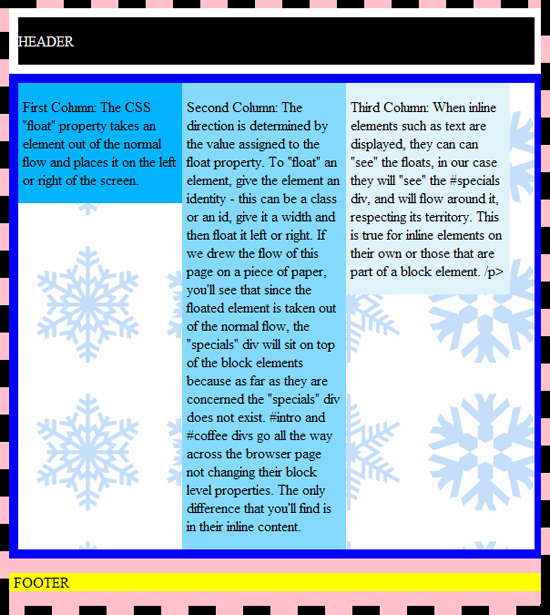
One way to remedy the situation is to somehow tell the maincontentwrapper div to start paying attention to its child elements even though they are floated. The CSS overflow property tells an element to stop ignoring its floated children and expand to contain them.
#maincontentwrapper {
overflow: auto;
}
With this change we now see that maincontentwrapper has expanded and we now see the snowflake background.
Let's take the "white" background away and use a transparent gif for our background image in the maincontentwrapper div to see what happens.
#maincontentwrapper {
background: url(http://pics.cssrule.com/pics/snowcrystals3.gif) repeat;
}

I'm going to switch back to the white background but still keep the gif file. In this section, I would like to give the columns margin and more padding to separate them from one another.
col1, #col2, #col3, #footer { padding: 0 15px; margin: 0 5px;}
COLUMN DROP: HOUSTON, WE HAVE A PROBLEM..
With the new padding and margins, the third column drops down. What's going on here? We made the width of each column a percentage value and the total width was never hardcoded. There's an explanation.
This has to do with the way the browser computes its numbers. Both the browser and we agree that total padding and margin costs us 120 pixels. There are 3 columns, each with 15px left and right paddings (30px total) and 5px left and right margin (10px total). 40 pixels per column times 3 columns gives us 120 pixels total.
Let's assume the browser window is sized such that its width equals 1020 pixels. You and I would typically subtract the 120 pixels from 1020 and then divide up the remaining 900 pixels among the three columns. Each would get 300 pixels. No columns drops, no complaints, no worries!
But the browser handles the situation differently. Given the 1020 pixel window width, it goes and takes 30% of that which comes out to 306 pixels, to use for the width of the div contents. For three divs 918 pixels will be used. By the time the browser compensates for the margins and padding, a total of 120 pixels as we computed above, the browser is at 1038 pixels which is over 1020 pixel width. That's why the column drops and that's why we need to adjust our percentage width down to say 25 percent. Going down to twenty-five percent is more than we need but it will cover narrower browser windows.


 Posts
Posts


2 comments:
Regarding the last part - mixing percentage and precise pixel counts in the same box is never a good idea under W3 box sizing model (where percentages are calculated against the parent container's actual width), though I admit its a useful practice for liquid layouts - and here lies the problem: as the layout changes width to support different browsers, the "extra pixel count" remaining after conservative percentage width setting (25% instead of 30% for example) changes drastically. Even if you sacrifice readability and set a low percentage width, some browsers will be so narrow as to still drop the columns (thing mobile internet devices) while people with wide screen monitors (becoming more and more common) will be annoyed by the tons of white space.
So what can be done about it: you can use the CSS3 box-sizing CSS property (or -moz-box-sizing for Firefox or -webkit-box-sizing for Safari/Chrome) to control the box sizing model. Setting this property to "border-box" will tell the browser to compute the percentage width after taking into account borders and padding (which means you'll have to do your spacing without margin - normally not a problem), while using the unofficial value "margin-box" will get you exactly the behavior that you want, though its not supported in Webkit browsers.
Oded,
Thanks for the comment. I agree that the mixing percentages and pixel counts can be tricky, especially without CSS3 box-sizing. I think CSS3 box-sizing will solve this problem nicely. I've been away from the blog awhile, when I get time, I'll update the post.
Post a Comment
Note: Only a member of this blog may post a comment.