


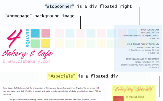
Let's bring up our latest version and take a quick look. The masthead looks a little weak with too much empty space to the right of store logo. I also think the logo itself can be improved because it looks a little too boxy. To change the logo quickly, all we have to do is to go back to Photoshop, or any image editor, and re-do part of the text in a font and color that is going to contrast with the blue square area. Here's what I came up with:

To balance the masthead and get rid of the unused space, I am going to list the Cafe locations with their addresses and phone numbers in the far right corner. I wrapped the information in a new div, #topcorner with a tight line-height, and small font size. I floated the div to the right and right justified its text which means the text will line up with the right edge of the page.
#topcorner {
                float: right;
                font-size: 0.84em;
                line-height: 1em;
                text-align: right;
                padding-top: 4px;
}
#topcorner h3 { font-size: 12px; }

<body>
<div id="homepage">

<div id="topcorner">
<h3>Four Square Café </h3>
<p class="hours">Open Daily 7 AM - 8 PM</p>
100 Melrose Boulevard, Los Angeles, CA 90211
<p class="phone">319.949.1200</p>

<h3>Four Square Café at the Plaza</h3>
.......
<h3>Four Square Sails at the Marina</h3>
.......
</div>  <!-- end of topcorner div -->
The updated logo and the corner div for restaurant locations is looking good but I feel I need another graphic to tie the logo to the section on the right so I go back to the image editor and come up with the following, transparent .png file to be used in a tiling effect:
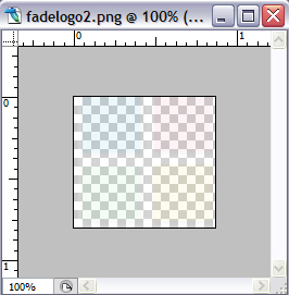
I will make the new image the background for the "#homepage" div and repeat it across the top of the div using repeat-x option.
#homepage {
  font-family:"Trebuchet MS",Verdana,Arial,Helvetica,sans-serif;
  font-size: 13px;
  line-height: 1.8em;
  width: 950px;
  margin: 20px auto 0;
  padding: 0;
  color: #4a4a4a;
  background: url("http://pics.cssrule.com/pics/fadelogo2.png") 0 0 repeat-x;
}
#content-wrapper { clear: both; }
UNDERLINED HEADINGS
Next up is underlining the headings for different sections using the border property. We have four different sections so I write 4 descendant selectors using the divs that contain them.
#intro h2, #coffee h2, #breakfast h2, #locations h2 {
                         padding-bottom: 5px;
                         border-bottom: 1px solid #2989f4;
}
We draw a single pixel thin line under the headings in matching blue by turning on the bottom border which together with the masthead changes make a big difference in the overall look by pulling it all together.
We are now finished with our first website design tutorial for beginners. With the exception of a negative margin example and the extensive use of floats in our layout, the CSS properties that we used for this tutorial are easy to understand and follow.


Post a Comment
Note: Only a member of this blog may post a comment.