


Before we start styling those, I want to make one quick enhancement at the top of the file. The customer quote uses the same font as the rest of our text. We are using the <blockquote> element for the quote which we can style for a new look.
blockquote {
font-style: italic;
font-size: 14px;
padding-right: 50px; padding-left: 10px;
}
Element selectors are the simplest selectors to write because you only need the element name after which you open your curly brace and write your CSS rules. We are telling the browser to display all blockquote elements in italic text with a font size of 14 pixels, nudged 50 pixels in from the right edge and 10 pixels from left.
That takes care of the blockquote element so now we can work on the page layout. By the time we are finished with this tutorial, our page will have many elements floated as shown below. The two unfinished sections breakfast and locations divs will each get 4 and 3 additional floats respectively:
BACKGROUND PROPERTY FOR FAUX COLUMNS
In the breakfast div, there are four main sections which I am going to float side by side to the left. I gave each of these sections a name and wrapped them in a div of their own. Each div will be 200 pixels wide, and 540 pixels high and will be 10 pixels away from its adjacent neighboring div. Text will be centered within the divs.
#muffins, #breads, #meats, #cheese {
float: left;
width: 200px;
height: 540px;
margin: 15px 10px 25px 0;
padding: 0 15px;
line-height: 1.6em;
text-align: center;
}
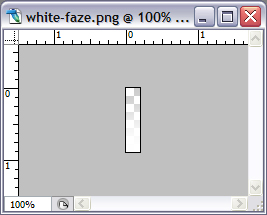
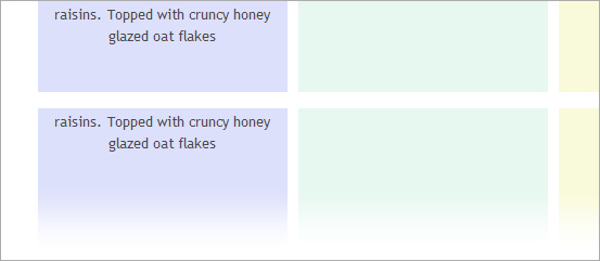
Here I am coloring the backgrounds of the divs individually because I want every div painted in a different color. I finished off each of the divs with a white gradient image, "white-faze.png" that I repeat across their bottoms:
#muffins { background: #dde0fb url(cafe15h_files/white-faze.png) 0 bottom repeat-x; }
#meats { background: #fae6eb url(cafe15h_files/white-faze.png) 0 bottom repeat-x; }
#cheese { background: #f9fad9 url(cafe15h_files/white-faze.png) 0 bottom repeat-x; }
#breads { background: #e6f8f0 url(cafe15h_files/white-faze.png) 0 bottom repeat-x; }
These background rules give each div a different color and also change the sharp bottom edges to a soft gradient as shown below.
If it hadn't been for different colors, I would have used a class for the divs instead of an id and simplified the code. I want to italicize the prices for each item so I declared an italic-text class and gave it a bottom margin of 10 pixels to keep the price bumping into the item name/description. h3 and h4 will be used as headings. "Muffins" gets the h3 treatment and "Cranberry Orange Muffins" the h4 with its small letter spacing. The description paragraphs for items get 15 pixel bottom margin to separate them from the next item.
#breakfast .italic-text {
font-style: italic;
margin: 0 0 10px 0;
}
#breakfast h3 {
text-align: center;
margin: 15px 0 8px;
}
#breakfast h4 {
margin: 20px 0 0 0; padding: 0;
letter-spacing: 0.12em;
}
#breads p, #muffins p, #cheese p, #meats p { margin: 0 0 15px; padding: 0; }
MORE FLOATS
The locations section follow the 4 floats above. I added an extra location for our Cafe, so we have three addresses to style. I wrapped each location in a new div so they all belong the same class, "alocation" which I style with a right margin of 67 pixels. The big margin will put that much space between the div itself and its adjacent div. I float each "alocation" div to the left. I center its text and separate the lines a bit by giving it a line height of 1.4em.
.alocation {
line-height: 1.4em;
text-align: center;
float: left;
margin-right: 67px;
}
SPECIFICITY, DESCENDANTS
The footer is the final section in our markup which right now only has a link. I clear all the floats above and draw a thin, dotted grey top border for visual separation. Text in this section will be 11 pixels, in a grey color and centered.
The anchor links are all descendants of the footer div and they are styled with a blue color for all states. If you hover over the link, it gets underlined. Remember you have to put a space between the descendant and the parent element when you are writing a descendant selector.
#footer a:link { ... } selector says select a:link pseudo-class that are descdendants of a footer ID element, which is a div in our case. Being a descendant simply means to be contained within that element's block - or in plain English if the element falls between the opening and ending tags of an element in the markup then it is a descendant of that element.
If we had written the selector as div#footer a:link { ... } instead then the selector becomes more specific, but otherwise works exactly the same. Either way, The selector tells the browser to select a:link pseudo-class enclosed within a footer ID div.
#footer {
clear: both;
border-top: 1px dotted #c3c3c3;
padding:0; margin: 0;
padding-top: 60px;
font-size: 11px;
text-align: center;
color: #8a8a8a;
}
div#footer a:link, #footer a:visited, #footer a:hover {
color: #2989f4;
}
#footer a:hover { text-decoration: underline; }


1 comments:
Superb ! Your blog is incredible. I am delighted with it. Thanks for sharing with me.
Post a Comment
Note: Only a member of this blog may post a comment.