


Think of a very basic web page such as a family website where people chronicle their vacations, or a product information page which has a lot of text with images sprinkled throughout. Let's mark up such a page for a fictitious company:
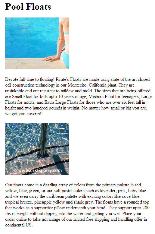
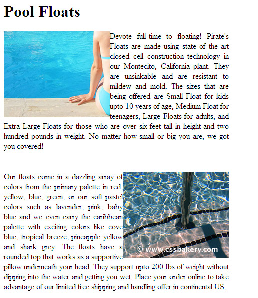
<div id="content">
<h1>Pool Floats</h1>
<img src="images/poolfloat1.jpg" alt="" />

<p>Devote full-time to floating! Pirate's Floats are made using state of
the art closed cell construction technology in our Montecito, California plant.  They are unsinkable
and are resistant to mildew and mold.  The sizes that are being offered are Small Float for kids
upto 10 years of age, Medium Float for teenagers, Large Floats for adults, and Extra Large Floats
for those who are over six feet tall in height and two hundred pounds or more in weight.</p>

<img src="images/poolfloat2.jpg" alt="" />

<p>Our floats come in a dazzling array of colors from the primary palette, red, yellow,
blue, green to pastel colors such as lavender, pink, baby blue and we even carry them in
caribbean colors of cove blue, tropical breeze, pineapple yellow and shark grey.  The floats
have a rounded top that works as a supportive pillow underneath your head.  They support up to
200 Ibs of weight well without dipping into the water and getting you wet.  Place your order
online to take advantage of our llimited free shipping and handling offer in continental US. </p>

</div>
Without any styling or floats, here's what we get:
The browser rendered two paragraphs with two images in between using it's built-in styles. We can take it further by adding our own CSS styles. Given two images, floating each to opposite sides of the screen is a good starting point.
We need to update the markup before adding the CSS. Each image gets its own class, one for floating to the left and the other for floating to the right.
<div id="content">
<h1>Pool Floats</h1>
<p >Devote full-time to floating!.....</p>
<img class="ileft" src="images/poolfloat1.jpg" alt="" />
<p >Our floats come..... </p>
<img class="iright" src="images/poolfloat2.jpg" alt="" />
</div>
NO WIDTH NECESSARY TO FLOAT AN IMAGE
Images are inline elements with dimensions therefore it's Ok not to specify a width for an image that you are going to float. If we were floating a block element like a div, we would want to give it an explicit width since a block element will expand as far as it can go horizontally (that is, until the edges of the Browser window or until it's restrained by a parent element).
I don't have much text to wrap around so I am going to keep the body narrow, limiting it's width to 450 pixels.
#content img.ileft { float: left; }
#content img.iright { float: right; }
body { width: 450px; }
We have the basic layout down just by floating the two images. Notice how the text started wrapping around the images. The rest is going to be simple styling. Let's change the font and also give the text and images some breathing room using margins:
body {
width: 450px;
font-family: Georgia, Sans-serif;
margin-left: 50px;
margin-top:30px;
}
#content img.ileft { float: left; margin-right:20px;}
#content img.iright { float: right; margin-left: 20px;}
#content p { text-align: justify; margin-bottom: 40px; }
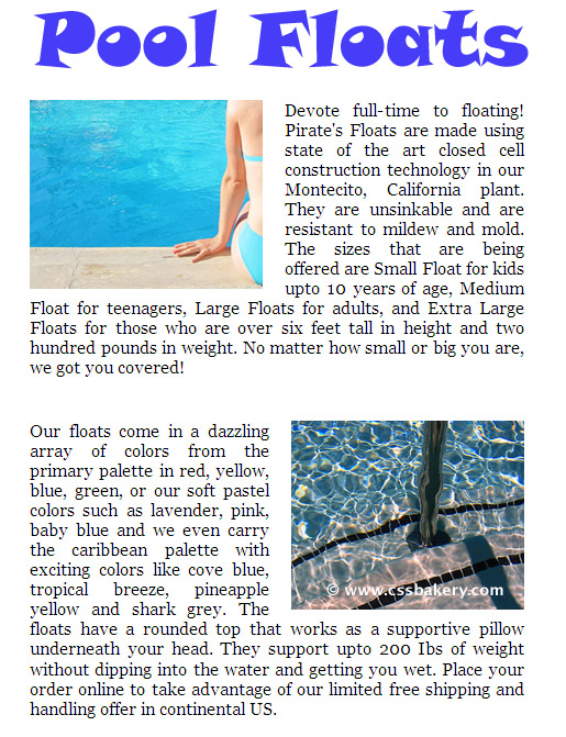
That'll do it. Before we render the page with these styles, let's also update the title with a bitmap which I designed in Photoshop using a font called "Snap".
IMAGE REPLACEMENT TECHNIQUE
The title of the page is in an h1 element whose style is a standard browser font in black plain text. We can switch to a more interesting bitmap by replacing the text with a bitmap. In order to make this work we need to update the markup with the span element:
<h1><span>Pool Floats</span></h1>
The CSS will look like:
#content h1 span { visibility: hidden; }
#content h1 { height: 70px; background: url(images/pooltitle2.jpg) 0 0 no-repeat; }
We add the span element to make it easy to hide the original text, and replace it with an image.
Using this span, we can hide the black plain text of the h1, by setting the span's visibility to hidden. The browser only allowed enough height for the size of the font being used for h1 which turns out to be shorter than our image so we have to include the actual height of our image which is 70 pixels.
HOW FLOATS TAKE ELEMENTS OUT OF NORMAL FLOW
We can try the same exercise by placing the img tags right in the middle of the p elements and observe how the images "move" in the ouutput. Image element is inline so expect to see our jpeg files to show up in the middle of our text before we float them. I am going to place braces before and after the img tags to make things clearer. First the markup:
<div id="content">
<h1>Pool Floats</h1>
<p>
Devote full-time to floating!
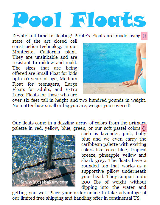
Pirate's Floats are made using {<img class="iright" src="images/smallgirl2.jpg" alt="" />}state
of the art closed cell construction technology in our Montecito, California plant. They are unsinkable
and are resistant to mildew and ...................... we got you covered! </p>
<p>Our floats come in a dazzling array of colors from the primary palette in red, yellow, blue,
green, or our soft pastel colors {<img class="ileft" src="images/smallpool2.jpg" alt="" />} such as
lavender, pink, baby blue and we even carry the caribbean palette ...................continental US.
</p>
</div> 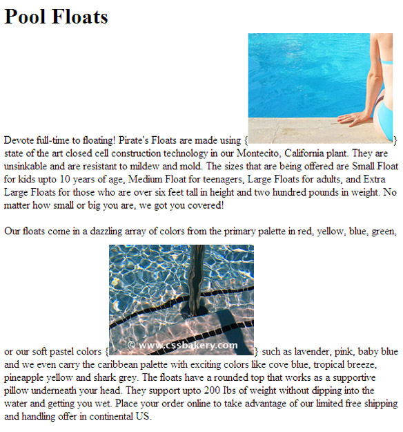
FLOAT AGAIN
Make a note of the opening and closing braces around the images. In the next step, we will float both of the images. The second image floats to the left and first image to the right. I highligted the braces where the images are embedded in red. After the floating, the braces will still show, but the image won't be between them anymore.
CSS stays the same with the exception of adding a little space around the top and bottom of our images:
#content img { margin-top: 15px; margin-bottom: 10px; }
We can make our output look exactly the same as the first exercise by placing the img tags right after the opening p tags and reducing the top and bottom margins for the img element down to 5 pixels each. Oh, and don't forget to take all the braces out because a single character will be enough to push the image one line down.


 Posts
Posts


1 comments:
Nice tutorial!
Post a Comment
Note: Only a member of this blog may post a comment.