


When I think of drop shadows, Adobe Photoshop is what automatically comes to mind but there is also a technique in CSS to produce a similar effect. Google Maps site uses CSS drop shadows that are programmed into the code. The screenshot shows the horizontal shadow they have under the blue ledge. I am going to add a shadow to the very top of my site using the same method.
.ds {
background:#000000 none repeat scroll 0 0;
overflow:hidden;
position:absolute;
top: 0px;
z-index:2;
width:100%;
}

.shadowStart {
left:0;
}

#ds .o1 {
opacity:0.1;
filter:alpha(opacity=10);

}
#ds .h1 {  height:1px; }


#ds .o2 {
opacity:0.08;
filter:alpha(opacity=8);

}
#ds .h2 {
height:2px;
}

#ds .o3 {
opacity:0.06;
filter:alpha(opacity=6);

}
#ds .h3 {
height:3px;
}

#ds .o4 {
opacity:0.04;
filter:alpha(opacity=4);
}
#ds .h4 {
height:4px;
}

#ds .o5 {
opacity:0.02;
filter:alpha(opacity=2);
}
#ds .h5 {
height:5px;
}
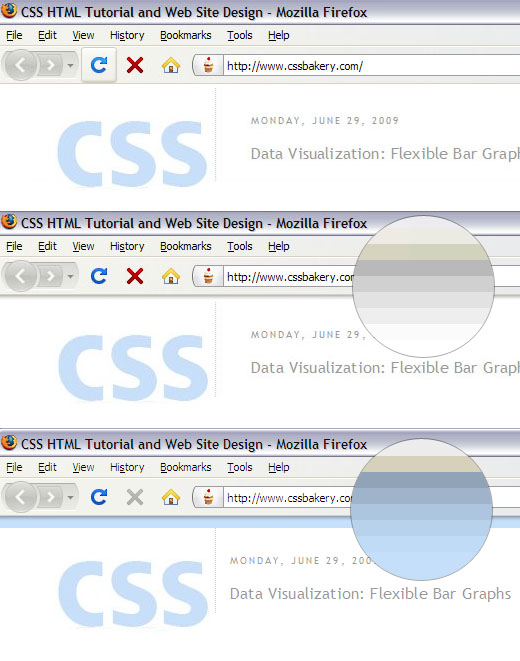
The screenshots show how I changed the top of cssbakery.com with CSS drop shadows. First image is the original, plain state without any kind of embellishment, next image shows how a 5 pixel drop shadow looks and finally I applied the same 5 pixel drop shadow on top of a blue strip that is wider than the drop shadow.
The magnified circles show what the pixels are doing up close. You can see the code working as the opacity goes down and the divs get more transparent - we are coloring the backgrounds of divs and tinkering with their opacities - as we move from o1, h1 to o5, h5 in a gradient fashion. The last image with the blue strip looks as if the divs are painted in blue but that's not the case. All divs are variants of the color black. When the opacity goes down, the color underneath shows through which makes the greys appear as if they are hues of blue.
All five divs are positioned absolutely at (0,0). The fifth div - it's the div with the least opacity - being 5 pixels, it layers itself over the other shorter divs. The first div's opacity is at 0.1 and it's the darkest of the bunch and its div is only 1 pixel high. It draws a single line and hands the baton to the next div in line. The 100 percent width ensures that we cover the entire width of the screen flexibly without having to limit ourselves to a fixed horizontal value. No matter which div their background is set to black in the ds class. We change the color by adjusting its opacity in "#ds .o1" etc. The first opacity statement is for Firefox and the next is for IE.
SAME NAME FOR BOTH AN ID AND A CLASS?
That's exactly what they do in the Google code. The practice is permitted in CSS but it can definitely be confusing. "ds" is an ID for the first div and a class for the inner divs. The markup is using the ID name to hook into the other elements that are enclosed within the div structure. So we don't really have anything for "#ds" element in the style sheet except for using it to get to the other elements like for example, "#ds .h4", to set the height of the fourth div. I personally would use a new name for the ID but wanted to show you this example so that if you run into code like this, you don't get surprised and perplexed.
The markup uses multiple classes for each element so the first div is of class ds, h1, o1, and shadowStart at the same time. If you remember from our previous discussions, the syntax for multiple classes requires that we separate each individual class from the next by a space and enclose the entire string in double quotes.
<div id='ds'>
<div class='ds h1 o1 shadowStart'></div>
<div class='ds h2 o2 shadowStart'></div>
<div class='ds h3 o3 shadowStart'></div>
<div class='ds h4 o4 shadowStart'></div>
<div class='ds h5 o5 shadowStart'></div>
</div>
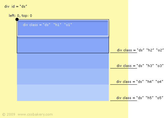
The figure shows what the browser does with our markup and styles. There are five inner divs which are stacked up on top of each other at 0,0 because all are absolutely positioned with their upper left corners placed at the same point. First div has a height of one pixel and is outlined in white, the successive div heights increase by one each time forming a gradient as they layer on top of each other. I outlined the second div in black for comparison. Each bar of blue represents one pixel height. The entire blue area is how big the fifth inner div is with 5 pixels.
Here's some further reading on CSS drop shadows.
2013 Note: The new CSS3 box-shadow property makes this approach obsolete.


 Posts
Posts


Post a Comment
Note: Only a member of this blog may post a comment.