


Without any CSS, the Zen Garden markup has plain text and basic browser styling. The browser has predefined styles for HTML elements so we get some spacing between elements, bold text in our headings and blue colored links. We are going to rewrite most of these rules later but this is how the garden markup renders without additional CSS.
As we proceed through the steps of creating our design (described here), it will help if you understand the overall structure of the Zen Garden HTML markup.
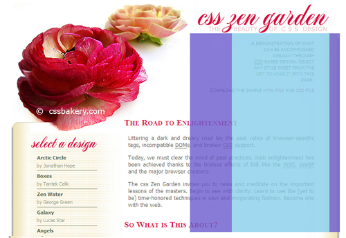
The first thing we'll do is a minimal CSS Reset, then style the container div, which wraps all the content. The body will have a white background and a minimum width of 905 pixels which will keep a resizing browser from collapsing the design. As you can see in our final design, we will wrap the content in an open, thin frame with 30 pixel tall red band at the bottom. There are two flower images tucked into the frame - a yellow flower in the bottom right corner and a pair of roses prominently displayed at the top left corner. In CSS 2.0, each element can only carry one background image so we will roll out these two images with two different elements.
While the first temptation might be to use the background of the container div to display the roses at the upper left corner, that would leave us with a big problem: how to get the yellow bloom positioned correctly at the lower right corner of the design. The positioning of the yellow bloom depends on how tall the container div ends up being, which is determined by the browser when it renders the page. It can be affected by things like the current text size in the browser, so there's really no way to know beforehand what those coordinates will be. The roses in the upper left are much easier to deal with since they are at fixed coordinates that we can determine up front. So, I'll make the bottom yellow bloom the background for the container div. I use 100% for x and y coordinates to position it at the lower right corner of the container, no matter how tall the container ends up being.
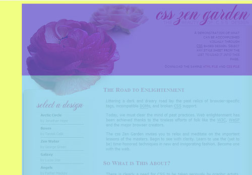
I'm going make the container div the containing block for other divs which is why I have its position set to relative. This statement does not affect the positioning of container div because we are leaving the top, left, and right attributes set to zero. So, it will be rendered where the browser places it in the normal flow. The 230 pixel top padding will give us enough space at the top to fit the other image that has the pair of roses, and the 77px right padding provides enough room to show the rightmost portion of the yellow bloom that extends beyond the content area. Some margin is used all the way around just to create some whitespace between the design and the edges of the browser window. Finally, I'd like to have a clean edge for text so I set text-align to justify which aligns the text in a straight line on both the left and right sides.
* {
       margin: 0;
       padding: 0;
}

body {
       color: #000;
       background: #fff;
       min-width: 905px;
}

#container {
       background: url(images/yf221x221.jpg) 100% 100% no-repeat;
       text-align: justify;
       padding: 230px 77px 24px 0;
       margin: 10px 30px 20px 70px;
       position: relative;
}
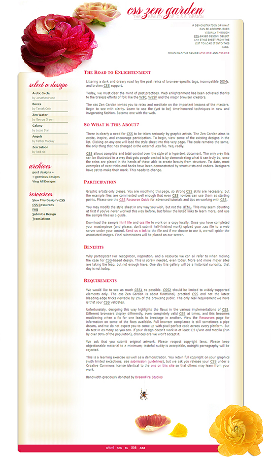
Here's what we have so far.
THE MASTHEAD
Now let's focus on getting the top part of the design, commonly called the masthead, completed. First we'll work on the upper left corner, then the title in the center, and finally the upper right corner.
Upper Left Corner
The pair of roses central in our design find a home in pageHeader div with a height of 353 pixels and width of 413 pixels which are the exact dimensions of the image. We position the background image at the upper left corner of the div using background-position: 0 0. Then we use absolute positioning to move the entire div to the upper left corner of the container div. The statements top: 0 and left: 0, along with position: absolute, specify that the div will be placed at coordinates 0,0 within the positioning context. Recall that the positioning context was established when we set “position: relative” on the container div.
#pageHeader {
        background: transparent url(images/ZroseNEWa.jpg)  no-repeat;
        height: 353px;
        width: 413px;
        background-position: 0 0;
        position: absolute;
        top: 0;
        left: 0;
        z-index: 5;
  }
The top left corner of the page is completed.
Title in the Middle
For the title, we'll use a CSS image replacement on the h1 element inside of the pageHeader div. So this will work by showing the title image as a background of the h1 element, and then hiding the text that is within the h1 (we want the image to show up but not the text). In fact, the image also takes care of the text within the h2 element as well. So we'll also want to hide the h2 text. Here's the CSS:
    #pageHeader h1 {
        background-image: url(images/Ztitle_e7cdcd.jpg);
        background-repeat: no-repeat;
        /*dimensions of the title jpeg*/
        height: 74px;
        width: 317px;
        /* Browser defaults to static positioning, so it will ignore top left right bottom
           unless we tell it to position absolutely (or relatively) */
        position: absolute;
        top: 0px; left: 420px;
    }

#pageHeader h1 span, #pageHeader h2 span {display: none;} 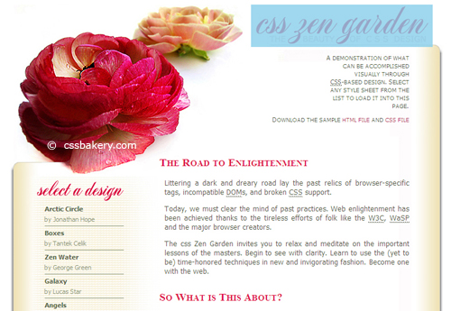
The "#pageHeader h1" rule sets the title image as the background, sets the h1 dimensions to match the image, and absolutely positions the h1 along the top of the container div. Since the image provides everything we want to display, we have a rule to turn off the text within the h1 and h2 spans by setting display to none.
[note: Later we will change the display: none to another text hiding method that is more friendly to screen readers.]
So now we've got the upper left corner and title.
Upper Right Corner
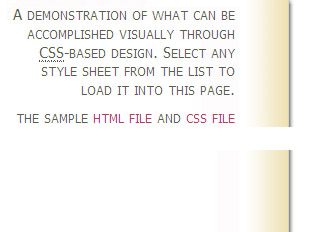
At the top right corner we want to place the two paragraphs within the quickSummary div. We use absolute positioning to move the whole quickSummary div to a position that is 70px from the top and 77px from the right edge of the container div. Keep in mind that this is a fluid layout, so when the browser window is re-sized horizontally, container can grow and shrink. Since quickSummary is positioned 77px from the right edge of container, it will move horizontally when the browser is resized by the user. For the text in these two paragraphs, we'll right justify it with "text-align: right" to line up nicely with the right edge of the design.
#quickSummary {
        width: 14em;
        height: 200px;
        padding-right: 24px;
        position: absolute;
        right: 77px;   top: 70px;
        z-index: 100;
        background: url(images/290X200NEW.jpg) no-repeat;
        background-position:top right;
        text-align: right;
}
We'll use the background of quickSummary to render the upper right rounded corner of the design. This is the rounded corner with a shaded right edge:
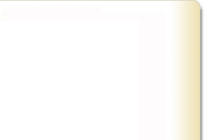
Note that the image is 200px high, and we also set the height of quckSummary to 200px. That's more than enough height for the text in the paragraphs, but we need some extra height to avoid having a gap in the right hand border of the content area. The figure below shows what happens in the final design if you don't provide the "height: 200px" setting in the rule:
In the rule above, we also move the text away from the right edge of quickSummary using right padding of 24px. For the width, note that we use 14em. The use of em's here is needed to keep the design working when the browser changes text size. If we had just specified a fixed width that doesn't adjust to changing text size, then when the text size increases, the lines would start to wrap around and break the design.
One last thing that is done in the rule above is setting the z-index. I'll describe the reason for that below. Next, we have three rules for fine tuning the appearance of the text in the two quickSummary paragraphs:
#quickSummary p {
       font-family: Tahoma, Arial, Helvetica, sans-serif;
       font-size: 70%;
       color: #566047;
       line-height:1.25em;
       font-variant : small-caps;
    }
    #quickSummary p.p1 {  padding-top:15px;   margin-right:35px; margin-left:40px;}
    #quickSummary p.p2 {  margin: 10px 35px 0px -150px; }
The first rule styles the text: the font family to be used, the size, and color. A line height of 1.25em adds a bit of whitespace between the lines of text. For an extra touch the "small-caps" font variant causes the lower case letters in the text to be rendered as small versions of capital letters. The last two rules fine tune the padding and margin around the two paragraphs to give us the final look of this corner of the design.
We have just begun but already have the building blocks of the frame completed.
About the z-index
Note that in the current state of the code, some of the text is being hidden behind the rose image at the upper left. This sort of thing happens when you start using absolute positioning. Absolute positioning takes elements out of the normal flow, so they can start overlapping. When they overlap the browser has to render one on top of the other. You can control which one is rendered on top using the z-index property. We'll return to this discussion when we go through the styling for the preamble div in the next post.


 Posts
Posts


Post a Comment
Note: Only a member of this blog may post a comment.