


#linkList {
position: absolute;
top: 200px; left: 0;
z-index: 11;
margin-top: 105px;
text-align: left;
}
This is an absolutely positioned element so we give it the coordinates of (0,200px) to pull it up to the top of the page. z-index is necessary to keep the element on top of pageHeader div which has a smaller z-index. Without a higher z-index, we will lose the "Select a Design" header. Also, 105 pixels for top margin so that we don't end up on top of the bitmap for the red rose. If you have text with more than word, with enough space, the words will separate from one another, giving you an unsightly sinkhole in between. text-align: left will take care of this potential problem.
Next we'll get rid of the bullets and style the ul/li elements:
#linkList ul {
margin: 5px 1em 0 60px;
list-style: none;
font-family: Tahoma, Arial, Helvetica, sans-serif;
}
#linkList li {
margin-bottom: 5px;
font-size: 70%;
width: 138px;
}
#linkList a { color: #5c7a5e;
text-decoration: none;
font-weight: bold;
}
#linkList a:hover {
text-decoration: underline;
}
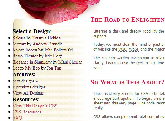
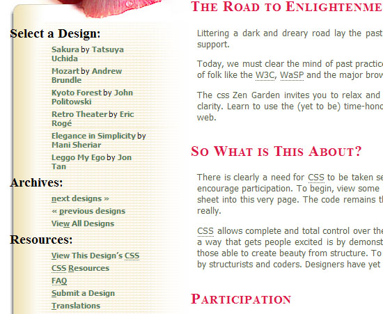
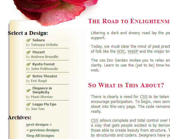
In lselect div, I want to draw a line between the li elements so I use a border-bottom rule.
#lselect ul li {
padding-bottom: 5px;
color: #858f72;
border-bottom: 1px solid #858f72;
}
The updated menu.
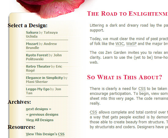
There are some links in the lselect div that we want to display on their own line in the menu, but there's no class name that lets us target them directly. So what we'll do is write a general rule for all the links in lselect, then we'll selectively undo part of it.
For the first part, we set all the links to have display: block. This will cause them to render on their own line.
#lselect ul li a, #lselect ul li a:link, #lselect ul li a:visited {
display: block;
padding: 0 0 5px 0;
color: #566047;
}
But here's where we "undo" that for other links that we don't want on their own line. These are the links that have a class="c". We accomplish this by setting these back to display: inline. While were at it, we give these links a different color:
#linkList a.c, #linkList a.c:link,
#linkList a.c:visited, #linkList a.c:hover,
#linkList a.c:active, #linkList a.c:focus {
color: #858f72;
display: inline;
}
#lselect ul li a:hover {
text-decoration: underline;
}
Once again, the new menu.
I'm going to skip the bottom border for the last child in "select a design". This rule will only work in browsers that recognize the last-child property of CSS3. IE will draw the extra bottom border:
#lselect ul li:last-child {
border: none;
}
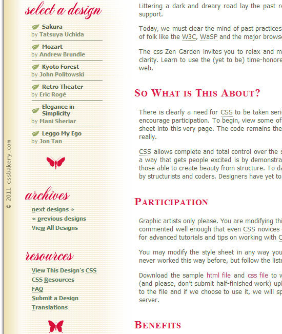
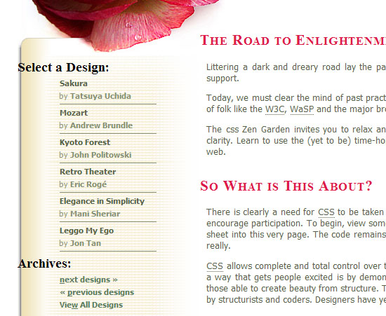
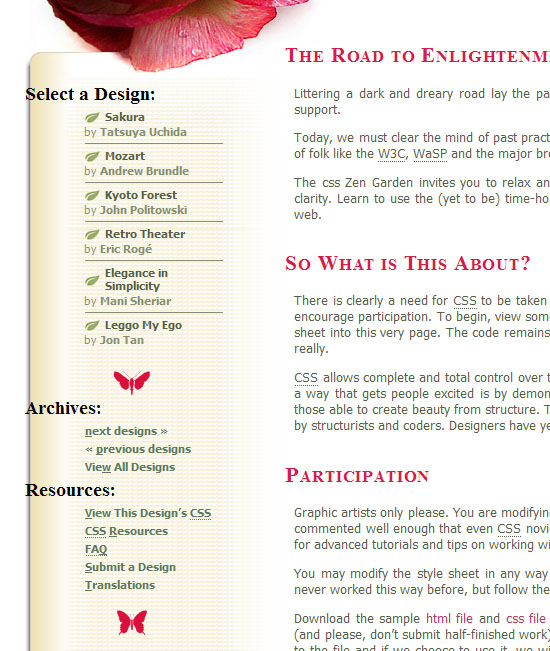
I have a leaf vector graphic that will go right before each li (menu item):

I thought of using list-style-image for this purpose but gave up on the idea when I figured the background property's just as good. Since we want this icon only for the "Select a Design", we are going to write our descendant selectors using #lselect. The property cascades down to a.c element but we do not want a second icon in the same menu item. That's why we are resetting the background images to none later. (note: This is due to 'cascading' not 'inheritance'. In inheritance a style applied to some parent element is inherited by a child element. But in this case the 'a' elements are siblings, not parent-child).
#lselect ul li a, #lselect ul li a:link, #lselect ul li a:visited {
padding: 0 0 2px 20px;
background: transparent url(images/littleleaf.png) left center no-repeat;
}
#lselect ul li a.c, #lselect ul li a.c:link, #lselect ul li a.c:visited {
background-image: none;
padding: 0;
}
The "Select a Design" menu with its new icons.
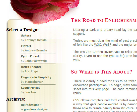
I have a moth and a butterfly which I'm going to use to separate the menu items, lselect (Select a Menu Design) and lresources (Resources) by dropping the bitmaps in their background images. A 40 pixel bottom padding will allow enough room to show each bug.
#lselect {
background: url(images/moth.gif) no-repeat 50% 100%;
padding-bottom: 40px;
}
#lresources{
background: url(images/butterfly.gif) no-repeat 50% 100%;
padding-bottom: 40px;
}
Here's the menu with the two insects.
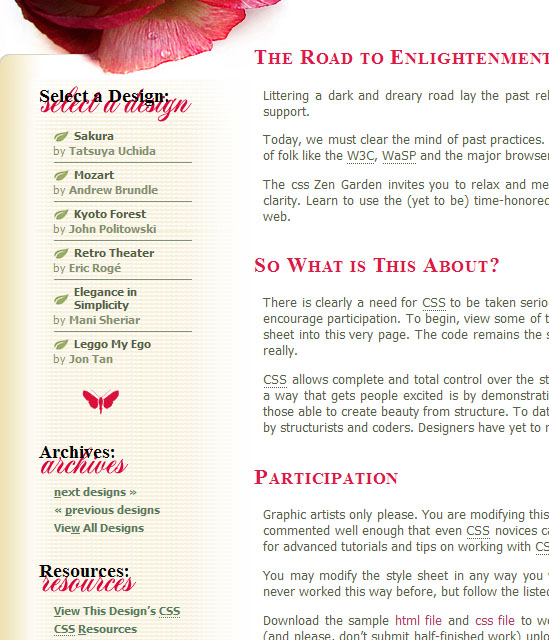
There are three headings in the menu, "Select a Design", "Archives" and "Resources" which are all in plain, black text. How about replacing the text with bitmap images? The first rule establishes the width and height for the bitmaps. The next three statements are straight forward where we drop in the bitmaps into each h3's background. The very last statement #linkList h3 span {visibility: hidden;} is for hiding the text that comes from the markup since we want to replace the text with the new images. If you skip this step, there will be graffiti on your menu.
#linkList h3 {
width: 163px;
height: 40px;
margin: 25px 0 5px 45px;
}
#linkList h3.select {
background: transparent url(images/h3_select_red.gif) left center no-repeat;
margin: 0 0 0 45px;
}
h3.archives {
background: transparent url(images/h3_archives.gif) left center no-repeat;
}
h3.resources {
background: transparent url(images/h3_resources.gif) left center no-repeat;
}
#linkList h3 span {visibility: hidden;}
Final html file after all the styles are applied. The design is fluid so you can test it by expanding/shrinking your browser window. A bulletproof design should hold up when you enlarge text size by three levels. I have not tested IE yet but in Firefox, everything's good:
CSS Zen Garden Series
- ExtraDiv1 Goes Where No Div's Gone Before, Part 8 | Final Design
- Styling the CSS Zen Garden Menu, Part 7
- Styling the CSS Zen Garden Footer, Part 6
- Styling the CSS Zen Garden Text Paragraphs, Part 5
- Spider & Rose for CSS Zen Garden, Part 4
- CSS Zen Garden HTML Elements, Part 3
- CSS Zen Garden Markup, Part 2
- Walking over to the Zen Garden, Part 1


Post a Comment
Note: Only a member of this blog may post a comment.