


In the last Zen Garden post, we worked on the #linkList element and finished the menu. There are just a few cosmetic changes to do before the design is complete.
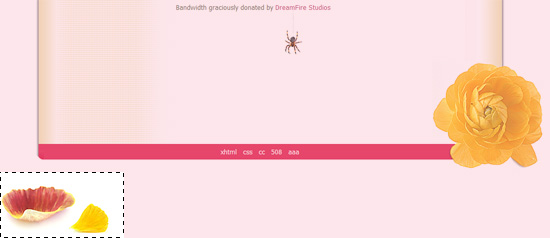
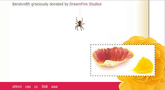
In the footer, I'm going to hang a spider from a hyperlink and right underneath the spider, I will drop a few flower petals. We can use one of the paragraph elements as a hook for the spider, but the petals are going to require the use of an extradiv that Dave Shea provided at the end of his Zen Garden markup.
p5 is the last paragraph in the markup:
<p class="p5">
<span>Bandwidth graciously donated by <a href="http://www.dreamfirestudios.com/">
DreamFire Studios</a></span>
</p>

The spider bitmap is 41px × 95px. I'm going to give the paragraph a height of 100 pixels and make the bitmap the background of p5 p. Then through background positioning, we will find the perfect place to hang the spider:
.p5 {
height: 100px;
background: url("images/itsy.jpg") 16em 1em no-repeat;
}
No matter what the browser window or the text size is doing, the spider stays in place, attached to the hyperlink. That's good. :)
STYLING THE EXTRA DIVS OF CSS ZEN GARDEN
Zen Garden has six of these extra div's.
#extraDiv2 {
width: 215px;
height: 106px;
background: url(images/shell215x106.jpg) 0 0 no-repeat;
}
The flower petal bitmap is going to go right underneath the spider. The bitmap is 215 by 106 pixels. So you give the extraDiv2 width and height that will match those numbers. Drop your bitmap into the background and you'll get this.
Let's change positioning from static to relative. I think Shea tells you to do this by absolute positioning. With relative positioning, the browser will keep the element in the flow but will move it by an x,y offset that you specify. We want to move the bitmap up into the frame, shifting it up by 200px from where it would be positioned in the normal flow. Horizontally, we want to move it 600px to the right (see the red dot in the diagram) to move it underneath the spider. I don't want to teach anybody math but for example for x, all the points along that vertical line (y-axis) are valid since they will all have the same x coordinate.
#extraDiv2 {
width: 215px;
height: 106px;
background: url(images/shell215x106.jpg) 0 0 no-repeat;
position: relative;
top: -200px;
left: 600px;
}
At first sight, everything looks good but the design quickly breaks when the user resizes the browser window. Try it and see for yourself.
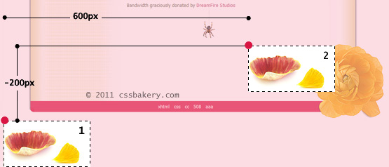
Remember the auto margin statement? Setting the left and right margins to auto will take of this problem nicely. Here's how the browser will compute the bitmap's final destination: First it will go through the normal flow and lay down all the elements including our bitmap. This would be position 1 in the illustration above. But it won't stay there. Auto margin is considered part of the normal flow so it'll center the image by computing the size of the browser window dividing it by two, then find the midpoint of our bitmap, and moving it to intersect with the halfline. I am not showing this position in the image.
From there, the relative positioning kicks in, and you move 200 up (up because it's negative) and 100 to the right which is position 2 in the illustration.
#extraDiv2 {
width: 215px;
height: 106px;
background: url(images/shell215x106.jpg) 0 0 no-repeat;
position: relative;
top: -200px;
left: 100px;
margin: 0 auto;
}
The curious may ask me why I chose 100 pixels for the x value. That's because when the browser is sized to an average width, the spider is positioned right above the red petal as if he's trying to reach it.
Ok, two down, two to go. One easy, the other has something with to do with our fluid design and is tricky.
First the super easy. I'm going to place another insect bitmap in our design, this time underneath quickSummary on the upper right. p2's background is clear, let's hook into that:
/* The dragonfly */
#quickSummary p.p2 {
background: url("images/dragonfly.gif")
no-repeat right bottom;
padding-bottom: 40px;
}
Normally we'd give a height and width but here I'm using the bottom padding since we know background images show through padding. 40 pixels is enough for our little guy.
Looks and works fine.
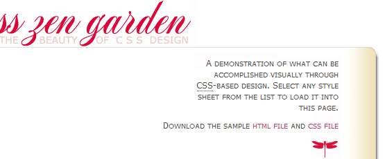
We are almost done. The eagle eyed aside, most people may not notice the gap between the red title and the moving grey line:
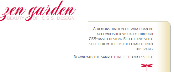
Using one of the extradiv's, I want to give the illusion of a long grey line that grows or shrinks depending on what the user is doing with the browser window. We accomplish this by turning on the top border of extraDiv1, and absolutely positioning it in just the right spot to align that border with the existing line.
We set the z-index to a high value (800) to make sure this line shows up on top of all other elements in the area. We give it a minimum width of 100px to make sure the line doesn't become too narrow when the browser window is narrow.
Finally, we play an interesting trick. We set to width to auto, and we set both left and right properties, which is something you usually don't see. This causes the div's left edge to be offset 524 px from the left edge of the page, and the div's right edge to be offset 130px from the right edge of the page. Thus, the width of the div varies with the width of the browser window, but the horizontal dimensions are controlled in such a way so that it appears to be an extension of the existing line underneath the page heading. This is interesting because its a case where we are using the left and right properties, along with absolute positioning to control the width of the element, as well as the left/right offsets from the edges of the page.
#extraDiv1 {
width: auto;
border-top: 1px solid #e1e1e1;
height: 1px;
position: absolute;
top: 80px; left: 524px; right: 130px;
z-index: 800;
min-width: 100px;
}
You can stretch the browser more and the design will not break - I had to limit myself for this screenshot because of my tight 550px main column width. The line will keep growing in the middle as if it's one piece:
This is the case when the browser is sized to its minimum - it cannot shrink more. See how perfectly the grey line is positioned, it always stops under "THE" and the right edge of the frame sits aligned under "DESIGN". Everything looks perfect even when you increase text size in the order of 5. I love how this works:
The interactive html file.


 Posts
Posts


Post a Comment
Note: Only a member of this blog may post a comment.