


Transparent Captions: This article touches on many key CSS concepts such as positioning, inheritance, and classes.
November 2009 Update: I now have a Javascript tool that will automatically add captioning to your image.
January 26, 2010 Update: I have a captioning tool that I wrote which automates the entire process. Very easy to use and with multiple options, you can try it here.
In this post, I will demonstrate semi-transparent captions for your images like the one shown above, and discuss the CSS and the HTML involved in depth. This tutorial touches on many key CSS concepts such as positioning, inheritance, and classes. The example code is usable for both regular web pages and also for blogs on Blogger. The extra code needed for Blogger will be labeled. Here's the HTML markup that I will be working with:
For those who want to just try the caption example, you can cut and paste the HTML and the corresponding CSS style without having to read the detailed discussion.
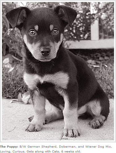
<div class="contain_image">
<img  class="captioned" src="http://pics.cssrule.com/pics/bwpup.jpg"
alt=" " >
<p><strong">Transparent Captions:</strong> This article touches on many key CSS concepts such as positioning, inheritance, and classes.
</p>
</div>
I want to place a semi-transparent white (or black - see here for creating a black transparent bitmap) strip on the bottom of the image to provide some contrast so that the text stands out more. To build this strip, I created a 1 pixel file in Photoshop, colored in pure white (or black), lowered the opacity of the layer down to 51% so that the picture below would still show through. To preserve its transparency, I saved it as a .png file with the "none" interlace option selected. To get more detailed instructions on how to create transparent png files please see this post.
The HTML element that I will apply the background image to is the p that is a descendant of the contain_image div. The browser computes the height and the width of the the p element and after that, it tiles in the one pixel transparency throughout the paragraph element.
.contain_image p {
background: url(http://pics.cssrule.com/pics/whitedot51.png);
position: absolute;
bottom: 0;
left: 0;
margin: 0;
padding: 10px;
color: #444343;
}
As you can see, I also reposition the p element using CSS absolute positioning so that the bottom of the p will be zero pixels away from the parent's bottom (bottom:0;), and zero pixels away from its parent's left (left:0;), which will place the p on the lower left corner of the image. The 10 pixel padding in all directions give the caption text some breathing room.
The width of the image is 395 pixels so I set the contain_image div width to be the same. This will keep the caption text from going horizontally beyond the boundaries of the image. Also, the absolute positioning I'm doing on the p element needs to be with respect to the .contain_image div, therefore I set the position property for contain_image div to relative. (By setting the parent div's position to relative, any absolute positioning I do on the p will take place within the context of the parent div. So position:relative; is needed, otherwise the absolute positioning will take place with respect to some other element on the page, which isn't what we want.)
.contain_image {
width: 395px;
margin: 0; padding: 0;
font: .75em/1.75em Verdana, sans-serif;
position: relative;
}
You'll also notice that I zeroed out the margins and padding for the img element (This is Blogger specific and only needed if you are captioning on your Blogger blog):
.post img.captioned {
margin:0; padding: 0;
}
This was necessary because Blogger was defaulting to 4 pixel padding on all images inside of posts (via the ".post img" selector). Here's what that was doing to my caption, leaving a noticeable gap in the lower right corner (this example I was using the white strip but color apart everything else is the same):
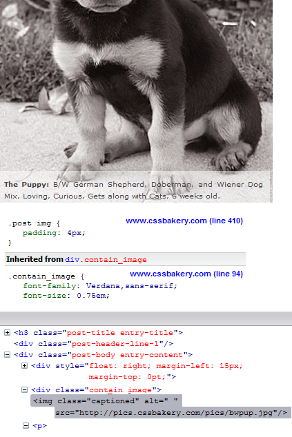
In order to override the padding set by ".post img", you have to write a more specific selector so I chose ".post img.captioned" since my img element is of "captioned" class (see HTML).
If you want to try this caption example, add the new CSS styling - .contain_image, .contain_image p, to your style sheet and use the html given in your markup file. Be sure to change the width in .contain_image to match the width of your image.
For those who want to try the caption in a Blogger blog, in addition to above rules, add the extra CSS rule, .post img.captioned, to your embedded styles by bringing up Layout/Edit HTML and updating the document in the head section. The HTML tags go directly into your post when you Edit/Create Post from the Posting option.
Here is the complete CSS:
.contain_image {
width: 395px;
margin: 0; padding: 0;
font: .75em/1.75em Verdana, sans-serif;
position: relative;
}

/*don't need this rule unless you are on Blogger*/
.post img.captioned {
margin:0; padding: 0;
}

.contain_image p {
margin: 0; padding: 0;
background: url(http://pics.cssrule.com/pics/whitedot51.png);
position: absolute;
bottom: 0;
left: 0;
padding: 10px;
color: #444343;
}
This is not a transparent caption but a basic, essential example. Here I'm going to frame and caption the image by adding two classes (contain_image and captioned) to the CSS and write the post using those two classes. The HTML stays exactly the same.
The new CSS styles:
.contain_image {
width: 395px; margin: 0 0 2px 0;
font: .75em/1.75em Verdana, sans-serif;
}

.captioned {
padding: 5px;
border: 3px double #ccc;
background-color: #fff;
margin: 0;
}

/*descendant selector for p */
.contain_image p { margin: 0; padding: 0;}
The HTML stays exactly as it was:
<div class="contain_image">
<img  class="captioned" src="http://pics.cssrule.com/pics/bwpup.jpg"
alt=" " >
<p><strong">Transparent Captions:</strong> This article touches on many key CSS concepts such as positioning, inheritance, and classes.
</p>
</div>
In this example I will show how to create a transparent caption using the opacity property of CSS. You won't need an image file because this method takes advantage of the background-color property. The first class, image-wrapper stays the same and I still have the p class which prints the captioning text although some of the code here is shifted over to "transbox" div. The new class, "transbox" div is where I will have the lowered opacity background or transparency. I will no longer have the background statement with a URL but simply use a background color which I will adjust using opacity parameters directly from the CSS style.
Both "transbox" and "image-wrapper" descendant p are positioned absolutely and placed on top of each other. The reason for adding the "transbox" div and making it a sibling of p instead of its parent is because had I wrapped "transbox" div around the paragraph element, then p would become a child of "transbox".
.image_wrapper {
width: 395px; height: 484px;
margin: 0; padding: 0;
font: .75em/1.75em Verdana, sans-serif;
position: relative;
}
.transbox {
margin: 0; padding: 0px;
background-color: #5396fa;
opacity:0.6;  filter:alpha(opacity=60);
position: absolute; bottom: 0; left: 0;
width: 100%;
height: 5em;
}
.image_wrapper p {
margin: 0; padding: 10px;
color: black;
position: absolute; bottom: 0; left: 0;
}
In most cases this would not be a problem and in fact is an expected and welcome effect but since opacity property once passed onto the children cannot be overridden, the p element will print out the caption in a semi-transparent color which is clearly a side effect you would not want. The children who inherit the opacity property cannot get rid of it, in other words, you can't redefine your own opacity, much like you can't get rid of the nose you inherited from great grandparent D'Artignon, no matter how much you dislike it.
The "transbox" div lays down the semi transparent rectangle below the text and as can be seen in the HTML below is a sibling of p. The lowered opacity of "transbox" stays within "transbox" div and is not passed down to "image_wrapper.p".
I have two statements for opacity, "opacity:0.6" is for Firefox which accepts values in the range of 0 to 1.0, one for the most opaque effect. For Internet Explorer, opacity property syntax is slightly different and the values range from 0 to 100. I used, "filter:alpha(opacity=60)" which is a middle of the range value.
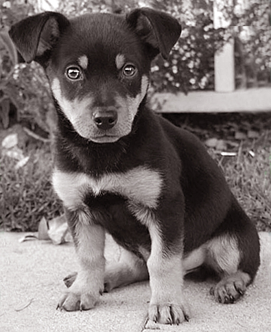
Transparent Captions: This article touches on many key CSS concepts such as positioning, inheritance, and classes.
The HTML that creates the puppy picture with the colorful caption in blue:
<div class="image_wrapper">
<img  class="captioned"
src="http://pics.cssrule.com/pics/bwpup.jpg" alt=" " />
<div class="transbox"></div>
<p><strong>Transparent Captions:</strong> This article touches on many key CSS concepts such as positioning, inheritance, and classes.
</p>
</div>
Here I tried the same technique on an image with rounded corners. The transparent white label that goes at the bottom is not round but since the background of my site is also white, they blend seamlessly. If you don't know how to create rounded corners, you may find this Adobe Photoshop tutorial useful.

Transparent Captions: This article touches on many key CSS concepts such as positioning, inheritance, and classes.


 Posts
Posts


10 comments:
Hi,
great tutorial!! Is it possible to center the "captionned image" on the page?
Thanks
Hi Fab, Thank you for your comment. Yes, it's possible to center an image that has captioning. If you want to center the last image in this tutorial, you'd say:
.image_wrapper_white {
margin-left: auto;
margin-right: auto;
}
.image_wrapper_white is the name of the div that contains the image.
Setting the left and right margin of a block element to auto centers it.
ye very good, but if it was so easy, everybody will do it. have you toughs about ie png transperancy?
I hope this works. I'm going to try this tomorrow.
Great post. thank you so much for sharing.
wow! great can i ask i want the back ground only not to be semi transparent. but when i tried the
background: #73828c;
opacity:0.6; filter:alpha(opacity=60);
all of the page begin to be semi transparent can you help me? sorry i'm really new to this
So you must have an opacity statement in the body (or your main div) which made all your content semi transparent. That's a common mistake. A lot of us assume that the transparency will only apply to the background and not effect our text. Opacity property in CSS works counterintuitively. You want to isolate it by placing it in a separate element like I have done with transbox div in my example.
If you don't want to write your own CSS/HTML, you can try Javascript transparent caption tool that automates the captioning process.
This functionality is normally embedded in picture galleries but separately doing this is really helpful, thanks
Hi Xishan, Glad you found it helpful. Yes, Javascript gallery plugins can also render grids. They usually do so using CSS similar to what I've described. When all you want is a simple image grid, its more efficient to just do it through CSS, thus avoiding the overhead of including a Javascript plugin.
fyi
Post a Comment
Note: Only a member of this blog may post a comment.