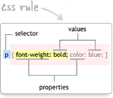
The picture shows a mountain range on the Pacific Crest Trail. This is a follow up to a question in a previous image grid post. In this post, I have the first image displaying larger than the rest. The only significant difference in the code between this and that earlier post is the CSS rule that allows the first image in the list to be larger (CSS selector: #grid li:first-child img). The same thing could have been accomplished by giving the first li an id and targeting that id with the CSS rule. e.g. id="big-image" and #big-image. The other modification was to change the widths and heights in the CSS to reflect the different image sizes I am using here. Your grid images will likely be self-descriptive and distinct. The reason I used cutups from a single image was for simplicity.
Here is the markup:
<div class="portfolio">
<ul id="grid">
   <li><a href="newgrid.html"><img src="pct0.gif"></a></li>
   <li><a href="newgrid.html"><img src="pct1.gif"></a></li>
   <li><a href="newgrid.html"><img src="pct2.gif"></a></li>
   <li><a href="newgrid.html"><img src="pct3.gif"></a></li>
   <li><a href="newgrid.html"><img src="pct4.gif"></a></li>
   <li><a href="newgrid.html"><img src="pct5.gif"></a></li>
   <li><a href="newgrid.html"><img src="pct6.gif"></a></li>
   <li><a href="newgrid.html"><img src="pct7.gif"></a></li>
   <li><a href="newgrid.html"><img src="pct8.gif"></a></li>
   <li><a href="newgrid.html"><img src="pct9.gif"></a></li>
   <li><a href="newgrid.html"><img src="pct10.gif"></a></li>
   <li><a href="newgrid.html"><img src="pct11.gif"></a></li>
</ul>
<h2>Ansel Adams Wilderness on PCT</h2>
<p>© Copyright Steve Dunleavy | Creative Commons License 2.0</p>
</div>
Here is the CSS:
ul#grid {
  list-style: none;
  margin: 20px auto 0;
  width: 550px;
  }

#grid li {
  float: left;
  margin: 0 5px 10px 5px;
  }

.portfolio {
  padding: 20px;
  margin-left: auto; margin-right: auto;  margin-top:50px;
  width: 513px;
  /*these two properties will be inherited by .portfolio h4 and .portfolio p */
  font-family: 'GraublauWeb', arial, serif;
  text-align: center;
  }

.portfolio h4 {
  clear: both;
  font-size: 35px;
  font-weight: normal;
  color: #58595b;
  width: 550px;
  }

.portfolio p {
  font-size: 15px;
  color: #58595b;
  width: 550px;
  }

#grid li a:hover img {
  opacity:0.3;  filter:alpha(opacity=30);
  }

#grid li img {
  background-color: white;
  padding: 7px; margin: 0;
  border: 1px dotted #58595b;
  width: 83px;
  height: 98px;
  }

#grid li:first-child img {
  width: 192px;
  height: 221px;
}

#grid li a {
  display: block;
} 
































4 comments:
Thanks for your new post related to my question in the previous post! This looks very helpful, and the way it is done is pretty much simpler than I thought - the flexibility of CSS keeps surprising me :) Thanks again.
You're welcome. Good luck :)
Hi, I went through your this post and found
really interesting. I landed this page through
internet search and found
this page very good.I am a web designer and
works in a web design
company
as a designer I liked the color of your blog
also.
Thanks,
aish
There is a way to make this responsive ?
Post a Comment
Note: Only a member of this blog may post a comment.