


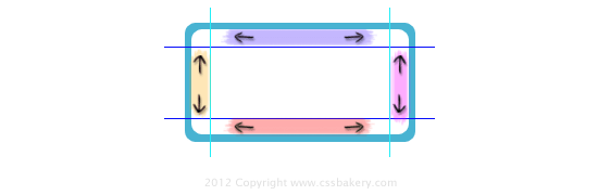 The CSS3 Backgrounds and Borders spec defines a new property called border-image. This is a powerful new way to draw borders of an element, using an image instead of a fixed color. But the usefulness of this property goes beyond just replacing border colors with parts of an image. It can be used to perform 9-slice scaling. This is a scaling technique where you divide an image into a grid of 9 images, like a tic-tac-toe grid. Then when you perform scaling, some of the 9 sub-images are scaled and others are not. Specifically, the corners are not scaled at all, whereas the non-corner images (the center and four sides) are scaled. This is shown in the diagram above.
 When the image is scaled up or down, the corner regions do not change size. The regions on the sides, top, and bottom of the grid, along with the center are scaled in specific ways. The sides are scaled in a vertical direction only. The top and bottom are scaled in a horizontal direction only. The middle section scales both horizontally and vertically.
In addition, there are several different ways to perform the actual scaling. For example, one way is to repeat a portion of the image to fill in the new space that's being opened up. Another way is to stretch the image so that it fills the space. There are a couple of other options that I'll describe later, but for now let's focus on the repeat option.
Using repeat the top and bottom regions will repeat in a horizontal direction as the element grows wider. Likewise, the left and right regions will repeat in a vertical direction as the element grows taller. The region in the middle will repeat both horizontally and vertically, as needed.
With this scheme in mind, you can sub-divide your image into regions that will do the right thing during scaling. For example, in the image above, we want the rounded corners to stay fixed in size, we want the top and bottom edges to expand horizontally, and the left and right edges should expand vertically. To make this happen we must define how the image is to be sliced up into the 9 regions.
So the first step in using border-image for 9-slice scaling is to determine where your sub-divisions will be for the regions. You need to know the distance from each dividing line to the corresponding edge of the image. Suppose for the image above that the vertical and horizontal lines of the "tic-tac-toe" grid are offset 20 pixels from each edge of the image. Then the CSS rules we need would be:
border-image: url(path/to/your/image.jpg) 20 20 20 20 repeat;
border-width: 20px 20px 20px 20px;
border-image-width: 20px 20px 20px 20px;
Now, no matter how we set the width and height of this image, it will comes out looking good, with the blue border remaining a constant width. If we had not used 9-slice scaling, then the image would simply scale up in all dimensions - just like scaling it with an image editor - thus causing the blue border to thicken and show jagged edges and pixelation as the image is made larger. 9-slice scaling avoids those problems.
While it's not the right answer for all types of images, for some things, like the "button" image at the top of this post, it's a great CSS3 solution that's now available in Firefox, Opera, Chrome, and Safari. (It's not in IE9, but let's hope that Microsoft will see fit to put it in IE10).


 Posts
Posts


Post a Comment
Note: Only a member of this blog may post a comment.