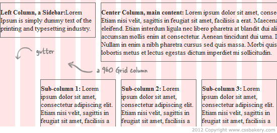
After working with Blueprint last week, I want to generate the same layouts using the 960 Grid System, which is a CSS framework based on a width of 960 pixels with either 12, 16, or 24 columns. The column widths for these difference schemes are 80, 60 and 40 pixels respectively. In this post I am only going to focus on the 24 column layout of 960 grid.
One difference between Blueprint and 960 for 24 column layout is in how the gutters are implemented. A gutter is the spacing between two consecutive columns. In Blueprint, all the gutters are accomplished using 10 pixels of right margin. Neither the left nor right edges of a container DIV have any white space because Blueprint removes the last right margin via the "last" class. In fact, the Blueprint "last" class exists for just one purpose: to set the right margin to zero. You are required to specify this class on the last element in any given row of the layout. 960 takes a slightly different approach and does not require a special class on the last element in a row.
In the 960 Grid System (24 column layout), each column has margin-left and margin-right set to 5px. These left and right margins of two consecutive columns combine to form 10 pixel gutters which is identical to the Blueprint gutter. Unlike Blueprint, the overall container gets 5 pixels of white space at the edges, and therefore you don't have do anything to turn off the margin on the rightmost element of each row. The basic steps for working with a 24 column layout in 960 Grid System:
- Download 960 Grid, and unzip it.
- Create an HTML file and link in 960_24_col.css as an external style sheet.
- You can optionally link in demo.css, which provides the pink-white background column grid and also turns on borders (helpful for debugging).
- Add a container div giving it a class of container_24 (that would be container_16 or container_12 for the other 960 layout schemes).
- Insert your content divs within the container, giving them class names to specify how many grid columns they should span. For example, grid_5 for a five column element.
- To create a new row in the layout, first insert a clear div, followed by the divs in the new row (see examples 3 and 4 below).
Example 1, a 2-column layout.
<div class="container_24">
  <div class="grid_5">
    <p>Left Column</p>
  </div>
  <div class="grid_19">
    <p>Right Column.</p>
 </div>
</div>
Since we are using 24 columns, the container div has the class 'container_24'.
Inside the container the class names are grid_X, where "X" is the number of columns the element should span (similar to the "span-X" classes in Blueprint). In the first example above the left sidebar is 5 columns wide and the main content area is 19 columns wide.
One difference from Blueprint is that you do not have to add a "last" class to the rightmost element in a row.
Example 2: Just as we did for Blueprint, we now turn this into a three column layout with left and right sidebars, and a center column for the main content.
<div class="container_24">
  <div class="grid_5">
    <p>Left Column</p>
  </div>
  <div class="grid_14">
    <p>Center Column.</p>
 </div>
  <div class="grid_5">
    <p>Right Column</p>
  </div>
</div>
Next, we add another row to the layout where the new row has 2 columns that equally divide the page: Example 3. We accomplish this by first adding a div with class="clear", then adding the div's for the new row. The clear class is defined by 960 Grid for this purpose. It keeps any new elements on the new row from floating up to the previous row.
The basic markup for Example 3:
<div class="container_24">
  <div class="grid_5">
    <p>Left Column</p>
  </div>
  <div class="grid_14">
    <p>Center Column</p>
    <p>Center Column</p>
 </div>
  <div class="grid_5">
    <p>Right Column</p>
  </div>
  <div class="clear"></div>
  <div class="grid_12"><p>A Fat Left Column</p>
  </div>
  <div class="grid_12"><p>A Fat Right Column</p>
  </div>
</div>
And finally, we have an example of a 2nd row where there are 3 columns directly under the center content column of the first row: Example 4. Again we use a class="clear" div to separate the rows of the layout.
In this example we want the three columns positioned directly under the center column of the preceding row. To accomplish this we use the "prefix_5" class on the first div, causing it to add five columns of padding to the left.
<div class="container_24">
  <div class="grid_5">
    <p>Left Column</p>
  </div>

  <div class="grid_12">
    <p>Center Column</p>
    <p>Center Column</p>
 </div>

  <div class="grid_5">
    <p>Right Column</p>
  </div>
  <div class="clear"></div>
  <div class="grid_4 prefix_5">
  <p>Sub-column 1</p>
  </div>

  <div class="grid_4">
  <p>Sub-column 2</p>
  </div>

  <div class="grid_4">
  <p>Sub-column 3</p>
  </div>

</div>
</body>
</html>









4 comments:
Hey! Would you mind if I share your blog with my
zynga group? There's a lot of people that I think would really enjoy your content. Please let me know. Thank you
My page ... ford ranger forum
Thanks so much for this! I've been struggling to use a basic 12 column 960 grid all afternoon and thanks to this article, I finally got it set up. :)
That's great! Thank you for the comment :)
Thank you alot!
Post a Comment
Note: Only a member of this blog may post a comment.