


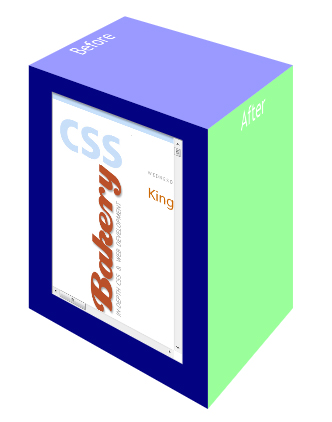
Above you see an image of a 3D box made from a single div element, and rendered in Chrome using CSS3 3D Transforms. On one side of the box you see a small window with CSSBakery showing in it. In the live demo, that is actually an iframe that allows you to scroll and click around.
If you click on the image you'll go to the live demo, but at the moment 3D Transforms are only supported on Apple Safari and Google Chrome (and based on my tests, Chrome doesn't render it when running on Windows XP). If you don't have a Browser with 3D transform support then it'll just look like a lot of gibberish and that includes Firefox which is the browser that I use. If you are on IE, you need more than a prayer. To download Chrome for Windows, visit Google. Google Chrome with Windows 7 as your OS will display the example correctly.
The markup for this is really simple:
<div id="bar1" class="bar">
 <iframe src="http://cssbakery.com"></iframe>
</div>
The CSS is a bit longer, but still not too bad. The main things we are doing are:
- Setting up a common perspective value and origin in a parent element (body). These values are then used by all 3D transforms that are done in all child elements.
- We set the transform style to: preserve-3d
- We create a couple of pseudo elements to go along with our content div. These are the ::before and ::after pseudo elements, which we'll use for rendering the right side and top of the 3d bar.
- We use the transform property on each of the 3 elements to rotate and translate it in space to form the image of a 3d box.
- We add some styles for the iframe I mentioned earlier, including some positioning and a scaling factor to make it fit.
Here's the CSS:
body {
 -webkit-perspective: 1000px;
 -webkit-perspective-origin: 200px -150px;
}

#bar1 {
 color: white;
 font-size: 50px;
 text-align: center;
 background: navy;
 top: 300px;
 left: 400px;
 -webkit-transform-style: preserve-3d;
 -webkit-transform: translateX(-20%) rotateY(-45deg);
}

.bar, .bar::before, .bar::after {
 padding: 0;
 margin: 0;
 position: absolute;
 left: 100px;
 width: 200px;
 height: 260px;
 display: block;
 position: absolute;
 font-size: 25px;
 line-height: 35px;
}

.bar::before {

 content: 'Before';
 top: -100px;
 height: 200px;
 background-color: rgba(0, 0, 255, .4);
 -webkit-transform: rotateY(90deg) rotateX(90deg) translate(50%, -50%);
 -moz-transform: rotateY(90deg) rotateX(90deg) translate(50%, -50%);
 -o-transform: rotateY(90deg) rotateX(90deg) translate(50%, -50%);
}


.bar::after {
 content: 'After';
 top: 0px;
 background-color: rgba(0, 255, 0, .4);
 -webkit-transform: rotateY(90deg) translateX(50%);
 -moz-transform: rotateY(90deg) translateX(50%);
 -o-transform: rotateY(90deg) translateX(50%);
}

iframe {
    position: absolute;
    left: -50px;
    top: -96px;
    height: 438px;
    -webkit-transform: scale(.48);
}


 Posts
Posts


Post a Comment
Note: Only a member of this blog may post a comment.