


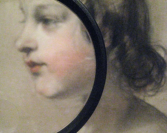
![19th Century Watercolor over Pen and Brown Ink<br><em>Portrait of a Child, 1840</em><br>[Sir Edwin Henry Landseer]<br>© 2011 Copyright www.cssrule.com All Rights Reserved](http://pics.cssrule.com/pics/child.jpg)
Sometimes you want to display an existing image in a different size and with a different crop, but without actually changing the image file itself. For example if you are displaying a lot of images that reside on Flickr, you could consider making copies of all the images and editing those copies (e.g. using Photoshop) to resize and crop. But that's a lot of work. Instead, we can resize and crop the original images directly in the Browser using CSS.
RE-SIZING
The original image could be any size, so it's likely that we'll need to resize it to fit in with our page layout. For example if we are laying out a grid of images we'll want to each image in the grid to be the same width and height. Cropping, which we talk about below, can help, but if the image is large we don't want to just crop a small section of it. Instead, we first want to scale the image to get as much of it as we can in our target rectangle, then we'll finish it off with a crop.
Scaling the image is pretty easy by setting the CSS width and height properties of the img tag. But there is one trick here: we never want to set both the width and height because then the image can be streched and distorted to meet the exact height and width we specify. Instead, what we want to do is set only the width, or only the height, letting the other dimension be determined automatically, and thus preserving the original aspect ratio of the image.
So one question we must answer for each image is: Do we scale it by height, or by width?
The answer depends on the aspect ratios of both the target rectangle, and the image. Suppose our target rectangle has a height of 100px and a width of 150px, while the image we are displaying has a height of 200px and a width of 450px - the dimensions for the B/W composite image that appears below. First lets consider what would happen if we scale the image width to be 150px in order to fit it into our target rectangle.
That's a scaling factor of 1/3, so the height will also be multiplied by 1/3 and we'll end up with an image 150 pixels wide, but only 67 pixels in height. Note that since we don't want to distort the image, we have to apply the same scaling factor of 1/3 to both the width and height. But the resulting height of 67 pixels doesn't work since our target height is 100px. As you can see, our resized image got too small for our targeted window. The blue area, which was supposed to be filled with the image, is empty.
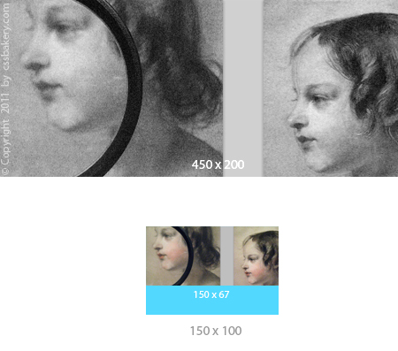
So lets try scaling the image height to 100px instead. That's a scaling factor of 1/2, so the width of the image gets reduced to 225px. This is better since the image is still large enough to fill our target rectangle. Of course it's wider than our target, but we'll fix that by cropping it.
Mathematically, the way to decide whether to scale the height or the width is to compute aspect ratios for both the target area and the image:
A_Target = TargetWidth / TargetHeight
A_Image  = ImageWidth / ImageHeight
Then compare them to decide whether to scale the image by height or width:
if (A_Image > A_Target) then
  scale image using height
else
  scale image using width
For the example discussed above, the calculations would be:
A_Target = 150 / 100 = 3:2 = 1.5
A_Image  = 450 / 200 = 9:4 = 2.25

A_Image is greater than A_Target, so scale using height.
CROPPING
To crop the image, we need to have a parent element that we set to the height and width of the target rectangle. The img tag is a child of this parent element. To crop, we just set the overflow property of the parent to hidden (overflow: hidden). If the scaled image is wider than the parent, this will crop off the right portion of the image. If the scaled image is taller than the parent, it will crop off the lower portion of the image.
To crop equally from all sides, we need to pull the image to the left (or up) relative to the parent. We can do this with negative margins. So let's say the scaled image is 20px wider than the parent. If we set margin-left of the image to be -10px, it will pull the image 10px to the left without affecting the parent, and the crop will be centered. If the scaled image is taller then the parent, then use a negative margin-top to achieve the same effect.
Given these two images of varying dimensions - one's vertical and taller, the other's got a horizontal layout that's wider - let's display them with the same dimensions (height and width the same) in an image grid using CSS:
<style type="text/css">
.flickrgrid a {
   height:275px;
   width: 275px;
   overflow: hidden;
   float: left;
   display: block;
   margin-bottom: 25px;
   }
#image1 {
   width: 275px;
   }
#image2 {
   height: 275px;
   }
</style>

<div class="flickrgrid">
<a href="images/drawingv.jpg"><img id="image1" src="images/drawingv.jpg"></a>
<a href="images/drawingh.jpg"><img id="images/drawingh.jpg"></a>
</div>

SAME EXAMPLE WITH LESS CSS
We can make the CSS more compact by using multiple classes. The width and height will be set in only one place. .window is made generic so that it can be used for a window of any dimension. We are going to reduce the size of each image in the grid to 220 pixels down from 275 pixels that I used in the example above. That'll give us extra room for right margin to separate the thumbnail images.
.window1, .window1 .taller { width: 220px; }
.window1, .window1 .wider  { height: 220px; }

.window {
   overflow: hidden;
   display: block;
   float: left;
   margin-right:20px;
   }

<a class="window window1" href="images/drawingh.jpg">
<img class="wider" src="images/drawingh.jpg">
</a>

<a class="window window1" href="images/drawingv.jpg">
<img class="taller" src="images/drawingv.jpg">
</a>
THREE IMAGE GRID
<style type="text/css">
.flickrgrid2 a {
   height:150px;
   width: 150px;
   overflow: hidden;
   float: left;
   display: block;
   margin-right: 15px;
   margin-bottom: 25px;
   }
#image12 {
   height: 150px;
   }
#image22 {
   width: 150px;
   }
#image32 {
   height: 150px;
   }
</style>
<div class="flickrgrid2">
<a href="images/drawingv.jpg"><img id="image22" src="images/drawingv.jpg"></a>
<a href="images/pencils550x361.jpg"><img id="image32" src="images/pencils550x361.jpg"></a>
<a href="images/drawingh.jpg"><img id="image12" src="images/drawingh.jpg"></a>
</div> 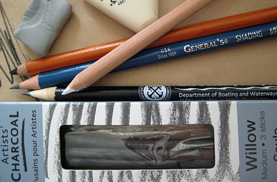
USING WIDER CROPS
Next we change the example above to make the cropping window wider than it is tall. So it will no longer be a square of 150px on each side. Instead it will be 150px tall and 180px wide. To do this we need to set the width of the a tags to be 180px, and then any images that need to be scaled by width, we will also set to be 180px wide.
The only tricky part of this is that since we are changing the width of the cropping window, it could mean that some images that we were previously scaling by height, now need to be scaled by width. This happens if the aspect ratio of the scaling window is now larger than the aspect ratio of the image.
In our example the aspect ratio of the cropping window is changing from 1 (150/150) to 1.2 (180/150). If we had images with an aspect ratio of say 1.1, then we would have been scaling them by width and cropping a little off the bottom, and now we need to scale them by height and crop a little off the right.
<style type="text/css">
.flickrgrid3 a {
   height:150px;
   width: 180px;
   overflow: hidden;
   float: left;
   display: block;
   margin-right: 3px;
   margin-bottom: 25px;
   }
#image12c {
   height: 150px;
   }
#image22c {
   width: 180px;
   }
#image32c {
   height: 150px;
   }
</style>

<div class="flickrgrid3">
<a href="images/drawingv.jpg"><img id="image22c" src="images/drawingv.jpg"></a>
<a href="images/pencils550x361.jpg"><img id="image32c" src="images/pencils550x361.jpg"></a>
<a href="images/drawingh.jpg"><img id="image12c" src="images/drawingh.jpg"></a>
</div>


 Posts
Posts


5 comments:
Thank you so much! :)
Tried clip:rect but couldn't position the resulting image. This worked - after I'd used 'view source' to see an example of a negative left margin. Thanks.
Jonathan, Thank you for your comment.
You saved my day!
Consider using max-width and max-height to scale with aspect ratio automatically.
Post a Comment
Note: Only a member of this blog may post a comment.