


-webkit-gradient(linear, left top, right top, from(#23262a), to(#2784ed))
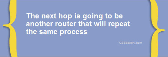
This post was really about blockquotes but since I used new CSS 3 features, I'm going to show the code for gradients and multiple background images. The blockquote was generated in the Chrome browser with CSS3. The CSS is very similar to the pullquotes with most of the action taking place in the openingbracediv.
div.openingbracediv {
    color: white;
    font: bold 24px/27px arial;

    /* this statement is for IE 8 and earlier versions */
    background: url("images/openingbrace300DropS.png")  no-repeat 2% 70% #899bc8;

    background: url("images/openingbrace300DropS.png")  no-repeat 2% 70%,
                      url("images/closingbrace300DropS.png")  no-repeat 98% 30%,
                     -moz-linear-gradient(100% 100% 245deg,  #2784ed, #23262a);

    background: url("images/openingbrace300DropS.png") no-repeat 2% 70%,
            url("images/closingbrace300DropS.png")   no-repeat 98% 30%,
           -webkit-gradient(linear, left top, right top, from(#23262a), to(#2784ed));

    background-color: #899bc8;
   -moz-border-radius: 10px;
    border-radius: 10px;
    width: 550px;
    }
/* for IE - the closing brace graphic */
.closingbracediv {
    background: url("images/closingbrace300DropS.png") no-repeat 98% 30% transparent;
   -moz-border-radius: 10px;
    border-radius: 10px;
    }
First background statement is for IE version < 9. The next two backgrounds are for Firefox and Chrome. IE being IE pokes its nose into the Mozilla and Webkit backgrounds and by the time we are done with the three background statements, IE no longer has a handle on what the background color should be. This is why I had to add a standalone background color just to set IE straight. Let's look at the second background statement written for Firefox. The opening and closing braces with drop shadows are going to layer over the color gradient. I purposefully positioned them asymmetrical along the y-axis to make things visually more interesting. In the -moz-linear-gradient(100% 100% 245deg, #2784ed, #23262a), the percentages can be rewritten as bottom right and you'd get the same results.
Gradient is the final entry which renders a fading layer going from a dark blue to a brighter blue using a 245 degree angle. Prior to CSS 3.0, our options were limited to uniform gradients that faded horizontally or vertically since we typically took a small slice of a gradient and repeated it either in x or y direction.
You might wonder if the order is important in the background statement. It is. If you were to move the gradient entry in between the opening and closing brace images, you will lose the closing brace from the final image because you'll write over it.

-moz-linear-gradient(100% 100% 245deg, #2784ed, #23262a);
Background statements for Firefox and Chrome have three background images assigned to them. Two brace images and since the gradient is considered an image, that brings the total to three. Before version 3.0, we could only do a single background image per element which forced us to use a lot of unnecessary markup in order to layout all the images. IE versions < 9 are not equipped to handle multiple images so the extra div named closingbracediv is there for putting out the closing brace in IE. No support for rounded corners in IE 8.0.
Browser Support for Multiple Backgrounds
- Internet Explorer 9.0
- Firefox 3.6
- Opera 10.5
- Safari (Webkit) 1.3
For the rest of the blockquote CSS and HTML.


 Posts
Posts


Post a Comment
Note: Only a member of this blog may post a comment.