If you are designing a site and traffic is important to you as it is to most people, then it's a good idea to prominently display your RSS feed instead of burying it like I had down in the bottom of my blog. Twitter and RSS go hand in hand these days so I included Twitter even though I don't have an account with them yet. Let's talk about the CSS styles that I wrote to display the two images for these services.
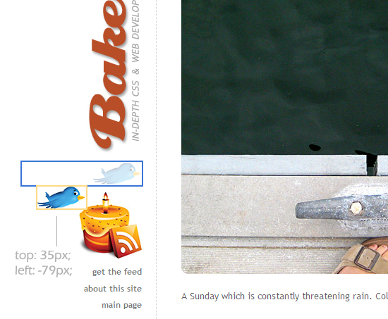
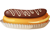
I wanted the bird appear as if it's hovering over the cake. Obviously that can be easily achieved in an image editor but in my case both images had to be clickable so combining the two was not an option. That's when CSS positioning came in handy.
For the RSS cake, I gave the dimensions of the image. Just as a reminder, you don't really have to specify width and height for images unless you want to change the original dimensions of the image. I just happened to write mine out, it wasn't really necessary.
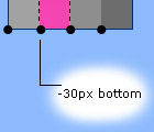
For the bird, I had to tweak with positioning. As you'll recall, in relative positioning the space occupied by the element remains in the flow but the element itself is shifted by however many pixels you specify typically in your top and left. So that's exactly what I did, I moved the bird around until I was pleased with its new position. That meant I pushed it down by 35 pixels and pushed it out by giving its left a negative value of 79 pixels.
The bird is moved relative to the position it would have occupied in the normal flow. What I really want you to see is the invisible "hole" left behind because of relatively positioning the bird. As far as the normal flow rendering is concerned, the bird's still there in the larger rectangle. It's because of that hole I had to go back in and adjust padding/margin on other elements.
img.rss { width: 90px; height: 94px; }
img.twitter { position: relative; top:35px; left: -79px;}
I updated my image captioning tool.
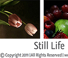
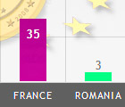
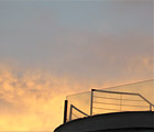
It has a new option that you can check off to display your caption on top of the image instead of bottom. To see how that looks, see the image in this post. As you'll see, showing caption on top of the image instead of the typical bottom makes more sense in some cases.














Post a Comment
Note: Only a member of this blog may post a comment.