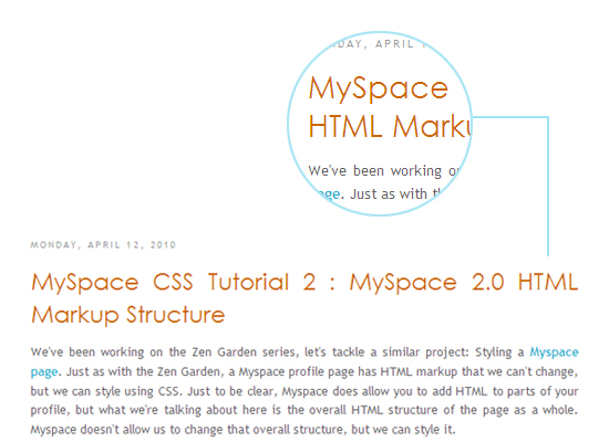
which we achieved by styling our h3's with the following:
.post h3 a, .post h3 a:visited {
font-family: Lucida Grande,Century Gothic,Arial, sans-serif;
font-size: 30px; /* WAS 25px */
color: #cc6600;
}
Pretty simple, right? The font looked good on a 17 inch with a resolution of 1440 by 900 but would come out looking hideous on a 12 inch (1024 by 768). The reason? It could be that the smaller machine did not have Lucida Grande font installed. Whatever the reason, to combat the variations based on screen size, resolution and font availability, I decided to give text replacement technique a chance.
Replacing heading text with images has become popular in recent years because it allows you to use fonts in your web application that are not installed on most web browsers out there. One technique called sIFR renders the text using Adobe Flash.
A newer technique called Cufon uses a pure Javascript solution. An online “font generator” tool transforms an uploaded font file into a Javascript file that contains data that describes the font. The Cufon rendering engine, written in Javascript, takes care of replacing the text on the page with a rendered image. (In IE it renders using VML, in other browsers it uses the HTML5 canvas tag).
All the post titles that you see on CSS Bakery - the large honey brown text leading each article - are now being generated by the Cufon technique which has eliminated the inconsistencies that we were experiencing across different platforms. That's positive.

I was getting to write a detailed how-to to teach you the technique until I realized that I am not entirely pleased with the results yet, one of which is a noticeable delay in displaying. I may be being picky but I could swear I also detected a bit of fuzziness around the new Cufon fonts. So until I come up with an explanation for at least one of these, I am going to postpone talking about Cufon.
Meanwhile I went back to the smaller laptop to investigate the source of the problem. Was it really a matter of font availability or something else which was causing the terribly jagged edges? It turns out the culprit was originating from a display option that was not set right buried deep in the control panel. Since some of you may be experiencing the same problem, I'm going to have you check your settings. Control Panel is accessed through the "Start" menu. So keep clicking until you are at Effects.
Control Panel > Display (Folder) > Appearance (Menu Option in Display) > Effects (Menu Button in Appearance)
From Effects, check the box next to the option, Use the following method to smooth edges of screen fonts which you'll set to "ClearType". This has a magical result of smoothing out all the jaggedness out of your fonts.
We'll still talk about text replacement techniques later.













Post a Comment
Note: Only a member of this blog may post a comment.