


First, here's the image and caption, without rounded corners and the existing CSS styles and HTML markup:
#photobox2 {
    float:left;
    margin: 12px 18px 18px 0;
    width:292px;
}
#photobox2 img { margin: 0; padding: 0; display: block; }
.captionbox2 p {
    font-family :arial,sans-serif;
    font-size: 10px;
    font-weight: 400;
    font-style:  normal;
    color:  #666666;
    line-height: 13px;
    text-align: left;
    vertical-align: baseline;
}
.captionbox2 {
    width: 290px; margin: 0; padding: 0;
    border-right: 1px solid #dfdfdf;
    border-left: 1px solid #dfdfdf;
    border-bottom: 1px solid #dfdfdf;
}
.captionbox2 p {
    margin: 0;
    padding: 6px 6px 8px 8px;
}
<div id="photobox2">
<img height="267" width="292" border="0" alt=" "
src="http://pics.cssrule.com/pics/caramelcake.jpg" alt=" " />
<div class="captionbox2">
<p>Caramel Cheesecake: A relative of Caramel Custard, this cheesecake
is enrobed in caramel sugar</p>
</div>
</div>
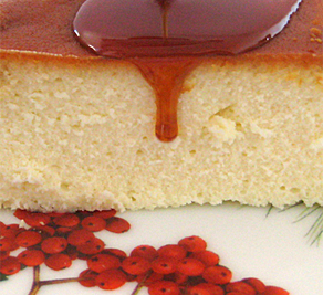
Caramel Cheesecake: A relative of Caramel Custard, this cheesecake is enrobed in caramel sugar.
I want to change this so that the lower left and lower right corners of the caption are rounded as seen in this magnified comparison close-up.
Step 1: Create a couple of rounded corner images in Photoshop. Ones I have are 4 pixels by 6 pixels, lc.gif and rc.gif. If you click on these links, you will get a very faint looking grey corners at the top corner of the browser. Best way to view them is to drag the gif images into Photoshop.
Step 2: Put in a couple of "div's" that will be used to hold the corner images. These go inside the existing caption div so that we can reposition them in a later step using the caption div as a positioning reference. So we change the post markup as follows:
<div class="captionbox2">
<div class="leftedge"></div>
<div class="rightedge"></div>
<p>Caramel Cheesecake: A relative of Caramel Custard,
this cheesecake is enrobed in caramel sugar</p>
</div>
Step 3: Using CSS, apply the images to the DIV backgrounds, and set their dimensions equal to the image size:
.leftedge {
   width: 4px; height: 6px;
   background: url(http://pics.cssrule.com/pics/lc.gif) 0 0 no-repeat;
}
.rightedge {
   width: 4px; height: 6px;
   background: url(http://pics.cssrule.com/pics/rc.gif)  0 0 no-repeat;
}
If we look at the post now, we can see that the rounded corners appear just above the caption paragraph. All we need to do now is reposition these images to correspond to the lower corners of the caption.
Step 4: Use absolute positioning to position the corner images. To do this we must specify position: relative on the parent div, otherwise the absolute positioning context will be some ancestor element and the images won't go where we want them. Then, we specify position:absolute on bo the corner DIVs and use negative numbers to align the images over the borders of the parent div:
.captionbox2 {
         position: relative; /* added */
         width: 290px;
         margin:0; padding: 0;
         border-right: 1px solid #dfdfdf;
         border-left: 1px solid #dfdfdf;
         border-bottom: 1px solid #dfdfdf;
   }
.leftedge {
       position: absolute;
       left: -1px; bottom: -1px;
       width: 4px; height: 6px;
       background: url(http://pics.cssrule.com/pics/lc.gif) 0 0 no-repeat;
}
.rightedge {
       position: absolute;
       left: -1px; bottom: -1px;
       width: 4px; height: 6px;
       background: url(http://pics.cssrule.com/pics/rc.gif)  0 0 no-repeat;
}
Note that the -1px on the bottom, left, and right attributes is required because if you just specify 0px, then the image will not overlap the borders and you'll end up seeing the entire border with the images just inside them.
Now, for extra credit we can refactor the CSS to make it a bit smaller and more reusable:
First, we'll factor out the common parts of .rightedge and .leftedge:
 .leftedge, .rightedge {
       width: 4px; height: 6px;
       position: absolute;
       bottom: -1px;
  }
  .leftedge {
       left: -1px;
       background: url(http://pics.cssrule.com/pics/lc.gif) 0 0 no-repeat;
}
  .rightedge {
       right: -1px;
       background: url(http://pics.cssrule.com/pics/rc.gif)  0 0 no-repeat;
}
Next, we'll split out the reusable part of the .captionbox2 styling into a separate class:
  .captionbox2 {
           width: 290px;
           margin:0; padding: 0;
    }
   .frame-with-rounded-bottom-corners  {
         position: relative;
         border-right: 1px solid #dfdfdf;
         border-left: 1px solid #dfdfdf;
         border-bottom: 1px solid #dfdfdf;
   }
And finally, we use the new class in the markup:
<div class="captionbox2   frame-with-rounded-bottom-corners">
<div class="leftedge"></div>
<div class="rightedge"></div>
<p>Caramel Cheesecake: A relative of Caramel Custard, this cheesecake
is enrobed in caramel sugar</p>
</div>
The result:
Caramel Cheesecake: A relative of Caramel Custard, this cheesecake is enrobed in caramel sugar
Caramel Cheesecake: A relative of Caramel Custard, this cheesecake is enrobed in caramel sugar. Like a flan, it's inverted after it's baked in a springform pan coated with caramelized sugar.
The caption automatically adjusts to the amount of text that you enter and you can also have links from within the caption title as seen in this final example.
You can adjust the amount of space around the caption text by adding more padding to the "captionbox2 p" selector. I have it set at "padding: 6px 6px 8px 8px;" right now.


 Posts
Posts


Post a Comment
Note: Only a member of this blog may post a comment.